

At Frames X, we’ve discovered the new best way to build components in Figma.
Let's call it Parametric Components.
This method reduces the number of variants in our design system by 80%, resulting in a smoother workflow and significantly faster Figma library performance.
Let me break it down ↓
What are Parametric Components?
Parametric design or parametric components is a technique for assembling Figma components that allows you to eliminate repetitive variants, such as Size, Color, or Text-specific variations.
Figma variants are typically used to reflect stylistic changes to a core component, such as altering the size, color, text, etc. Take a regular Badge, for example—it might have size and color variations baked in as separate variants, which usually results in a huge, unmanageable component set.
With parametric components, we can replace these repetitive variants with variables, allowing for a more optimized workflow and less memory usage in Figma. How does it work?
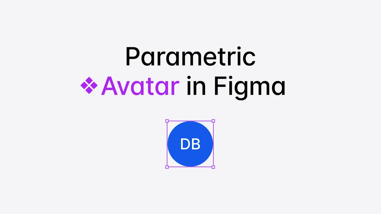
Let's take the Avatar component as a simple example:
Here's how the Avatar variants looked before and after using parametric components:

The Size-related variants for Avatar are gone, but the ability to change the size of the component is still available. So, how does this work?
How to Create Parametric Components
To create parametric components, start by identifying the properties that can be transformed into reusable Figma parameters. These can include colors, size, font-size, width x height, etc.
In our Avatar example, the following properties can be transformed into variables:
The size of the avatar;
Text font-size;
Online indicator (dot);
Loading progress indicator.

These properties will store Numeric values and use variable modes instead of variants to alter the component. So, once we know our properties, let’s turn them into variables.
First, create a new variable collection named Avatar:

Next, create four Number variables to represent responsive width and height values for:
Avatar (size of the avatar);
Text (font-size of the label);
Dot (size of the online indicator);
Stroke (thickness of the loader stroke).

Then, we'll create Size modes for each variable, such as XS, Small, Medium, and Large, to match the options available in the previous component set.

For Avatar size and Dot size, we will assign flat numeric values.
For Text, we'll reuse existing Text Variables from our Figma design system.
For the Stroke, we'll also reuse existing numerical Figma Variables. You can also reuse any numeric variables you previously had for that purpose, so it makes sense to have a single source of truth for all of your parametric components
!Important note: the standard Pro Figma plan allows for only 4 modes per variable, which is too low and needs to be revised. To have more than four modes, you'll need to upgrade to the Enterprise plan.
Now, we need to assign these variables to the actual component parameters: the Width and Height of the Avatar. We will also assign the font size of the text and the size of the dot indicator.

Bonus Tip: You can right-click the variable mode column and set it as the default Mode for a component. In our case, I’m making the default one the medium size.

Once everything is connected, let’s test Avatar setup and switch from one Size (Mode) to another.

Just like that, we've removed 80% of the original variants, making the entire Avatar set much easier to manage. The Figma Avatar component is also now lighter when imported than the original set. Here is a comparison of the two: when imported into the new empty with 197 layers vs 65.
Why Does Parametric Design Matter?
If you're building a design system, here's a key takeaway:
When someone imports a component from your UI kit/design library, all its variants get brought into their file, potentially bloating it and slowing things down with hundreds and maybe thousands of unused variants.
This isn't the case with variables. Variables only pass the necessary values into the file—they don't create variant duplicates or memory overhead.
What are the Downsides?
Parametric components have a learning curve. They require a blend of variants and variables, which might not be intuitive to most users.
Plus, the current execution in Figma aligns less with how things are represented on the code side. Variable modes feel closer to an attribute you'd have at a top level rather than on a component level.
And, as Jacob Miller (DS+AI Figma Product Manager) stated:

→ Read the original thread on X.
Conclusion
To wrap everything up, I believe parametric design is the best way to build components in Figma. This method not only saves memory usage and removes extra work, but it also promotes the creation of better systems and products.
Hopefully, Figma will reconsider the number of variable modes available on the Pro plan.
Regarding the Frames X UI Kit, we're committed to implementing Parametric Design in upcoming releases. While Figma's current support for parametric components is still evolving, it's clear this is the direction forward. So we're actively working on refining Frames X to align with this approach and ensure it's the perfect fit. Stay tuned!


