Figma Popover
Figma Popover
Preview
Figma Popover
Figma Popover Component
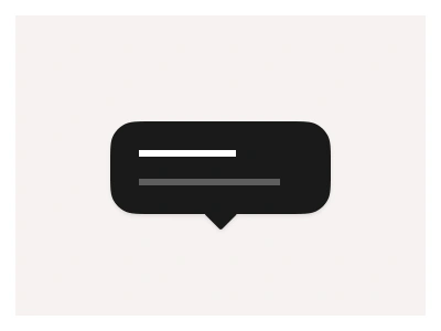
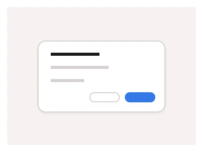
The Popover displays content over the main UI in a floating window. A Popover shows relevant information, tips, or extra controls in a floating window. The Popover's tail points to an element or highlights an area that requires explanation.
Use the Popover component to appear near the triggering element with a close-on outside click or Esc button press.
Popover Anatomy
| Set | Variants | Properties | Copy to Figma |
|---|---|---|---|
| Popover | 26 | Size Medium, LargeDirection None, Bot Left ↙, Top Left ↖, Left Top ->, Right Top ->, Bot Center ↓, Top Center ↑, Left Center ->, Right Center ->, Bot Right ↘, Top Right ↗, Left Bot ->, Right Bot -> |
Figma Popover
Popover
popover example
popover component
figma popover
Interactive component