Figma Checkbox
Figma Checkbox
Preview
Figma Checkbox
Figma Checkbox Component
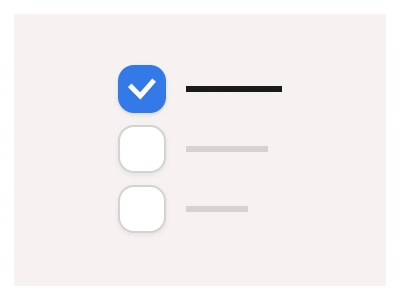
The Checkbox component communicates whether an option is selected, not selected, or indeterminate. Use checkboxes whenever a user can select a single or multiple option from a single list.
Checkboxes UI Best Practices
Ensure each checkbox has a clear, concise label that describes what the option does.
Checkbox labels should always be clickable along with the checkbox shape, improving usability.
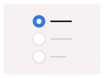
When to use Checkboxes vs. Radio buttons:
Use checkboxes for optional or additive choices.
Use Radio Buttons for mandatory, single-selection scenarios.
Always group related options clearly and provide clear labels for both components.
Check Box Anatomy
| Set | Variants | Properties | Copy to Figma |
|---|---|---|---|
| CheckboxLabel | 48 | Size Small, Medium, Large, XLState Checked, Hover Checked, Indeterminate, Unchecked, Hover Unchecked, DisabledDirection Left, Right | |
| CheckboxCaption | 48 | Size Small, Medium, Large, XLState Checked, Hover Checked, Indeterminate, Unchecked, Hover Unchecked, DisabledDirection Left, Right | |
| CheckboxButton | 40 | Size Small, Medium, Large, XLState Checked, Hover Checked, Unchecked, Hover Unchecked, DisabledDirection Left, Right | |
| Checkbox | 18 | Size Small, Medium, LargeState Checked, Hover Checked, Indeterminate, Unchecked, Hover Unchecked, Disabled |
Figma Checkbox
Checkbox
checkbox example
check box
checkbox component
Interactive component