Figma Radio Group
Figma Radio Group
Preview
Figma Radio Group
Figma Radio Group
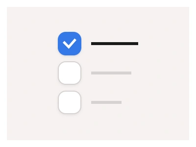
The Radio Group component lets users select one option from a set. The radio group is available as column and row variants. Use the radio group to allow users to select a single option at a time.
Radio Group Anatomy
| Set | Variants | Properties |
|---|---|---|
| RadioGroupRow | 24 | Size Small, Medium, Large, XLItems x7, x6, x5, x4, x3, x2 |
| RadioGroupCol | 24 | Size XL, Large, Medium, SmallItems x7, x6, x5, x4, x3, x2 |
RadioGroup arranges two to seven nested radios as a RadioGroupRow at 56, 64, 80 and 84px heights or a stacked RadioGroupCol, in Small, Medium, Large and XL sizes, for single-choice lists.
Radio Group AI Prompt
Paste this into Claude, ChatGPT, or Figma Make:
Build a radio group component in Figma as two sets composing the kit's RadioLabel instances. RadioGroupRow: two to seven labelled radios in one horizontal auto-layout row with even gaps, in Small 56, Medium 64, Large 80 and XL 84px heights, wrapping onto a second line when the frame narrows. RadioGroupCol: the same two to seven items stacked vertically with a consistent gap, hugging their content height. Give both an optional group label above, a helper or error line below, and an Items property so adding an option never needs manual spacing. Exactly one item is Checked in each variant and the rest Unchecked; add a Disabled variant greying the whole group. Build a card-style variant where each option is a bordered RadioButton card with a title and caption, the checked card tinted. Wire the items as an interactive component so clicking an Unchecked radio checks it and unchecks the previous one, and bind colours to variables for light and dark mode.
Figma Radio Group
Radio Group
radio group example
radio group component
figma radio group
Interactive component
Premium Figma UI Kit & design resources
Explore high-quality Figma components, templates, and UI elements.