Figma Tooltip
Figma Tooltip
Preview
Figma Tooltip
Figma Tooltip Component
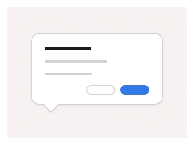
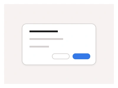
The Tooltip component displays additional information when users interact with other UI elements by clicking or hovering them.
Use Tooltips to reveal important information and give users hints about your product or other UI elements' functionality.
Tooltips Anatomy
| Set | Variants | Properties |
|---|---|---|
| TooltipLabel | 9 | Type Top Right, Top Center, Top Left, Left, Right, Bottom Right, Bottom Center, Bottom Left, None |
| Tooltip | 9 | Type Top Right, Top Center, Top Left, Left, Right, Bottom Right, Bottom Center, Bottom Left, None |
| TooltipChart | 8 | Type Top Left, Top Right, Top Center, Left, Right, Bottom Left, Bottom Center, Bottom Right |
Tooltips are three sets — Tooltip and TooltipLabel each with nine positions from Top Left to Bottom Right or None, and TooltipChart in eight positions for data points — small floating hints shown on hover or click.
Tooltips AI Prompt
Paste this into Claude, ChatGPT, or Figma Make:
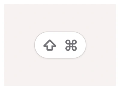
Build a tooltip system in Figma as three sets. Tooltip: a dark rounded bubble with white text and a small tail, with a Type property for nine placements — Top Left, Top Center, Top Right, Left, Right, Bottom Left, Bottom Center, Bottom Right and None without a tail — the tail rotated and offset for each. TooltipLabel: the same bubble holding a bold label plus a secondary line, for richer hints such as a shortcut with a KBD keycap. TooltipChart: a light card with a shadow for data points, showing a date header and one or more rows of a coloured dot, series name and value, in eight placements so it can flip away from chart edges. Add a Boolean for a max-width wrapping variant with multi-line text. Build examples: an icon button with a Top Center tooltip, a truncated table cell with a Bottom Left tooltip revealing the full text, and a line chart point with a TooltipChart. Wire the hover trigger in a prototype with a short delay and fade, and keep colours on variables so the dark bubble inverts in dark mode.
Figma Tooltip
Tooltip
tooltip figma
figma tooltip
figma tooltip prototype
Helper component
Premium Figma UI Kit & design resources
Explore high-quality Figma components, templates, and UI elements.