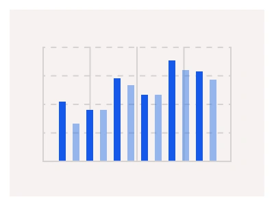
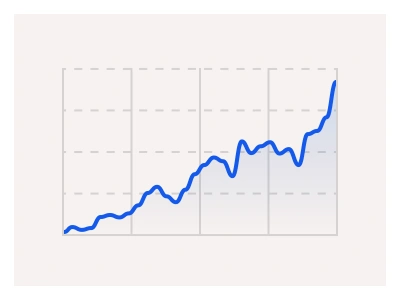
Figma Scatter Chart
Figma Scatter Chart
Preview
Figma Scatter Chart
Figma Scatter Charts
Scatter charts, or scatter plots, are a type of data visualization used to display the relationship between multiple numerical variables. Each chart point has its own volume/size and color-coded category.
Scatter Charts UI Best Practices
Only display up to 2-3 different data series per chart. Too many points and colors make the correlation patterns impossible to spot;
Use distinct colors to visually separate data categories and groups;
Use consistent scaling and opacity levels to highlight crucial points on the charts to improve readability.
Figma Scatter Chart
Scatter Chart
scatter charts
scatter graph
scatter chart component
Interactive component