Figma ComboBox
Figma ComboBox
Preview
Figma ComboBox
Figma ComboBox Component
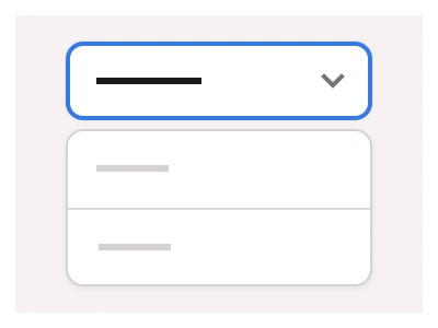
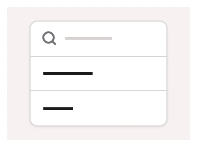
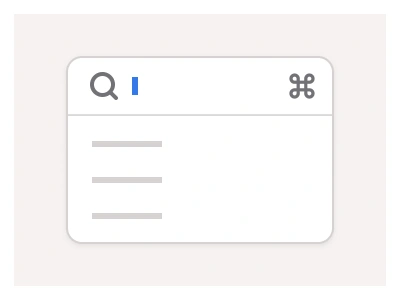
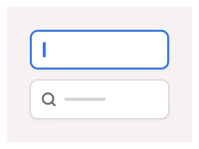
The ComboBox component is designed to autocomplete input and provide the user with a list of suggestions from which to choose.
You can customize the pop-up size and elements available in the Combobox by adjusting the nested Dropdown List component.
ComboBox UI Best Practices
Provide autocomplete suggestions as the user types;
Allow users to navigate options using arrow keys and select with Enter;
Use predesigned variants to distinguish between focused, hover, and default states.
Combobox Anatomy
| Set | Variants | Properties | Copy to Figma |
|---|---|---|---|
| Combobox | 24 | Type Default, SecondarySize Small, Medium, LargeState Default, Disabled, Hover, Focused |
Figma ComboBox
ComboBox
combobox example
combobox component
figma combobox
Interactive component