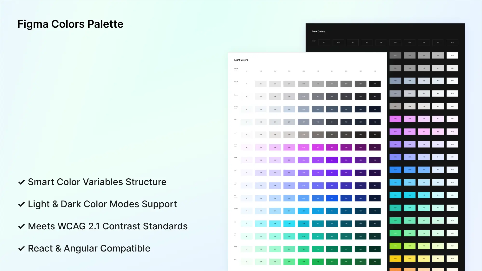
Figma Colors Palette
UI Colors Palette for Figma
Frames X colors palette provides a robust color system for designing high-quality UIs and systems.
The color palette utilizes the WCAG compatibility standards with post-processing of the APCA Color Model to calculate the ideal contrast. Frames X UI Kit color palette includes an extensive color library you can use as your project foundation. Add it to your Team library in Figma and start designing beautiful and high-performing products right now.
The Frames X UI Kit color palette ensures the perfect contrast within and between color schemas. The Figma color palette features a thoughtful naming convention, where each color name corresponds to its corresponding saturation level (color intensity).
Frames X Color Palette Core Features
44 Color Schemas with perfect contrast ratio for every possible UI case scenario.
Naming convention that reflects color hierarchy and saturation level.
Optimized dark colors for bulletproof dark mode design.
When utilizing the Frames X UI color palette, you can expect a similar or nearly equal contrast between foreground and background elements when using shades from the same color range.
Applying Colors to UI Elements
For optimal contrast ratio for your UI elements, use colors from the 500-700 range. This applies to primary and active elements. Use 50-100 for backgrounds and text colors.
Switch Between Light and Dark Modes
You can switch between color modes anytime by selecting elements with color variables applied. Use the control in the right sidebar on the Layer panel to switch modes.
React and Angular Compatible
You can use Frames X UI Kit's color palette in your Angular and React projects using our open-source design tokens. You can preview and customize the color tokens via the CocoKits App.
Learn more from Best Practices for UI Colors in Figma.
Resource name
Frames X UI Kit - Colors Palette
Features
Figma Variables
Format
Figma
Size
23 MB
More Figma resources
Figma Tables Template
figma tables
table template
Figma iPhone Mockup
figma iphone 16
iphone mockup
Figma Pricing Template
figma pricing
pricing template
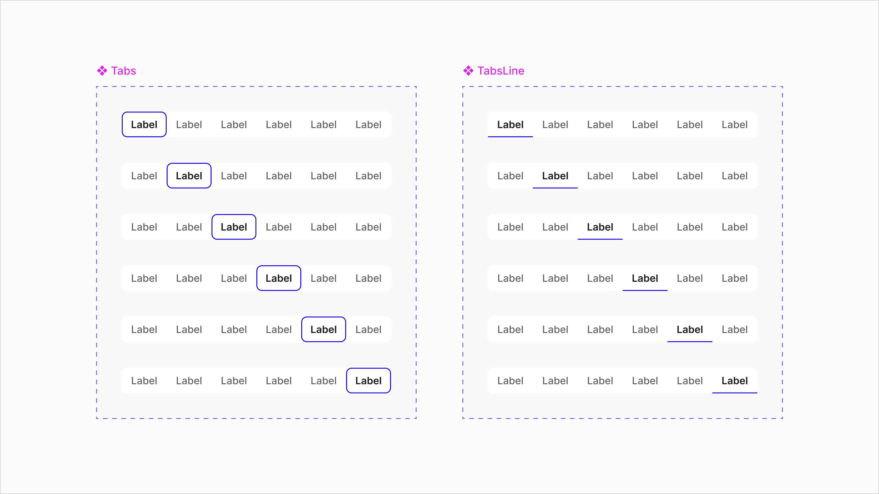
Figma Tabs Template
ui tabs
tabs component
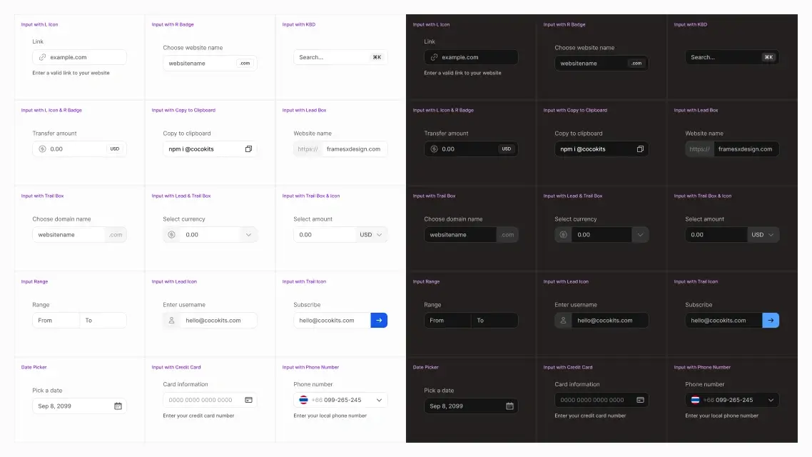
Figma Forms Examples
figma forms
input component
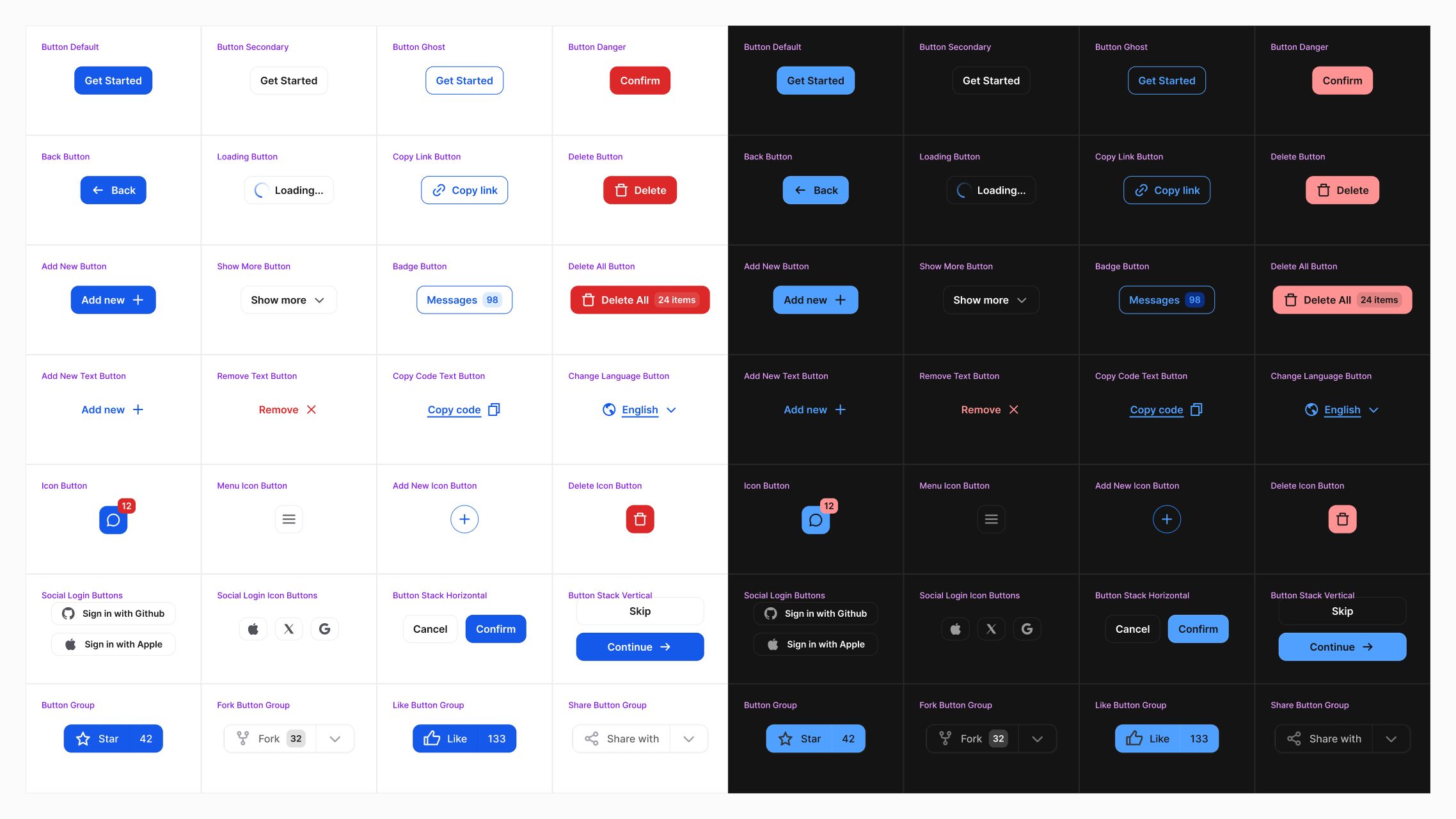
Figma Button Examples
figma buttons
button component
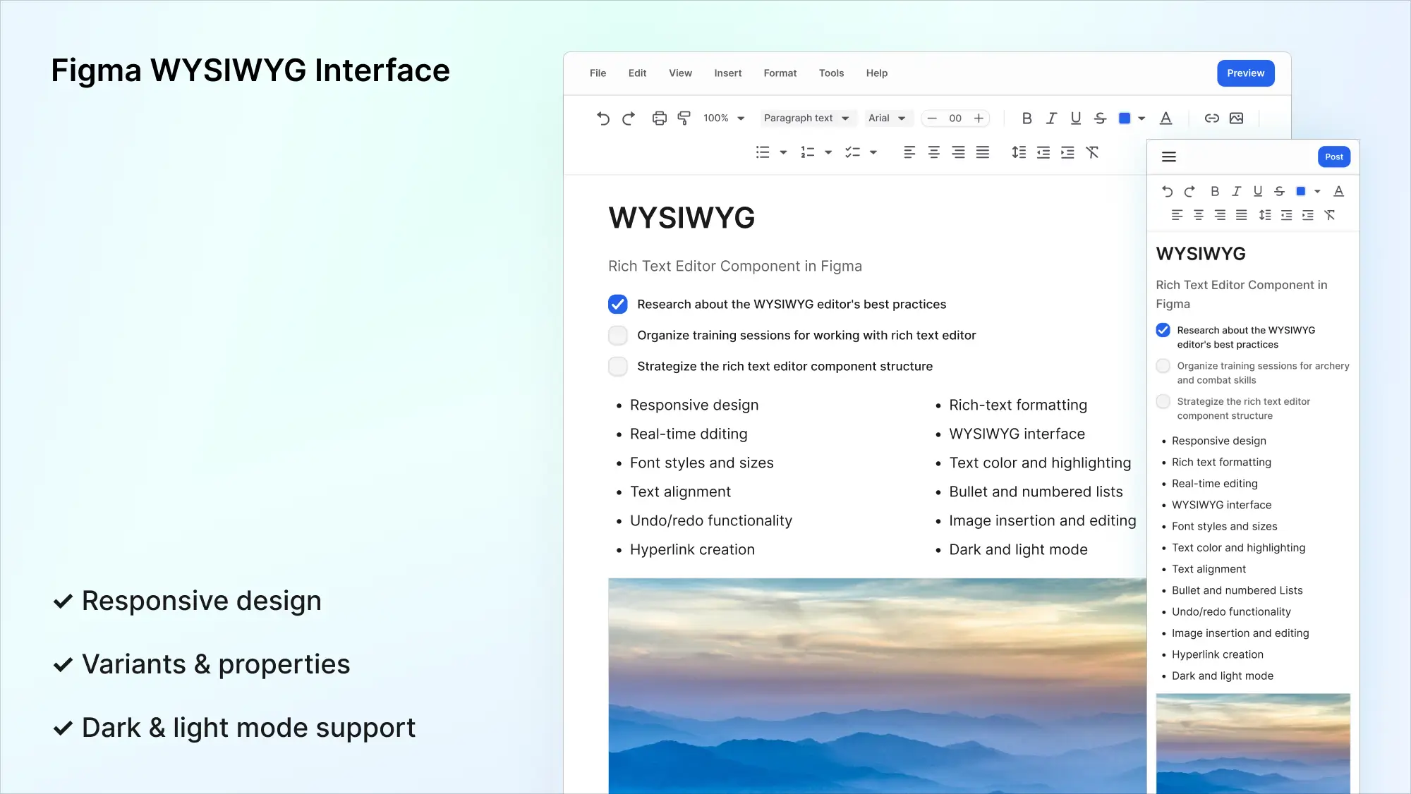
Figma WYSIWYG Interface
wysiwyg interface
text editor
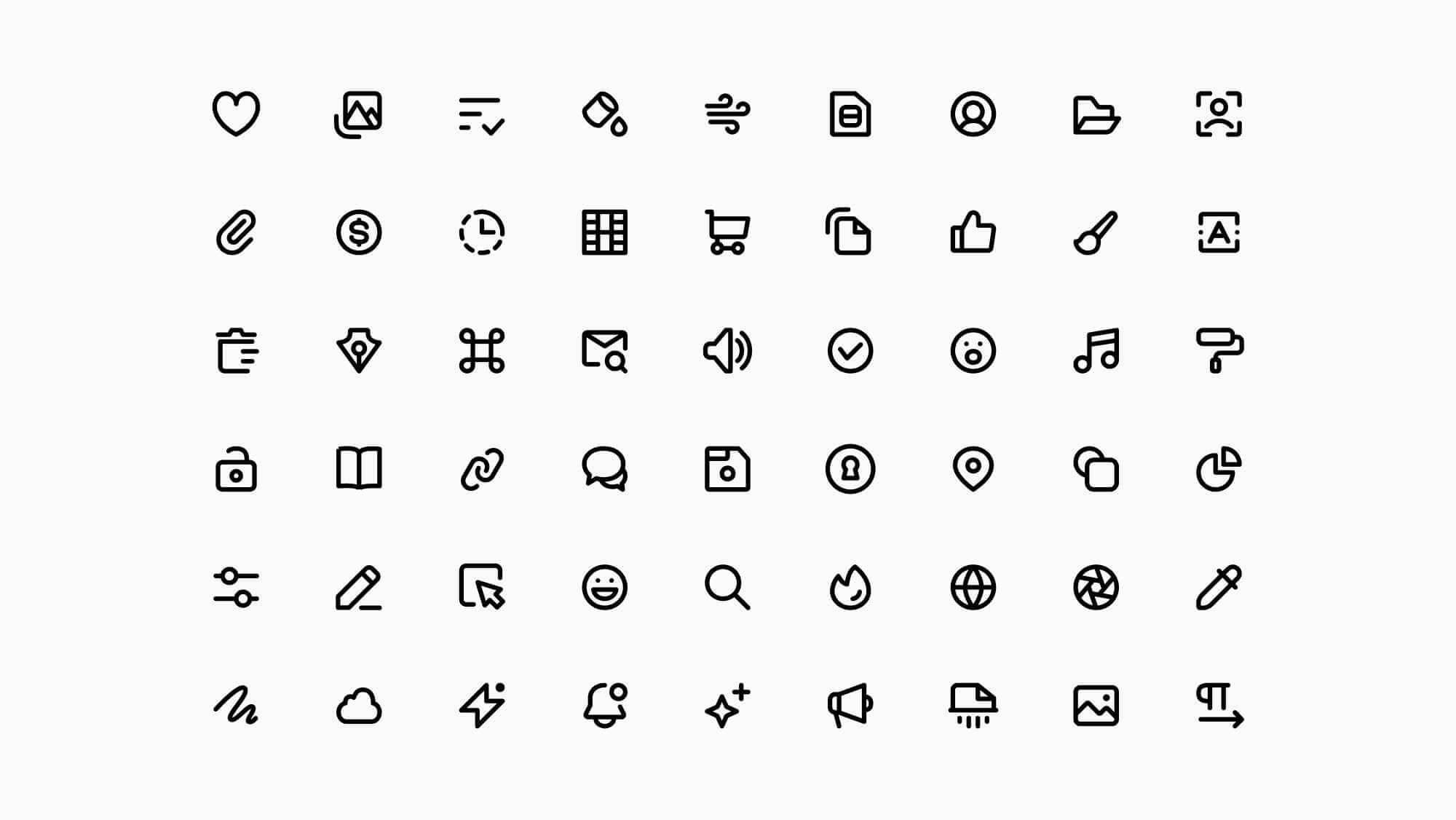
Super Basic Icons
ui icons
free icons
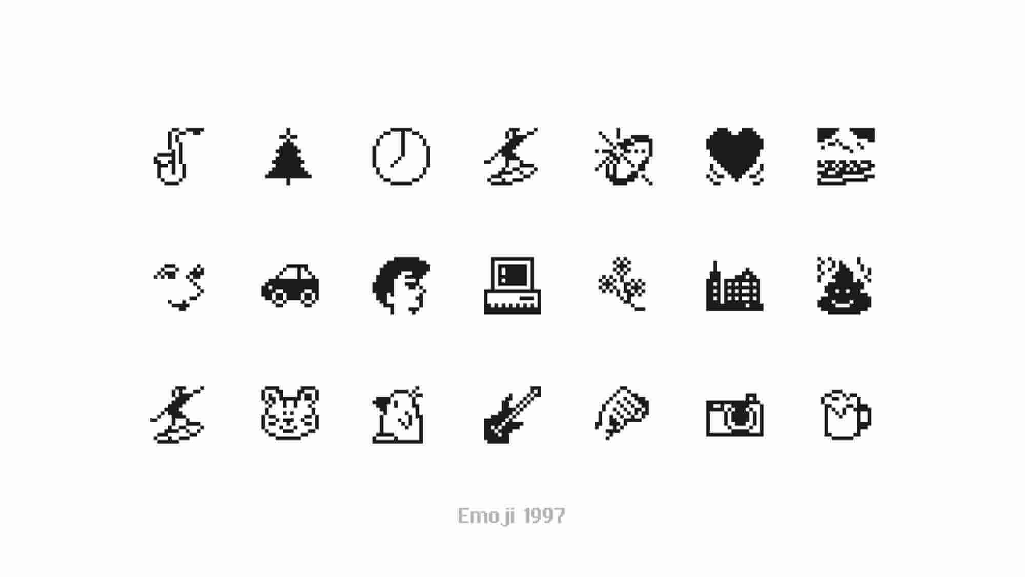
Emoji 1997 SVG Icons
emoji
free icons
Free icons to copy and paste


