Figma Radius
Figma Radius
Preview
Figma Radius
Figma Variables: Radius
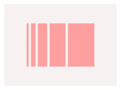
Radius styles the corner curvature of UI elements, from sharp (smaller radius) to rounded (larger radii). Radius can greatly influence an element's perceived visual center, softness, and brand aesthetics.
You can adjust default system radii and modes from the Local variables menu. To learn more on how to use Figma variables effectively, be sure to visit our Intro Guide to Figma Variables.
Radius styles are Figma number variables for corner curvature — a scale from sharp to fully rounded with modes — applied to every component so a brand can switch from square to pill-shaped UI by changing the mode.
Radius AI Prompt
Paste this into Claude, ChatGPT, or Figma Make:
Build a corner radius system in Figma using variables. Primitives: a radius scale of 0, 2, 4, 6, 8, 12, 16, 20, 24, 32 and 999 for full pills. Semantic tokens: radius-xs for chips and tags, radius-sm for inputs and small buttons, radius-md for buttons and cards, radius-lg for modals and panels, radius-xl for hero media, and radius-full for avatars and pills. Modes: Sharp mapping the semantic tokens to 0 to 4px, Default mapping them to 4 to 16px, and Rounded mapping them to 8 to 32px, so one mode switch restyles the whole interface. Bind the corner radius of a button, an input, a card, a modal, a chip and an avatar to the semantic tokens, then show the same component row three times, one per mode, to demonstrate the shift from square to pill. Add a note frame explaining when nested radii should subtract the padding so inner and outer corners stay concentric. Name tokens radius/role so they sort together in the variable picker.
Source
Type
Styles
Figma Radius
Radius
corner radius
figma border radius
radius styles
Styles
Premium Figma UI Kit & design resources
Explore high-quality Figma components, templates, and UI elements.