Figma Skeleton
Figma Skeleton
Preview
Figma Skeleton
Figma Skeleton Component
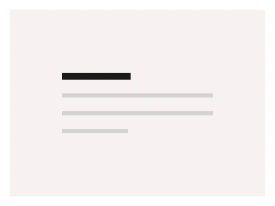
The Skeleton component displays a graphic placeholder of your content before it loads on the user’s side. Our Skeleton UI includes a gentle pulsing animation to indicate the loading state.
Skeleton Anatomy
| Set | Variants | Properties |
|---|---|---|
| Skeleton | 30 | Type Text 1, Text 2, Text 3, Card, UserSize Small, Medium, LargeDirection Left, Right |
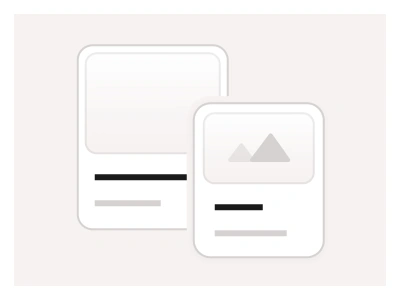
Skeleton is one set of thirty variants — Text 1, Text 2, Text 3, Card and User types in Small, Medium and Large sizes aligned Left or Right — built on a SkeletonBase with Start and End animation frames and Circle and Square shapes for a pulsing loading state.
Skeleton AI Prompt
Paste this into Claude, ChatGPT, or Figma Make:
Build a skeleton loading system in Figma as three sets. SkeletonBase: a rounded grey block with an Animate property of Start and End where the fill shifts between two greys, for a smart-animate pulse loop. SkeletonShape: Circle for avatars and Square for thumbnails and icons. Skeleton: thirty composed placeholders — Text 1, Text 2 and Text 3 as one, two or three text lines of decreasing width; Card as a thumbnail block over a title line and two body lines; User as a circle avatar beside a name line and a caption line — each in Small, Medium and Large sizes and aligned Left or Right. Build three examples from these: a product grid of six Card skeletons, a comment thread of User skeletons, and an article page with a hero block and Text 3 paragraphs. Wire a prototype that loops Start to End with a one-second smart-animate ease so every placeholder pulses together, and keep corner radii and greys on variables so skeletons match the loaded components in light and dark mode.
Figma Skeleton
Skeleton
skeleton ui figma
skeleton loading examples
skeleton component
Helper component
Premium Figma UI Kit & design resources
Explore high-quality Figma components, templates, and UI elements.