Figma Accordion
Figma Accordion
Preview
Figma Accordion
Figma Accordion
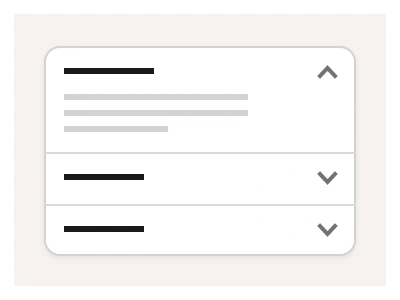
The Accordion is a lightweight UI component that expands and collapses content, commonly used for Figma FAQs, product features, and help sections.
Accordion Anatomy
| Set | Variants | Properties | Copy to Figma |
|---|---|---|---|
| Accordion | 16 | Type Default, SecondarySize Small, MediumState Collapsed, Collapsed Hover, Expanded, Expanded Hover | |
| AccordionGroup | 24 | Type Default, SecondarySize Small, DefaultItems x3, x4, x5, x6, x7, x8 |
Accordion can function as a standalone element or within a group to organize multiple entries. Ideal for answering user questions, revealing hidden content, and improving page structure.
Figma Accordion
Accordion
figma accordion component
figma accordion
accordion ui
Interactive component