Figma Dropdown List
Figma Dropdown List
Preview
Figma Dropdown List
Figma Dropdown Component
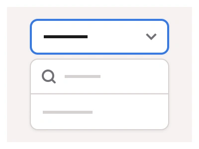
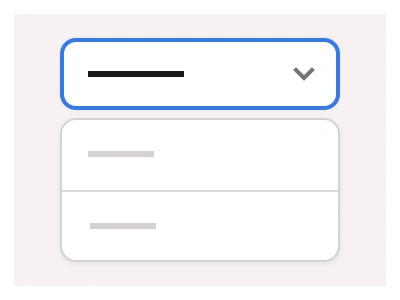
The Dropdown List component displays a pop-up with options for users to choose from. It includes interactive dropdown elements for hover, clicks, and active states.
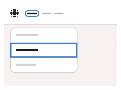
The dropdown is a versatile component that can be nested into other components, such as Date Pickers, ComboBox, and Time Pickers.
Dropdown UI Best Practices
Support up/down arrow keys for item selection and enter key for confirmation;
Implement type-to-search functionality for quicker option finding in long lists.
Dropdown List Anatomy
| Set | Variants | Properties | Copy to Figma |
|---|---|---|---|
| DropdownListSearch | 24 | Size XS, Small, Medium, LargeItems x2, x4, x6, x8, x10, x12 | |
| DropdownList | 24 | Size XS, Small, Medium, LargeItems x2, x4, x6, x8, x10, x12 |
Figma Dropdown List
Dropdown
dropdown figma
figma dropdown
dropdown example
Interactive component