Figma Command Panel
Figma Command Panel
Preview
Figma Command Panel
Figma Command Panel Component
The Command Panel component provides users with access to quick actions and frequently used commands in a separate floating UI that helps execute commands faster. With the command panel, users can access everything from one spot - files, actions, settings, and everything is searchable.
Command Panel UI Best Practices
Implement a keyboard shortcut (e.g., Cmd/Ctrl + K) for rapid activation;
Enable forgiving search to quickly find commands and content;
Display relevant suggestions based on current user input.
Command Panel Anatomy
| Set | Variants | Properties |
|---|---|---|
| CommandPanel | 3 | Size Small, Medium, Large |
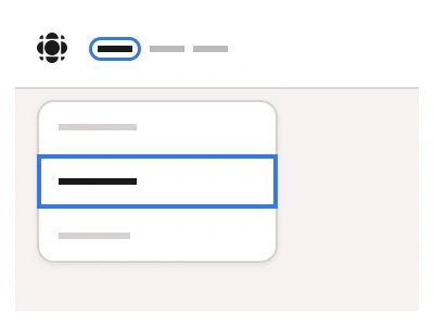
The file shows the panel in Small, Medium and Large sizes, light and dark mode, with CommandSearch in Active, Hover and Typing states and CommandItem in Default, Hover and Focused states.
Command panel vs search vs menu
Three components overlap here and the choice is about intent. Search finds content and returns results. A Menu lists a fixed set of actions under a trigger. The Command Panel does both from the keyboard: it opens on a shortcut, accepts free text, and ranks commands, files and settings in one list. Reach for it in tools where a power user issues dozens of actions a day, such as editors, dashboards and admin consoles. For a marketing site or a settings page with five options, a Menu is lighter.
The three sizes map to context rather than screen: Small at 444px fits inside a sidebar or a modal, Medium at 522px is the default for app shells, and Large at 600px suits full-screen editors where the panel also shows previews. CommandSearch and CommandItem are separate components, so the row height, icon slot and shortcut label change together across sizes. Group captions, the filter pills and the keyboard-shortcut labels are text properties, which keeps the panel editable without detaching, and the dark variant is bound to the same colour variables as the rest of the kit.
Command Panel AI Prompt
Paste this into Claude, ChatGPT, or Figma Make:
Build a Command Panel component in Figma in Small, Medium and Large sizes, 444, 522 and 600px wide. It is a floating white panel with a hairline border and a soft shadow. Top: a CommandSearch field, 44, 56 and 64px tall, with a search icon, a Type a command or search placeholder and a sparkle icon on the right; states Active, Hover and Typing. Under it a filter row of pill tabs All (selected, outlined in blue), Assets and Plugins. Then groups with a small grey caption such as Suggestions and Settings, separated by a hairline: each CommandItem row is 40, 48 or 58px tall with a leading icon, a label like Calendar, Mailbox, Galery, Interface, Code or Tasks, and an optional keyboard shortcut such as ⌘U on the right; states Default, Hover with a light grey fill, and Focused with a blue outline. Make a dark mode variant with a near-black panel.
Figma Command Panel
Command Panel
command panel example
command panel component
figma command panel
Interactive component
Premium Figma UI Kit & design resources
Explore high-quality Figma components, templates, and UI elements.