Figma AI Chat
Figma AI Chat
Preview
Figma AI Chat
AI Chat UI Design Template for Figma
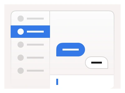
Most AI chatbot UI follows the same common pattern: past chats on the left, the conversation in the middle, a prompt box below. Frames X ships that screen built from kit components, so it restyles through the same variables as your product. Let’s call it the AI chat template.
You could use it when the product talks back: assistants, support copilots, in-app chatbots, LLM playgrounds. For people talking to people, with contacts, read receipts and media, start from the messaging template.
What’s inside the AI chat template
Breakpoints. Desktop, tablet and mobile, in light and dark mode.
Sidebar. Search (⌘K), Recent, Starred and View All tabs, ListItem rows with an unread dot or count badge, a TabsToggle footer with an Upgrade to Pro button.
Navbar. Model picker on the left, account avatar menu on the right.
Chat thread. A centred reading column. User prompt as a ChatBubble, assistant reply as text blocks split by divider rules.
Message composer. Multi-line Input with plus and attachment icons and a Focused state.
Mobile. Sidebar hidden behind the navbar, chat thread and message composer in the view.
How to design an AI chat UI in Figma
Define three sections. Use a horizontal auto layout with a fixed sidebar and a pane that fills the rest. In the pane, stack the navbar, the chat thread and the message composer, and pin the composer to the bottom so the thread scrolls under it.
Build the chats history from list items. Each row has a leading chat icon, a text layer truncated to one line and a trailing slot for the badge. Group the rows under Starred and Recent with tabs above them. The selected row gets the Filled variant.
Stack the chat thread from chat bubbles. Use the Sent variant, right-aligned, for the user and the Received variant with an avatar for the assistant. For long answers you could drop the bubble and place text blocks with divider rules. Headings and code read better on a plain surface than inside a rounded box.
Use Input component for message composer. Make it multi-line, with the plus button in the leading slot and the attachment icon in the trailing slot, as wide as the chat thread.
Add the navbar. Use a dropdown for the model picker and the avatar menu.
AI chat UI design best practices
Narrow chat thread. Keep the thread a narrow reading column with air on both sides. Full-width paragraphs are hard to read and harder to skim.
Two users chatting. Give each side its own shape. The user gets a filled, right-aligned bubble and the assistant gets plain full-width text with an avatar. Identical bubbles on both sides make the reader check alignment on every turn.
Chat history. The chat thread is a log you could scroll back through. Keep every answer easy to skim with headings, lists, code blocks and dividers, so a long conversation reads like a document.
Message composer stays in place. Pin it to the bottom and let it grow with the draft. Enter sends the message and Shift+Enter adds a new line. Keep the attach and voice actions as icons inside the field.
Search for chats history. Make the history searchable, let users star chats, badge unread replies and keep every prompt to one line.
Empty chat state must include prompt examples. A new chat with no messages is the first screen most users see. Add three or four prompt examples there instead of a blank canvas.
Quick chat actions. Copy, regenerate and thumbs up or down belong to the reply. Place them under it, on hover on desktop and always visible on mobile.
AI chat template prompt
Paste this into Claude, ChatGPT, or Figma Make:
Build an AI chat assistant screen in Figma for desktop, tablet and mobile. Desktop is 1440 by 1216px with two panes. Left sidebar, 304px: a logo and a Search (⌘K) field with a microphone icon, tabs Recent, Starred and View All with a 24 badge, a collapsible Starred group and a Recent group of chat rows; each row is 44 or 56px with a chat icon, a prompt truncated to one line and an optional blue unread dot or a grey count badge (2, 11); the open chat is filled brand blue with white text; the footer has an Upgrade to Pro button with a sparkle icon and a Beta pill with a new badge. Right pane: a 64px navbar with a model picker reading ChatGPT 9.0 and a chevron on the left and an avatar with a chevron on the right; a centred 798px thread with the user prompt as a right-aligned brand-blue bubble with white text, then the assistant answer with a small avatar, an intro line and five numbered sections separated by hairline dividers, each a bold heading and a bullet list; a 144px composer pinned to the bottom with a plus icon, the placeholder Reply to AI Chat..., an attachment icon on the right and a 2px brand-blue focus ring. On tablet keep both panes at 292 and 668px; on mobile show a 56px navbar, the thread and a 134px composer at 360px wide. Bind every colour, radius and type size to variables and build a dark mode with the same structure.
Figma AI chat FAQ
Is this a ChatGPT UI design?
Yes, in layout. The pattern is a history sidebar, a chat thread and a message composer, and the template follows it because users already know it. Nothing in it is copied from any product. It is built from Frames X components and bound to the kit variables, so one change restyles the whole screen.
Where to start chatbot UI design in Figma?
So start with the chat thread. Get one prompt and one answer reading well at the column width, then add the message composer, then the chats history. The sidebar is the easiest part and the one most people draw first. In my opinion that order is backwards. The thread is the product and the sidebar is a list.
What makes a good AI chatbot UI design?
A good chatbot UI does three things without the user noticing. They always know who said what, they can find a past chat in seconds, and the message composer never moves. The practices above cover each one. The rest is typography, and the kit text styles handle that.
Is there a desktop and a mobile chatbot UI design?
Yes, and a tablet one between them. Desktop keeps the sidebar and the chat thread side by side. Mobile hides the sidebar behind the navbar and keeps the thread and the message composer on screen. You could design the desktop version first and let the breakpoints follow, since every part is the same component at a narrower width.
Can it be a website chatbot UI design template?
Yes. On a website it is usually the same screen without the sidebar, a chat thread and a message composer inside a panel or a page. Drop the sidebar, keep the thread width, and the result matches the rest of your site through the same variables.
What is the AI chat template built from?
The AI chat template is mostly built from chat bubble and list-item components, with search, tabs, input and avatar around them. Take the chat component to add messages to a screen you already have, and the template when you need the assistant screen.
Can I take the AI chat to code?
Yes, through the code components. The template is a Figma file, and its parts exist in code as the Frames X React and Angular code components. Point your AI agent at those components and at the Figma file as the source of truth, and it builds the template in code for you.
Preview it in Figma above, or grab the whole kit ↓
Figma AI Chat
Figma AI Chat
figma ai chat
ai chat ui design
ai chat template
Figma dashboard
Premium Figma UI Kit & design resources
Explore high-quality Figma components, templates, and UI elements.