Figma Date Picker
Figma Date Picker
Preview
Figma Date Picker
Figma Date Picker Component
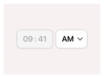
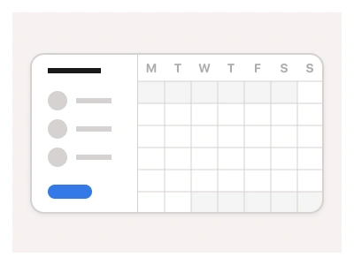
The Date Picker component enables users to enter, edit, and select dates using a text-based input with or without a Calendar or a Calendar sheet pop-up.
Date Input Anatomy
| Set | Variants | Properties |
|---|---|---|
| DatePickerRange | 24 | Type Default, SecondarySize Small, Medium, LargeState Default, Disabled, Hover, Focused |
| DatePicker | 24 | Type Default, SecondarySize Small, Medium, LargeState Default, Disabled, Hover, Focused |
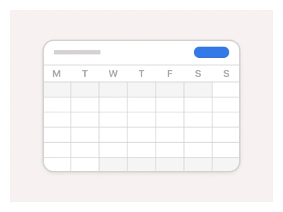
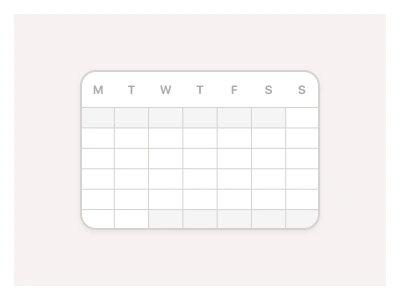
DatePicker and DatePickerRange each come in Default and Secondary types, Small, Medium and Large sizes, and Default, Disabled, Hover and Focused states — 48 variants — paired with a calendar sheet pop-up with previous and next month arrows and a Monday-first weekday header.
Date Input AI Prompt
Paste this into Claude, ChatGPT, or Figma Make:
Build a Figma date picker in two component sets. DatePicker: a rounded input field with placeholder text on the left and a calendar icon on the right, in Default and Secondary types, Small, Medium and Large sizes, and four states — Default, Hover, Focused with an accent border, and Disabled at reduced opacity. DatePickerRange: the same field holding a start and an end date. Below the field build the calendar sheet pop-up: a header row with a previous-month chevron on the left, the month and year centred in bold, and a next-month chevron on the right; a weekday row reading M T W T F S S; then a seven-column grid of day cells where the selected day gets a filled accent circle, days outside the current month are muted, and a selected range tints every cell between start and end. Make the day cell its own component with Default, Hover and Selected states so the sheet prototypes picking a date, and keep the grid and paddings on auto layout so all three sizes stay aligned.
Figma Date Picker
Date Picker
calendar picker
date input
date picker component
Interactive component
Premium Figma UI Kit & design resources
Explore high-quality Figma components, templates, and UI elements.