We're excited to announce the release of Frames X 2.9. This update marks a significant milestone in creating the most comprehensive UI kit for Figma. Today, we're proud to strengthen that position with our newest update!
In Frames X 2.9, we've focused on two key areas:
We've carefully redesigned our UI library core elements, addressing every bug and optimization opportunity to ensure a better design experience for every component in the kit—setting a new standard for a UI kit in Figma.
Second, we've reimagined Frames X Mono, introducing a new approach to styling our UI kit with semantic gradient variables. Opening up new possibilities for creating unique, stylish, and scalable interfaces in Figma.
Let's explore what's new in version 2.9!
Meet the New Frames X Mono UI Kit
We've reimagined the Frame X Mono UI kit.
While flat design is still the king, many brands need more visual complexity for their GUI. That's why we've reinvented our styling and variables system to support more complex brandings that rely on gradients instead of flat colors.

The new Mono UI kit introduces semantic gradients in Figma. This update will allow you to use gradient variables as the primary tool for handling your UI styles in Figma.
Each of the new gradients is crafted from the Frames X Color Variables, delivering both flexibility and semantic precision. The result? A powerful design system that maintains brand consistency while pushing the boundaries of what's possible in Figma.
This update isn’t just about adding gradients to the UI—it’s about rethinking how Frames X approaches complex styling. By integrating color variables into our UI library, we’ve created a system that’s both visually unique and robust.
To introduce gradients to your workflow and better explain all variable connections, we've created a detailed style guide to help you customize the Frames X Mono UI kit effectively.

→ Preview Frames X Mono UI Kit
New Button Group Components
We've expanded Button groups with primary and secondary styles. Primary buttons showcase your brand color, while secondary button groups can offer subtle alternatives that pair perfectly with inputs, backgrounds, and other UI elements.
You can use button groups to provide users with more connected actions, connected actions like filters, sorting, and navigation, all while offering primary and secondary color options.

→ Preview Button Group Component
Improved Floating UI Elements and Components
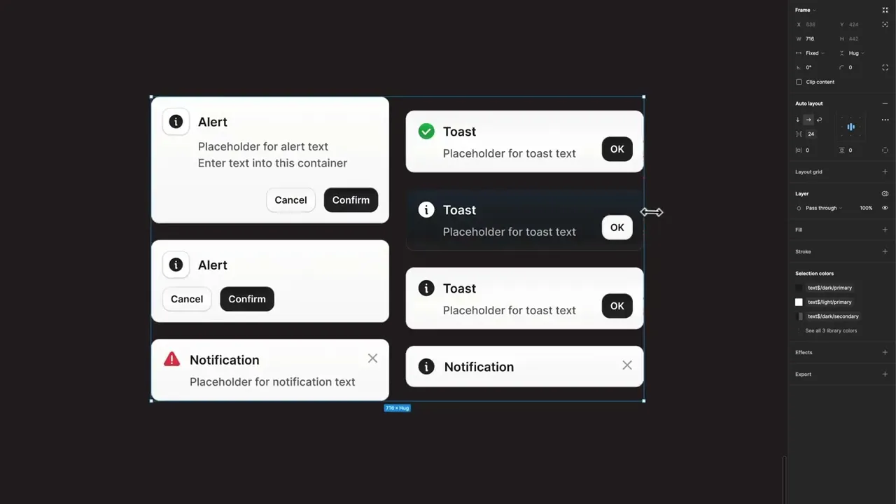
We have redesigned Toasts, Notifications, and Alerts to better differentiate each component in FramesX's interface hierarchy. All floating elements now have synchronized states and provide additional size variants to better suit various UI scenarios.
Additionally, we have improved the responsiveness of all floating components by leveling up the Auto layout and adding extra breakpoints.
Unified Form Properties and Form Elements
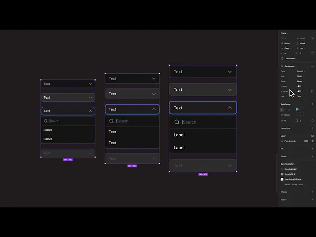
The Select, ComboBox, Date Picker, Search, Time Picker, and Input components now have consistent styling across the Frames X UI kits, including both the Mono and Root UI kits. This sync ensures that all Forms and Input elements are bound by the same rules.
This level of consistency is unmatched by any other UI kit and is particularly beneficial for larger enterprise teams where 100% consistency is important for application performance. This update makes it easier to manage larger design systems across different projects and Figma files.
Calendar Sheet Components
We’ve added a new Calendar Sheet component for picking dates without a visible input field or a form. This calendar features easy-to-scroll lists for selecting the day, month, and year, making date selection more precise.
While the calendar sheet functions effectively on its own, it can also serve as a foundational element for creating more complex features, such as Date Pickers and Calendar components.

→ Preview Calendar Sheet Component
Search Components
We've added a dedicated Search component to our UI Kit, making it easier to build search functionality in your interfaces. While you could previously modify the standard Inputs to act as search fields, we felt that the search deserved its own page.
The Search component comes in two styles and three variant sizes, matching our regular inputs in design flexibility. We've also added a Search Button Component to provide extra options when creating complex search components and layouts.

AI Chat and AI Landing Templates
We've added two new responsive templates focused on AI chatbot design. Each template includes dark and light modes, responsive layouts, and specialized elements designed specifically for AI chat interactions.

→ Preview AI Chat Template | Preview AI Landing Template
Bug Fixes and UI Kit Performance Improvements
During our thorough update, we squashed every reported bug and discovered a few more along the way. We've optimized all component properties, ensuring consistent naming across all elements in Figma, and did a bunch of procedures for refining our UI kit.
The most important update is our unified property names and text labels across all Figma components, creating a single standard. We're starting the year by bringing you more optimized UI components in Figma.
Frames X UI Kit 3.0 and Beyond Figma

As our beloved Figma X UI kit reached 130 pages of high-quality design content, it made us think. What could be the next big thing for Frames X?
While it saddens us to see Figma's development pace slow down, we've decided not to pace down and instead expand our UI kits beyond Figma. So, Frames X is growing in two new exciting directions.
1) First, we're diving deeper into Code Components. After successfully launching our UI components for Angular, we're now developing React components in partnership with CoCoKits. In the next release, you can expect more ready-to-use components tailored to your favorite frameworks.
2) Second, we're bringing Frames X UI Kit to Framer. We believe Framer is shaping the future of web design right now, developing advanced features at an impressive pace and making things that were never possible before. So, in 2025, we're committed to bringing your favorite UI kit to this rapidly rising platform.
While we’re making the switch, our connection to Figma remains strong. We’ll continue to enhance the Frames X experience in Figma as new features roll out, but without adding new components or templates to the main kit.
Thanks for reading and for staying with us. We wish you a successful and joyful new year!


