Figma Scroll Bar
Figma Scroll Bar
Preview
Figma Scroll Bar
Figma Scroll Bar Component
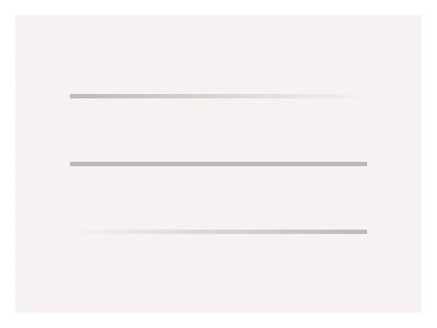
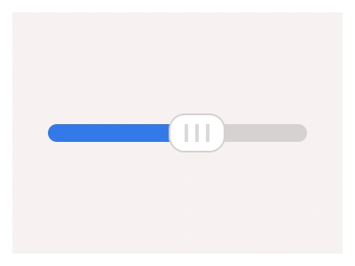
Figma prototypes scroll on their own, but a static mockup shows nothing past the frame edge. The scroll bar makes the cut-off visible: a track with a thumb that tells the user, and your team, that content continues. Frames X ships one ScrollBar set with six variants: Vertical and Horizontal, each with a 75%, 50% or 25% thumb.
Pick the thumb size by how much content is out of view: 75% for a list that barely scrolls, 25% for a long page. A thumb that never changes size reads as decoration.
What is in the scroll bar set
Direction. The Vertical variant pins to the right edge of a frame, the Horizontal one to the bottom. Same track and thumb, turned structure.
Size. 75%, 50% and 25% thumbs stand for how much of the content fits in the view, so a spec shows the honest scroll length.
Styling. Track and thumb colors come from the kit neutral variables, so the bar follows your theme in one change.
How to make a scroll bar in Figma
Draw the track. A thin rectangle pinned to the frame edge, full height, with a corner radius that matches your surfaces.
Add the thumb. A shorter rounded rectangle on top of the track. Wrap both in an auto layout frame, set the track to fill and the thumb to a fixed length.
Turn the pair into a component set with a Direction property for Vertical and Horizontal, and a Size property for the three thumb lengths.
Pin it with constraints: right edge plus stretch for a vertical bar, bottom edge plus stretch for a horizontal one, so it stays in place at any frame size.
For working scroll in a prototype, set the content frame overflow to Vertical scrolling. Figma then shows its own overlay while dragging. The component keeps scroll visible in the static design.
Scroll bar UI best practices
Show the bar where scrolling is the feature: tables, file lists and chat threads. Skip it on marketing pages, where scrolling is a given.
Keep the thumb proportional. Its length is the only cue for how much content is left, which is why the set carries three sizes.
Overlay beats classic in tight layouts. Draw the bar on top of the content edge, the macOS way, instead of giving it a column of its own.
Keep contrast low but visible. A thumb that competes with content pulls the eye on every screen.
Keep horizontal bars for wide data, like tables and boards. If body text scrolls sideways, fix the width instead.
Scroll Bar Anatomy
| Set | Variants | Properties | Copy to Figma |
|---|---|---|---|
| ScrollBar | 6 | Direction Vertical, HorizontalSize 75%, 50%, 25% |
The file carries one ScrollBar set with six variants: Vertical and Horizontal, each with a 75%, 50% and 25% thumb, styled through the kit neutral variables.
Scroll bar AI prompt
Paste this into Claude, ChatGPT, or Figma Make:
Build a ScrollBar component set in Figma. Track: a thin full-length rounded rectangle pinned to the frame edge, light grey. Thumb: a shorter rounded rectangle on the track, darker grey, same corner radius. Make two directions, Vertical pinned right and Horizontal pinned bottom, and three thumb sizes covering 75%, 50% and 25% of the track. Wrap each pair in auto layout, set the track to fill and the thumb fixed, add Direction and Size variant properties, and bind both colors to neutral variables so the bar follows the theme.
Figma scroll bar FAQ
Does Figma show a scroll bar in prototypes?
Yes, while scrolling. Set the frame overflow to Vertical or Horizontal scrolling and the preview draws a temporary overlay bar that disappears at rest. Mockups, specs and screenshots need the component to show that content continues.
How do I make a custom scrollbar in Figma?
Build the track and the thumb as two rounded rectangles, wrap them in auto layout and pin the pair to the frame edge with constraints. The steps above walk through it. You could also paste the ready set with the Copy component button and restyle it through variables.
What do the 75%, 50% and 25% sizes mean?
The share of content that fits in the view. A 25% thumb says three quarters of the page is off screen, and a 75% thumb says the list barely scrolls.
What is the difference between a scroll bar and a scroll area?
The scroll area is the container that clips and moves content. The scroll bar is the control that shows the position inside it. In Figma, a frame with overflow scrolling is the scroll area. The component adds the visible bar.
Which components pair with the scroll bar?
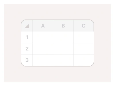
Table, Dropdown List, File Manager and Chat all clip long content, so the bar drops into any of them with the same variables.
Figma Scroll Bar
Scroll Bar
scroll bar example
scroll bar component
figma scroll bar
Interactive component
Premium Figma UI Kit & design resources
Explore high-quality Figma components, templates, and UI elements.