Figma Drawer
Figma Drawer
Preview
Figma Drawer
Figma Drawer Component
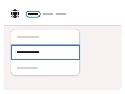
The Drawer component includes side and bottom panels that slide into the user's view, offering quick access to navigation commands and system options. Use drawers instead of Side Menus when you need to add UI elements, actions, or content without changing the interface layout.
The Drawer can be attached to any edge of the screen with pre-designed variants offering flexibility in organizing your project's UI.
Drawer Anatomy
| Set | Variants | Properties |
|---|---|---|
| DrawerSide | 24 | Type Left, RightSize Medium, SmallItems x13, x12, x10, x8, x6, x4 |
| Drawer | 16 | Type Top, BottomSize Small, MediumItems x10, x8, x6, x4 |
The drawer family is three sets — DrawerSide sliding from the Left or Right with 4 to 13 items, Drawer from the Top or Bottom with 4 to 10 items, both in Small and Medium — built from a DrawerItem row at 36 or 44px with Default, Hover and Active states and 8, 16 or 32px padding.
Drawer AI Prompt
Paste this into Claude, ChatGPT, or Figma Make:
Build a drawer component in Figma as three sets. DrawerItem: a navigation row with an icon, a label and an optional trailing badge or chevron, in Small 36 and Medium 44px heights, with Default, Hover and Active states — Active carries an accent tint and a bolder label — and a Padding property of 8, 16 or 32px for nesting depth. DrawerSide: a full-height panel sliding from the Left or Right with a header holding a logo or title and a close icon, a scrolling list of 4 to 13 DrawerItem instances, and a footer with a user row, in Small and Medium widths. Drawer: a panel sliding from the Top or Bottom with a drag handle, a title and 4 to 10 items, in Small and Medium heights. Place a dimmed overlay behind each panel as a separate layer so it can be toggled. Wire a prototype where a burger icon opens DrawerSide with a slide-in transition and the overlay click or close icon dismisses it.
Figma Drawer
Drawer
drawer example
drawer component
figma drawer
Interactive component
Premium Figma UI Kit & design resources
Explore high-quality Figma components, templates, and UI elements.