Figma Counter
Figma Counter
Preview
Figma Counter
Figma Counter Component
Carts, seat pickers and settings all need a number the user can nudge. The counter is that control: a value with a minus and a plus around it. Frames X ships one Counter set with 16 variants: Default and Secondary types, four sizes from Small to XL, and a Segmented option that splits the buttons from the value.
Pick the size by where the control sits: Small for table rows and dense lists, XL for a product page where quantity is the main action.
What is in the counter set
Type. Default and Secondary, so the control can match a primary form or a quieter row without a restyle.
Size. Small, Medium, Large and XL at 24, 28, 40 and 44px heights, one list from table rows to product pages.
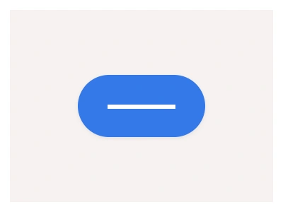
Segmented. True splits minus, value and plus into their own boxes. False keeps the three parts in one pill.
How to make a counter in Figma
Start with the value. A text layer in a fixed-width frame, centered, so two digits do not shift the buttons.
Add the buttons. Minus on the left, plus on the right, each a small component of its own so hover styling stays in one place.
Wrap all three in auto layout. Zero gap gives the one-pill look, and a gap with borders on each part gives the segmented look.
Turn the group into a component set with Type, Size and Segmented properties.
Wire the prototype so plus and minus swap between value variants. Two or three values are enough to sell the interaction.
Counter UI best practices
Use a counter when the range is small. Quantity, guests and rooms move by one or two presses, and a wide range belongs to the slider or a plain input.
Keep typing available for big jumps. Pair the control with a text input when users go from 1 to 50 in one move.
Size the buttons for the surface. Small fits desktop tables, and Large or XL gives comfortable touch targets on product pages.
Hold the width steady. A value that resizes the control makes the buttons crawl under the pointer.
Show the limits in the control. When stock caps at nine, stopping the counter there is clearer than an error after the press.
Counter Anatomy
| Set | Variants | Properties | Copy to Figma |
|---|---|---|---|
| Counter | 16 | Type Default, SecondarySize Small, Medium, Large, XLSegmented False, True |
The file carries one Counter set with 16 variants: Default and Secondary types, Small, Medium, Large and XL sizes at 24, 28, 40 and 44px, each in a one-pill and a Segmented layout.
Counter AI prompt
Paste this into Claude, ChatGPT, or Figma Make:
Build a Counter component set in Figma. Structure: a minus button, a centered value and a plus button in one auto layout row. Sizes: Small 24, Medium 28, Large 40, XL 44px tall. Types: Default and a quieter Secondary. Segmented: True separates the three parts into their own boxes, False keeps one pill. Keep the value frame a fixed width so digits do not shift the buttons, add Type, Size and Segmented variant properties, and bind fills and borders to neutral variables so the control follows the theme.
Figma counter FAQ
What is a counter component?
A number with a minus and a plus around it, for values users change in small moves: quantity in a cart, guests in a booking, rooms in a filter. The set ships Default and Secondary types in four sizes, with a segmented layout option.
What is the difference between a counter and a stepper?
The counter changes a value. The stepper shows progress through named steps in a flow, like a checkout. Search mixes the two names, so check which control the design actually needs.
How do I make the counter stop at a limit?
In a prototype, give the limit its own variant with the minus or plus in a muted look and no interaction on it. Two or three value variants are enough to sell the behavior.
Can users type a value instead of pressing the buttons?
Not in the counter itself. Pair it with a text input where typing is faster, like a quantity field that jumps from 1 to 50.
Figma Counter
Counter
counter example
counter component
figma counter
Interactive component
Premium Figma UI Kit & design resources
Explore high-quality Figma components, templates, and UI elements.