Figma Pricing
Figma Pricing
Preview
Figma Pricing
Figma Pricing Component
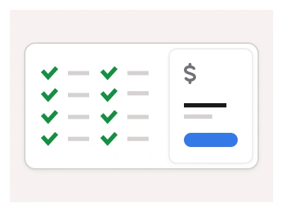
The Pricing component displays available pricing plans for your products and services. Pricing cards consist of a price tag, a features list, and a primary CTA button.
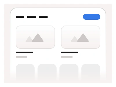
You can customize the content of the pricing card by updating the nested variants (base elements) and component properties. By stacking pricing cards together, you can create comprehensive and responsive Pricing page layouts.
Pricing Cards UI Best Practices
Use variants to draw attention to the recommended plan. Ensure the recommended option stands out but doesn’t overshadow the other options;
Avoid too many options, as it can lead to decision paralysis. Offer 3-4 pricing tiers to cater to different user segments;
If possible, include a free trial or demo to reduce the bounce rate and build a list of future customers.
The pricing card is a nested component — plan name, price tag with period, a features list and a primary call-to-action — with variants that highlight the recommended plan and stack into responsive pricing tables.
Pricing AI Prompt
Paste this into Claude, ChatGPT, or Figma Make:
Build a pricing card component in Figma. Card: a rounded surface with a plan name, an optional Most popular badge, a large price with a per-month suffix, a one-line description, a primary call-to-action button, a divider and a features list of five rows each with a tick icon and text, plus a muted footnote. Type property: Default with a white surface, Highlighted with an accent border and tinted header for the recommended plan, and Inverted on a dark surface. Size: Small, Medium and Large widths. Booleans for the badge, the footnote, a strike-through old price and a per-seat line. Add a billing toggle component — Monthly and Yearly with a Save 20% chip — and compose a three-card pricing table with the middle card Highlighted, a four-card version, and a mobile version stacking the cards with the highlighted one first. Keep the feature row and button as nested instances so editing a plan's features never breaks alignment, and bind colours to variables for light and dark mode.
Figma Pricing
Pricing
pricing card example
pricing component
figma pricing
Interactive component
Premium Figma UI Kit & design resources
Explore high-quality Figma components, templates, and UI elements.