Figma Menubar
Figma Menubar
Preview
Figma Menubar
Figma Menubar
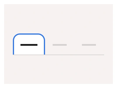
The Menu Bar component is a top-placed bar that provides quick access to a consistent set of system commands or navigation options.
You can use the Menu Bar instead of Menu Navigation or Navbar components when you need a simple top-level navigation without extra nested elements.
Menubar Anatomy
| Set | Variants | Properties |
|---|---|---|
| Menubar | 21 | Size Large, Medium, SmallItems x2, x3, x4, x5, x6, x7, x8 |
Menubar is one set of 21 variants — two to eight items at Large 48, Medium 44 and Small 36px — built from a MenuItem with Inactive, Hover, Selected and Focused states, for simple top-level navigation without nested panels.
Menubar vs navigation menu vs navigation bar
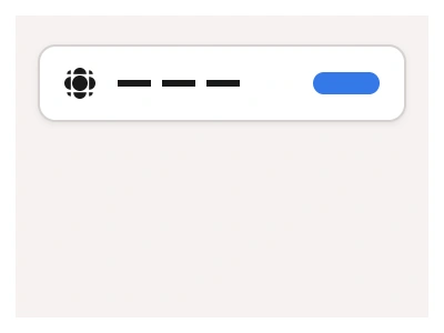
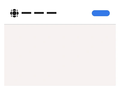
The kit has three top-of-page navigation components and the difference is depth. The Menubar is a flat row of text links, two to eight items, with no panels or submenus; it belongs on documentation sites, settings pages and app tabs where every destination fits in one word. The Navigation Menu adds hover and click panels with grouped links, descriptions and icons, which is what a marketing site with products, solutions and resources needs. The Navigation Bar is the full header: logo, a Menubar or Navigation Menu in the middle, and actions such as search, a theme toggle and sign-in buttons on the right.
Because Menubar is built from a single MenuItem component, the 21 variants differ only in item count and size; height is 36, 44 or 48px and the accent underline on the selected item is the same token across all of them. A Boolean property adds a trailing divider and another exposes a right-aligned slot for a button or avatar. Swapping the Menubar for a Navigation Menu inside a Navigation Bar is a component swap, so the layout survives the upgrade when a site outgrows flat navigation.
Menubar AI Prompt
Paste this into Claude, ChatGPT, or Figma Make:
Build a menubar component in Figma as two sets. MenuItem: a text link with optional leading icon in Small 36, Medium 44 and Large 48px heights, with four states — Inactive in secondary text, Hover with a light fill, Selected with an accent underline or bolder label, and Focused with a visible focus ring. Menubar: a horizontal auto-layout row of two to eight MenuItem instances with equal gaps, in the same three sizes, with a Boolean for a trailing divider and a Boolean for a right-aligned slot holding a button or avatar. Add a compact variant where labels shrink to icons with tooltips. Wire Inactive to Hover and Hover to Selected as an interactive component so a prototype demonstrates switching tabs, and keep the items as instances so renaming or reordering never breaks spacing. Show examples: an app top bar with File, Edit, View and Help; a settings page with Profile, Security and Billing; and a dashboard header with Overview, Reports and Team beside a user avatar.
Figma Menubar
Menubar
menu navigation
menu bar
menubar component
Interactive component
Premium Figma UI Kit & design resources
Explore high-quality Figma components, templates, and UI elements.