Figma Input
Figma Input
Preview
Figma Input
Figma Input Component
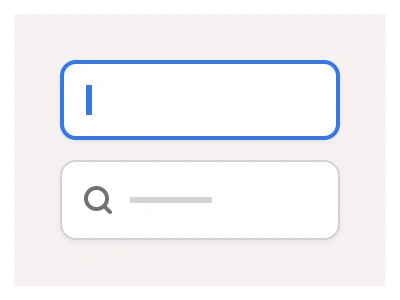
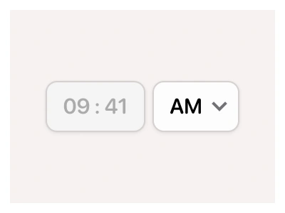
The Input or text field component allows users to enter and validate text data.
Text Input Anatomy
| Set | Variants | Properties | Copy to Figma |
|---|---|---|---|
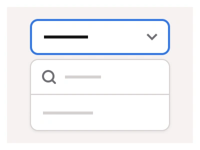
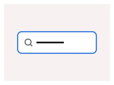
| Input | 54 | Type Default, Secondary, Combo BoxSize Small, Medium, LargeState Default, Disabled, Hover, Focused, Warning, Typing | |
| InputMaterial | 36 | Type Fill, OutlineSize Small, Medium, LargeState Default, Disabled, Hover, Focused, Warning, Typing | |
| InputTextArea | 18 | Size Small, Medium, LargeState Default, Disabled, Hover, Focused, Warning, Typing | |
| InputSideLabel | 18 | Size Small, Medium, LargeState Default, Disabled, Hover, Focused, Warning, Typing |
The Input field component allows users to enter and validate text data. You can use inputs to create forms, search boxes, filters, dropdown lists, and text areas. Combine inputs with other Forms elements such as Toggles, Checkboxes, and Radios to create multi-step UI flows.
Figma Input
Input
text field example
input component
figma input
Interactive component