Figma Heatmap Chart
Figma Heatmap Chart
Preview
Figma Heatmap Chart
Figma Heatmap Charts
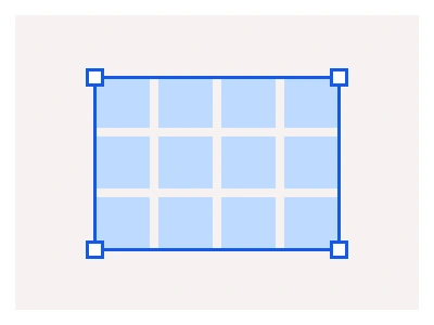
Heatmap charts display data using color intensity on a two-dimensional grid. They visualize patterns, trends, and correlations within data. More saturated colors usually represent higher volumes of values compared to less saturated colors.
Tip: Use colors that represent the logic behind them. For example, if your heatmap shows the number of apples versus the number of vegetables, you can use red vs. green color to enhance the understanding of your data.
Figma Heatmap Chart
Heatmap Chart
heatmap charts
heatmap graphs
heatmap chart component
Interactive component