Figma Sizing & Spacing
Figma Sizing & Spacing
Preview
Figma Sizing & Spacing
Figma Variables: Size & Spacing
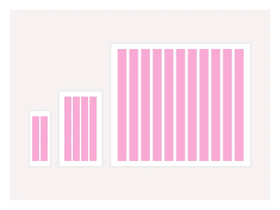
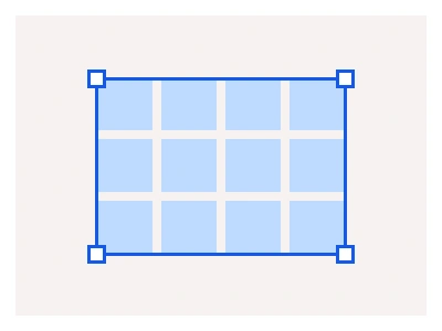
Frames X features a universal Sizing and Spacing system that enhances your design with consistency. It uses spacing tokens (or Spacing Figma Variables) to control the distances between design elements in your interface.
The system improves upon the traditional 8px base unit approach by using a 1px base unit (spacing-1) within a 0-384px scale. This method allows for direct multiplication of the base token to generate the full range of space values, eliminating the need for any calculations.
Sizing & Spacing Variables Features
Support for multiple spacing modes: Compact and Spacious.
Tokens/Variables: spacing-1 to spacing-48.
Scale range: 0px to 384px.
Base unit: 1px.
Unlike most frameworks, Frames X UI Kit offers multiple sizing modes (Compact and Spacious). These modes allow your interface to expand and shrink depending on the level of accessibility you want to achieve.
The Frames X sizing system is a set of spacing variables on a 1px base unit across a 0 to 384px scale, with Compact and Spacious modes that shrink or expand every gap and control height in one switch.
Size and Spacing AI Prompt
Paste this into Claude, ChatGPT, or Figma Make:
Build a sizing and spacing variable system in Figma. Primitives: a spacing collection named by multiples of a 1px base — spacing-0, 1, 2, 4, 6, 8, 12, 16, 20, 24, 32, 40, 48, 64, 80, 96, 128, 192, 256 and 384 — so any value is a direct multiple without calculation. Semantic tokens: gap-xs to gap-xl for auto-layout gaps, padding-sm to padding-xl for containers, inset for inputs and buttons, and control heights control-sm, control-md and control-lg. Modes: Compact mapping control heights to 32, 40 and 48px with tighter gaps, and Spacious mapping them to 40, 48 and 56px with wider gaps for accessibility. Bind the padding, gaps and heights of a button, input, card and list row to the semantic tokens, then show a settings form twice, once per mode, to prove the interface expands and contracts from one switch. Add a usage note: never mix the two modes within one screen. Name tokens space/role so they group in the variable picker.
Note: use sizing variables to enhance readability and avoid mixing Compact and Spacious modes within the same interface. To learn more about how to use Figma variables effectively, be sure to visit our Intro to Figma Variables Guide.
Source
Type
Styles
Figma Sizing & Spacing
Size & Spacing
size variables
figma spacing
size and spacing styles
Styles
Premium Figma UI Kit & design resources
Explore high-quality Figma components, templates, and UI elements.