Figma Modal
Figma Modal
Preview
Figma Modal
Figma Modal Component
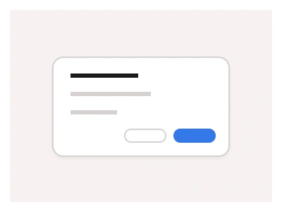
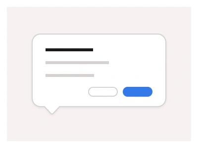
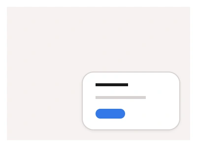
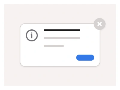
The modal component is a floating window that overlays the current screen, focusing user attention on specific content or actions related to their current task.
The content behind the modal dialog is inactive, meaning that users cannot interact with it while the dialog is persistent.
Modal UI Best Practices
Use modals sparingly for important information to avoid disrupting user work;
Always keep modals' content condensed and relevant to the user's current actions;
Provide a clear exit option and support keyboard navigation for every modal.
Modals Anatomy
| Set | Variants | Properties | Copy to Figma |
|---|---|---|---|
| ModalConfirm | 3 | Size Mobile, Tablet, Desktop | |
| ModalLogin | 3 | Size Mobile, Tablet, Desktop | |
| ModalDiscard | 3 | Size Mobile, Tablet, Desktop | |
| ModalRegister | 3 | Size Mobile, Tablet, Desktop | |
| ModalDelete | 3 | Size Mobile, Tablet, Desktop | |
| ModalShare | 3 | Size Mobile, Tablet, Desktop | |
| ModalSearch | 3 | Size Mobile, Tablet, Desktop | |
| ModalCreate | 3 | Size Mobile, Tablet, Desktop | |
| ModalOnboarding | 3 | Size Mobile, Tablet, Desktop | |
| ModalAdd | 3 | Size Mobile, Tablet, Desktop | |
| ModalUpload | 3 | Size Mobile, Tablet, Desktop | |
| ModalFeedback | 3 | Size Mobile, Tablet, Desktop | |
| ModalPayment | 3 | Size Mobile, Tablet, Desktop |
Figma Modal
Modal
figma modal
figma modal popup
figma modal template
Interactive component