Hey there! We're excited to share the release of Frames X 2.8!
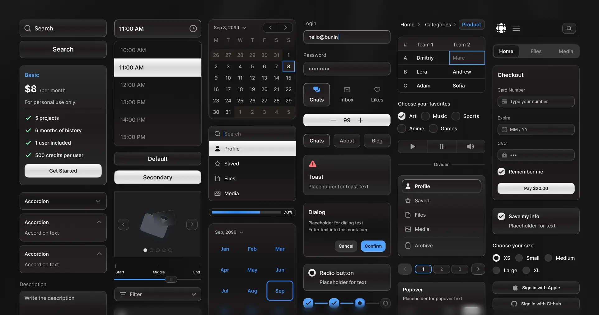
Yes, you read that correctly—we've made a major update! Frames X now includes its own open-source code components and design tokens! We're bringing your favorite UI kit directly into your codebase because we believe great design should be available everywhere.
As the next big step for Frames X UI Kit, we're joining an open-source technology to bring our components and designs to React, Angular, Vue, and other popular development frameworks. We're excited to share this milestone release with you.
And we're not forgetting our roots! Frames X remains and will remain your go-to Figma UI tool—still the largest and most practical UI kit in the world, but now even more powerful!
So, let's explore what's new in version 2.8!
UI Components for Angular
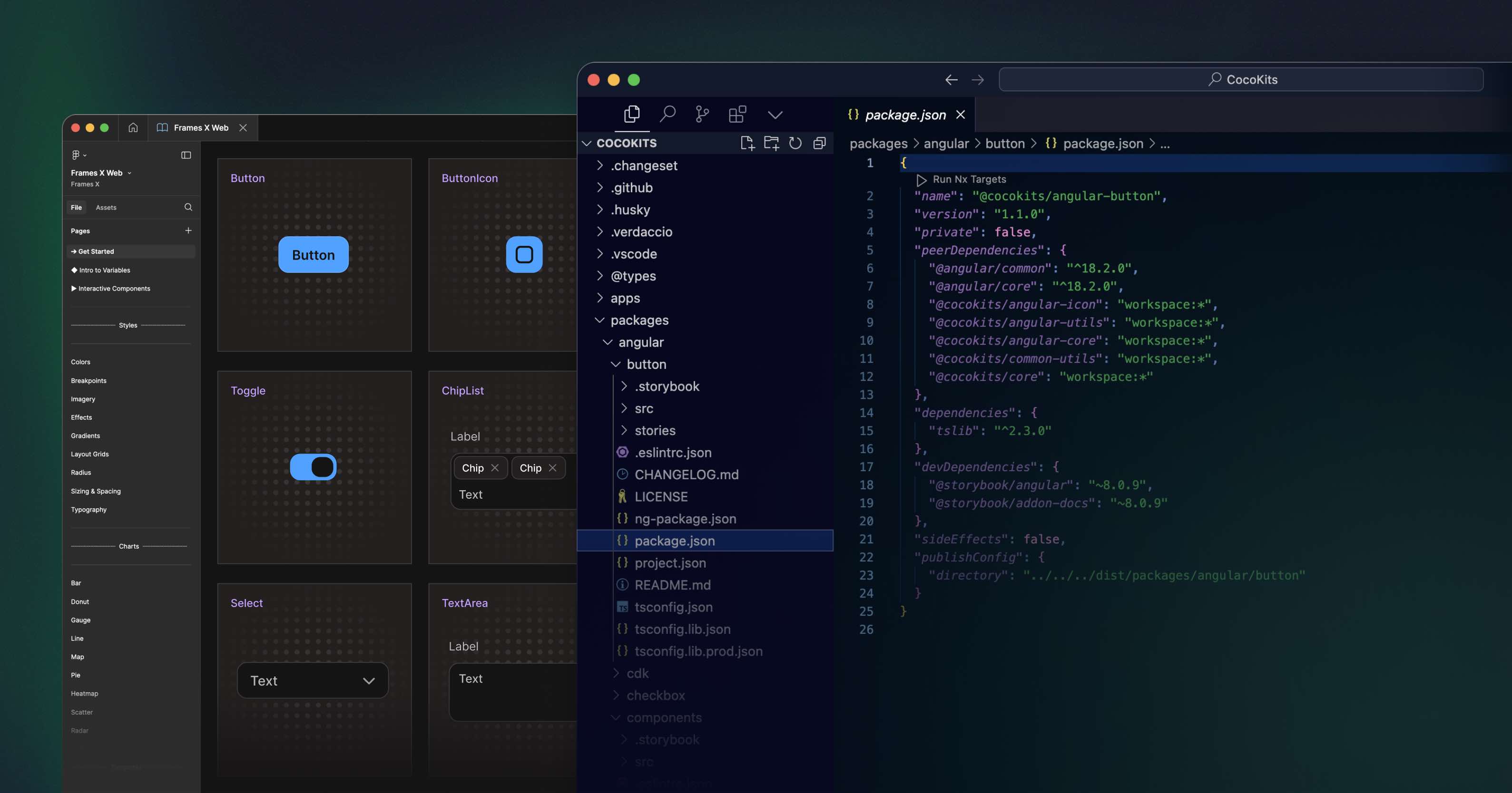
We're thrilled to present you with the first batch of FramesX web components. Frames X has partnered with CocoKits, an emerging tech Company, to bring your favorite UI components to life.
CocoKits is the platform for bridging design and code, and FramesX has become the pioneer of this cutting-edge open-source technology.
We're launching v2.8 with 14 expertly crafted Angular components that blend stunning aesthetics with robust code implementation. This release is the first among many, and we plan to scale our UI kit along with other frameworks, including React, Vue, Vanilla HTML, and Web components, building that ultimate design toolkit for designers and developers.
Learn more about FramesX's new direction—explore what's next on our roadmap!
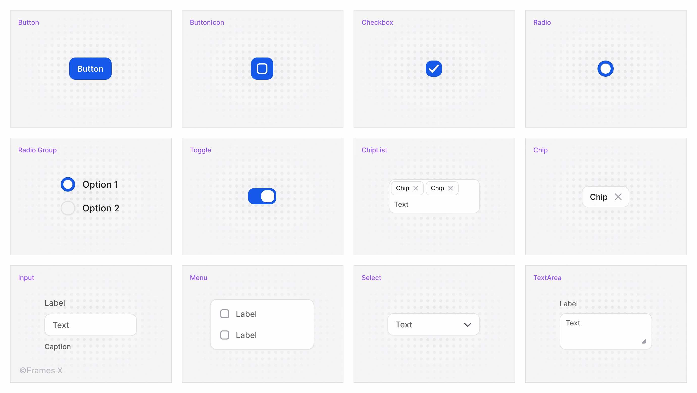
All coded components include the same customization options as you've used in Figma. Modify colors, typography, sizing, and border-radius using your existing Frames X design system properties. Experience the same flexible customization workflow you know from Figma in code.
Design Tokens and Code Syntax in Figma
We're excited to announce that FramesX Design Tokens are now live and available to everyone! Every Figma variable now seamlessly translates into functioning code.
FramesX now delivers perfectly matching variables with design tokens, bringing everything you need to create beautiful, scalable applications and websites.
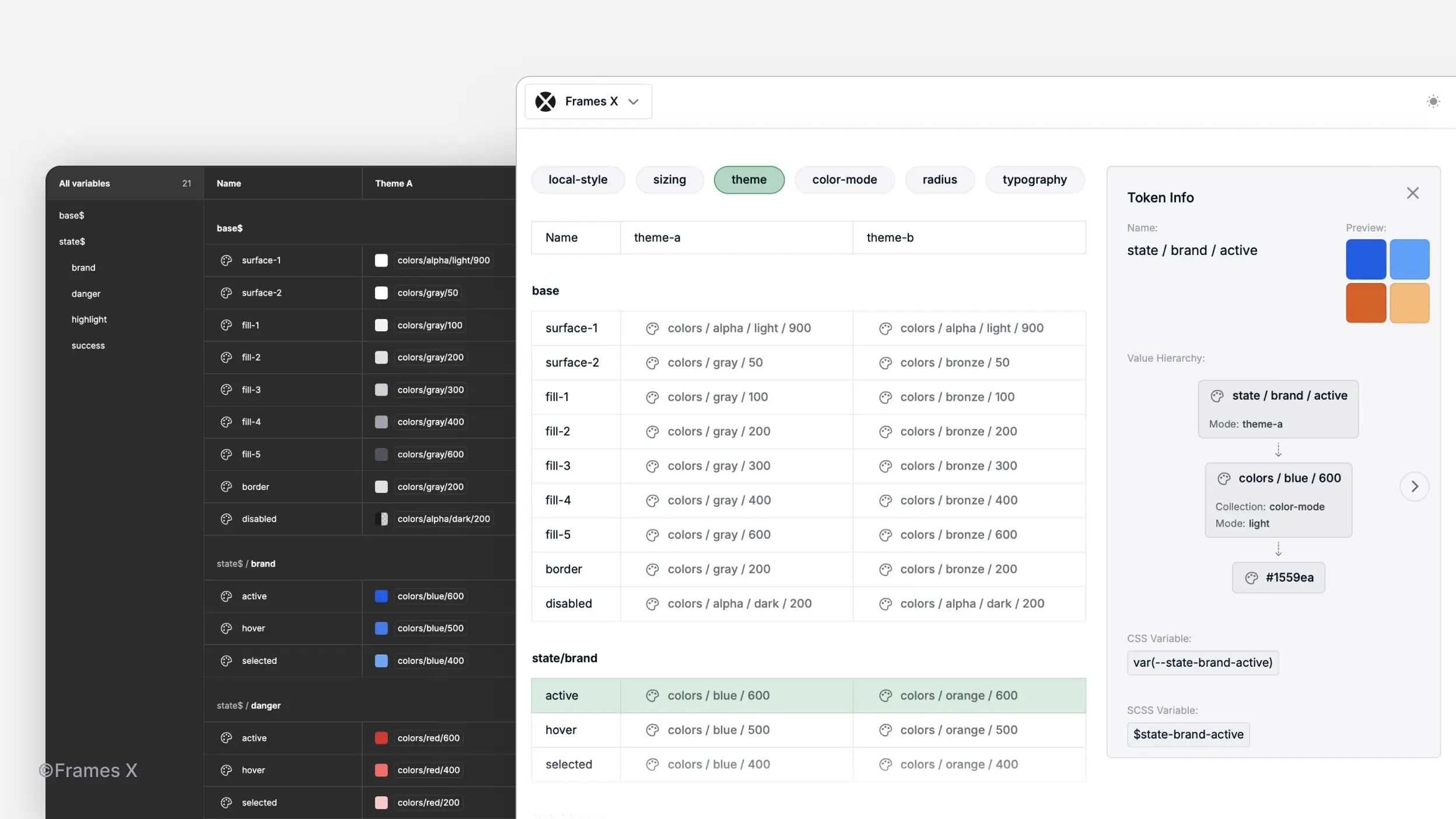
Thanks to Frames X integration with CocoKits' power-house features—you can experience the same rich customization from our Figma variables in code, with complete support for Color Modes, Themes, Spacing, Effects, Typography, and Sizing variables you're used to in Figma.
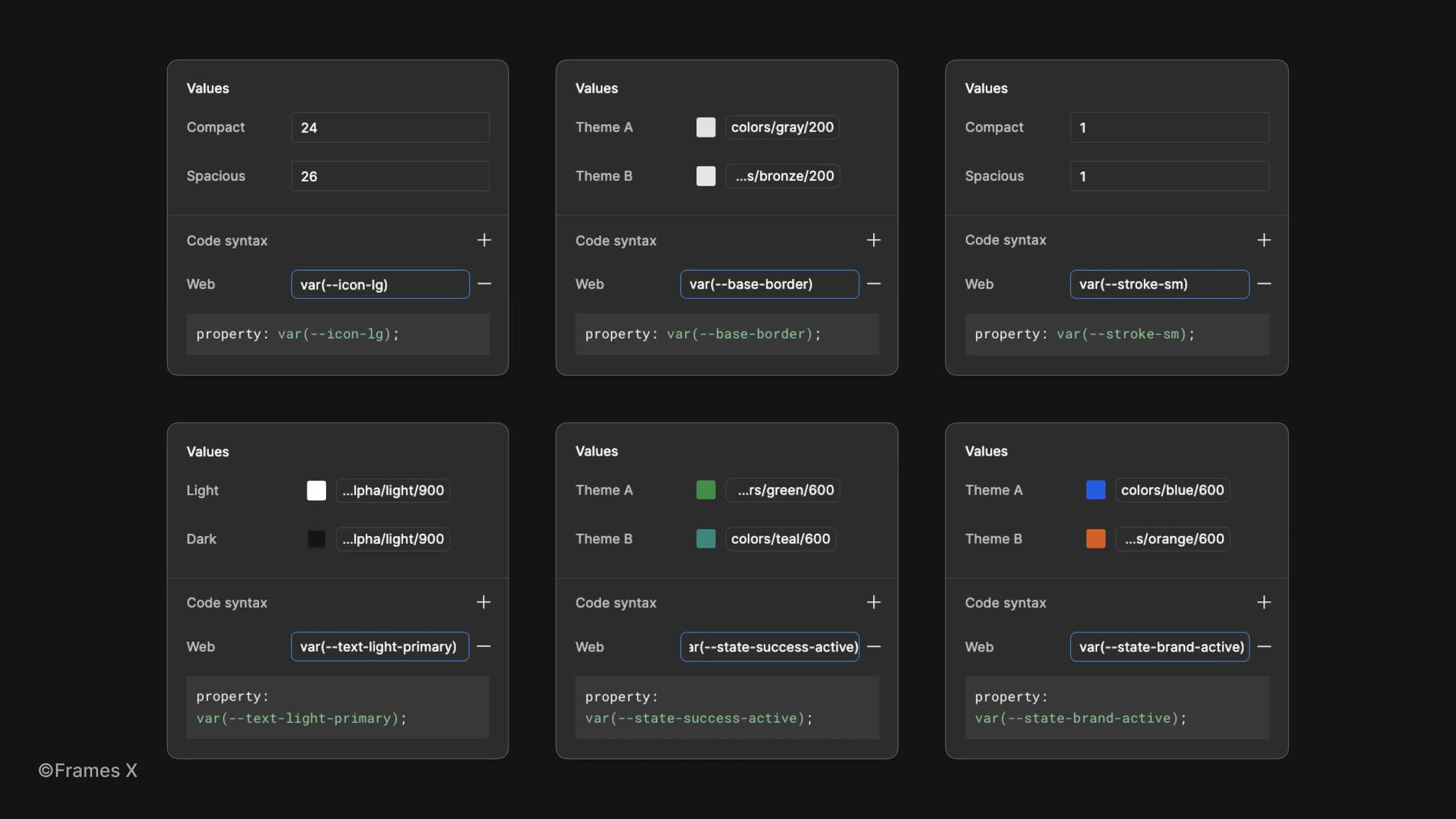
We’ve also updated our Figma variables with helpful Code Syntax snippets, allowing your team to collaborate more effectively; thanks to the new Figma Branching feature, you can easily preview changes to variables when using the Frames X UI kit as your Team Library.
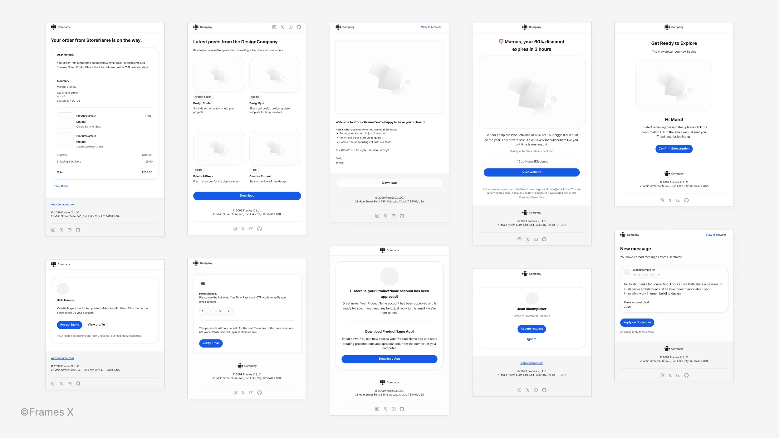
Responsive Email Templates
Introducing 20 new responsive email templates in Figma. Each template seamlessly adapts to desktop and mobile views, featuring customizable components to help you create beautiful and professional newsletters and marketing campaign designs.
Wireframe Templates and Examples
We've added 8 responsive website templates to the Root Wireframe UI kit. These include site examples for the homepage, store, ticket booking, e-commerce, checkout, account, forms, and dashboard page design.
Use these professionally crafted and responsive templates to accelerate and kickstart your next Figma website project.
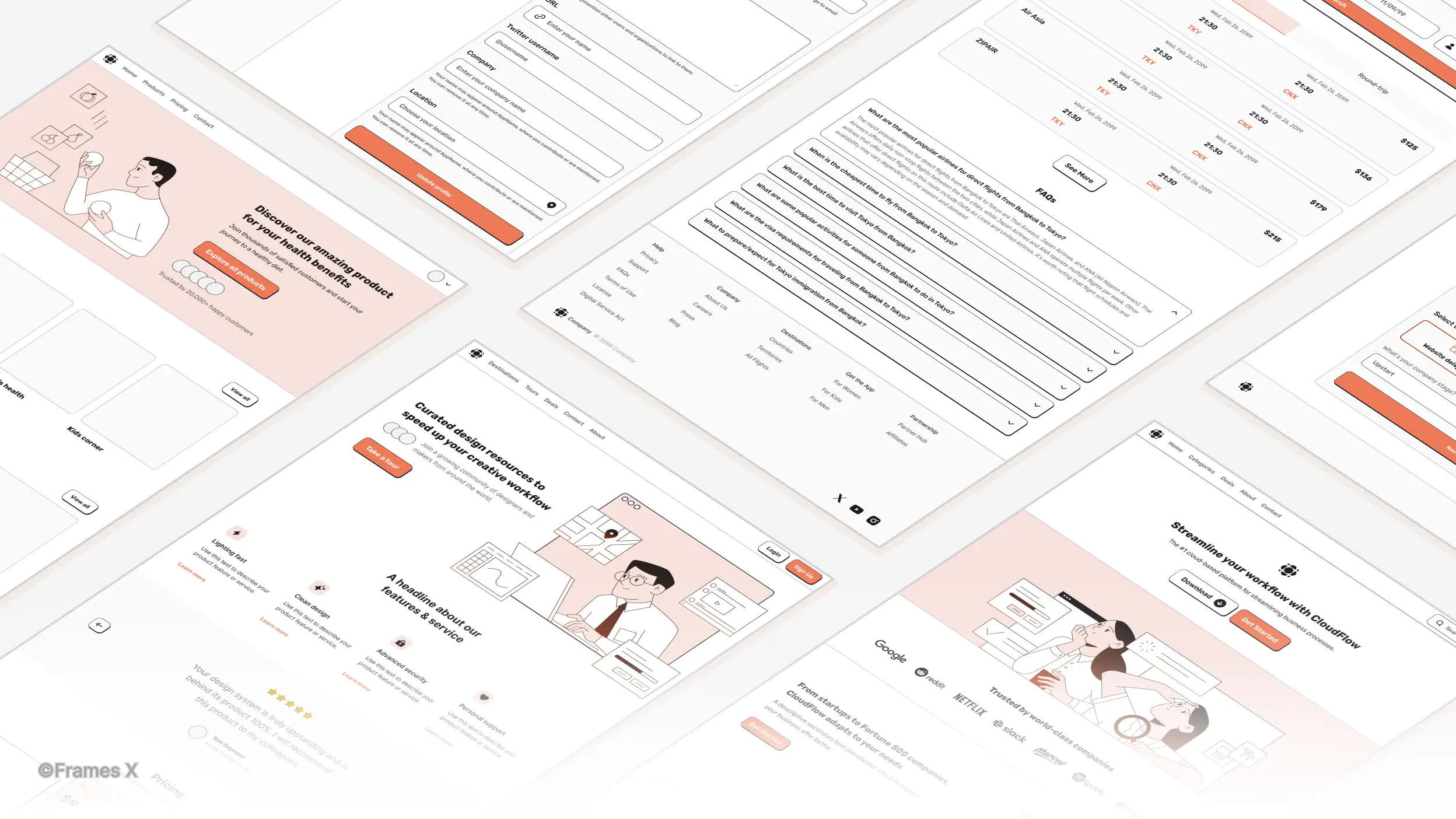
→ Preview Frames X Root Wireframes
Sticky Notes and Whiteboard Templates
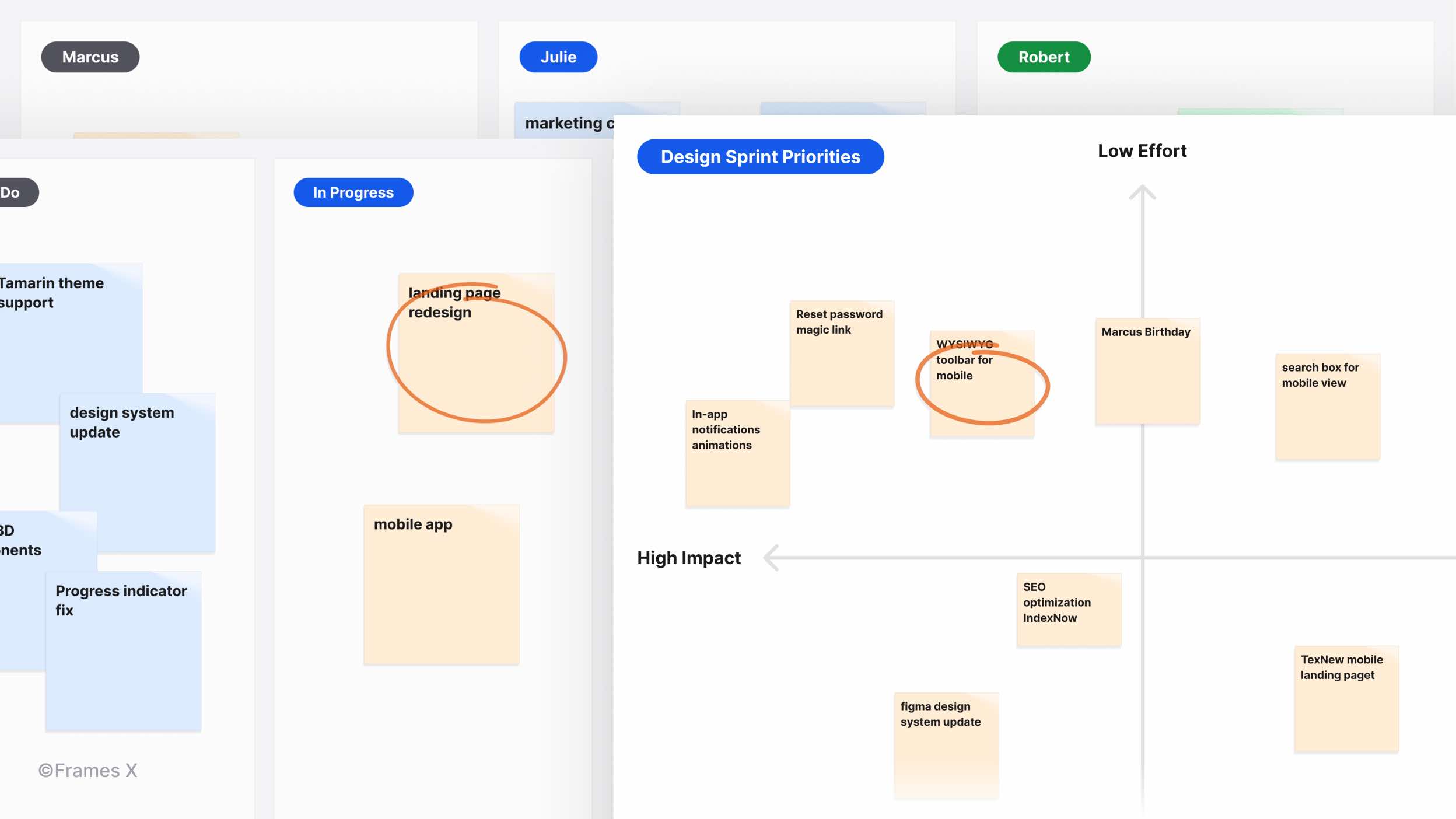
We have added new Sticky Note components to assist you in brainstorming and capturing ideas directly within your favorite Figma UI kit.
Additionally, we've included useful whiteboard examples, such as impact graphs, retrospectives, and to-do boards, to inspire your team's sprint planning and creative process in Figma.
→ Preview Whiteboard Templates
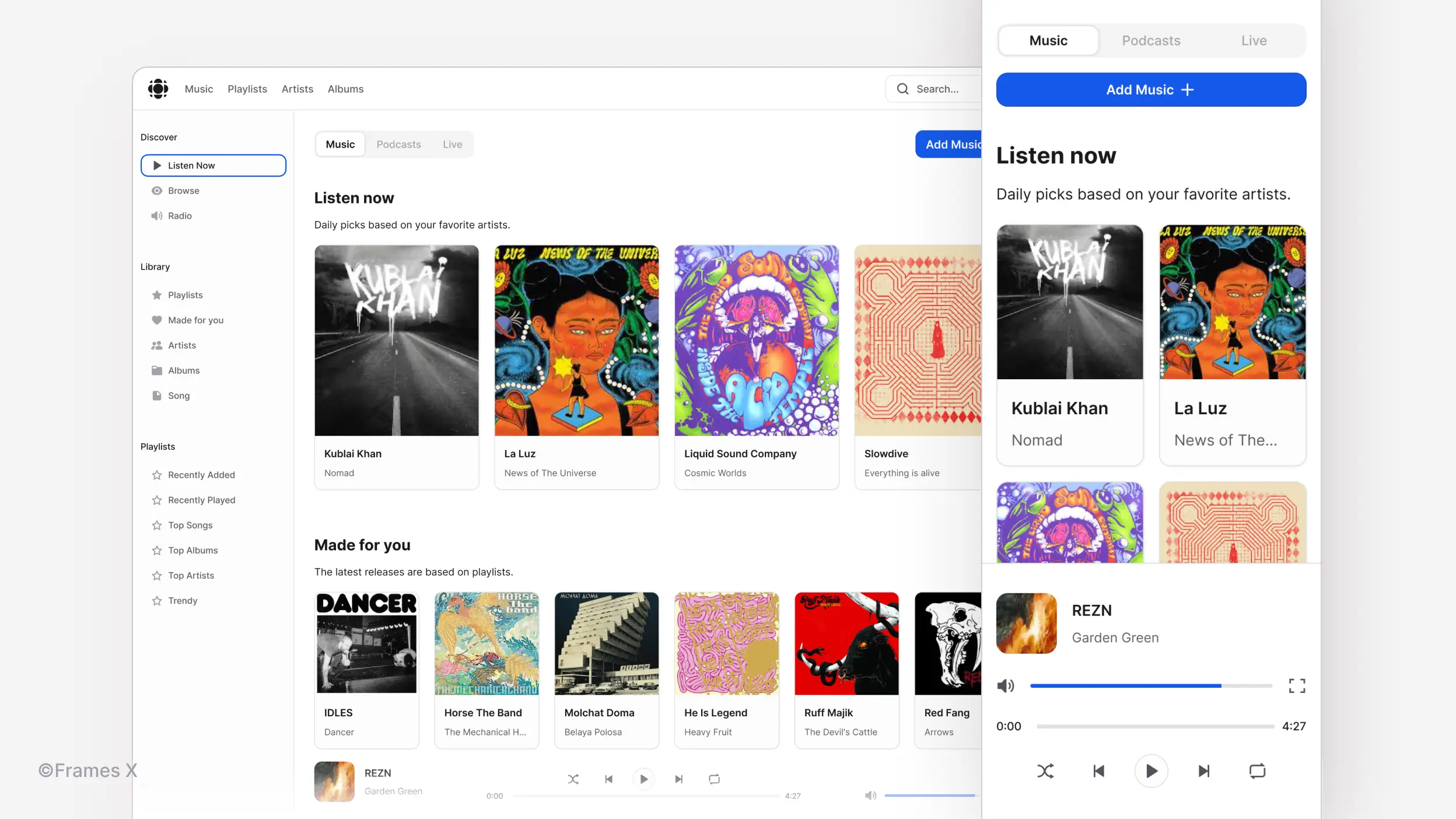
Music Application Template
Introducing our new Music App template for creating media and music library interfaces. The responsive design seamlessly adapts to desktop, tablet, and mobile views, providing an ideal foundation for any media interface.
As a bonus, we've updated our Repository, File Manager, Documentation, and Mail app templates with new essential UI elements.
Time Picker Component
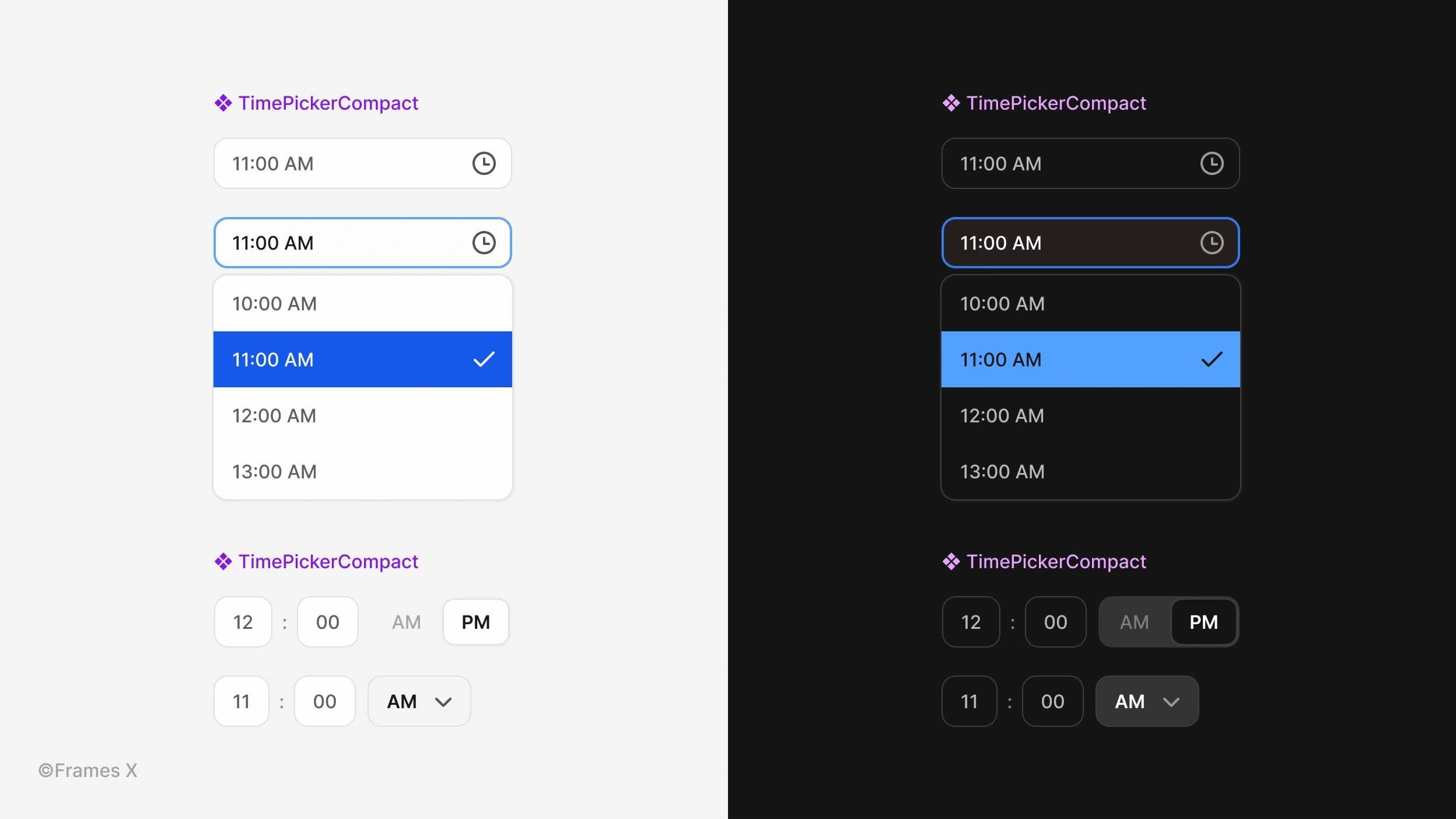
We've expanded our Forms UI kit with the Time Picker, a dedicated input for precise time selection. This component comes in various sizes and includes both standard design fields and a compact variant, which is ideal for mobile applications and interfaces with limited space.
→ Preview Time Picker Component
Chip List Component
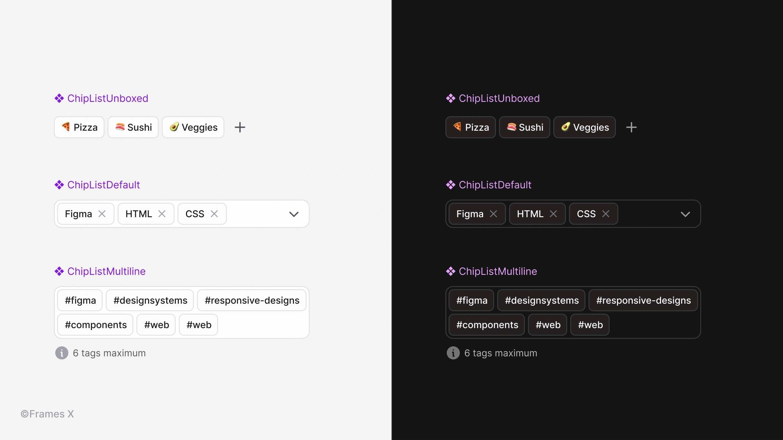
Introducing Chip List, a versatile forms component for content filtering and organization. Use chip lists alongside other form elements to create flexible single-line or multiline controls for filtering, tagging, and group selection.
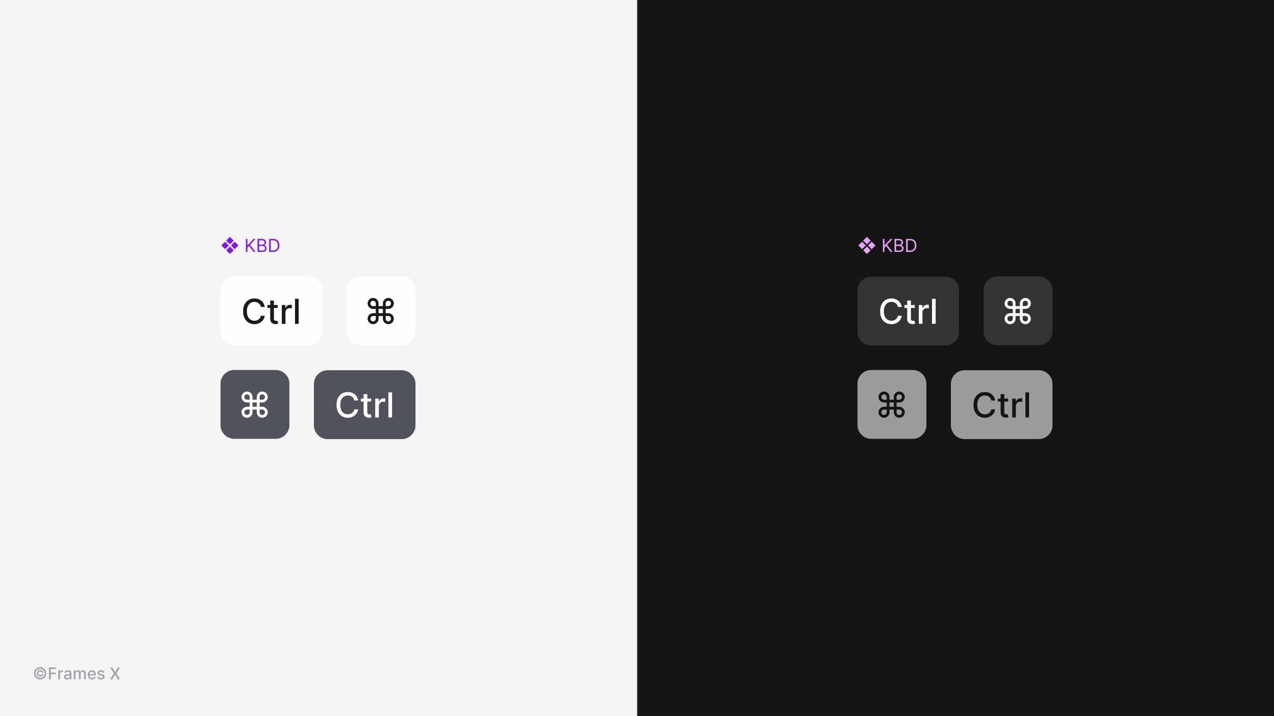
New KBD Component
We have introduced the KBD component, an essential UI element for displaying keyboard input within other components or elements. This HTML native component is commonly used to showcase keyboard shortcuts and key combinations.
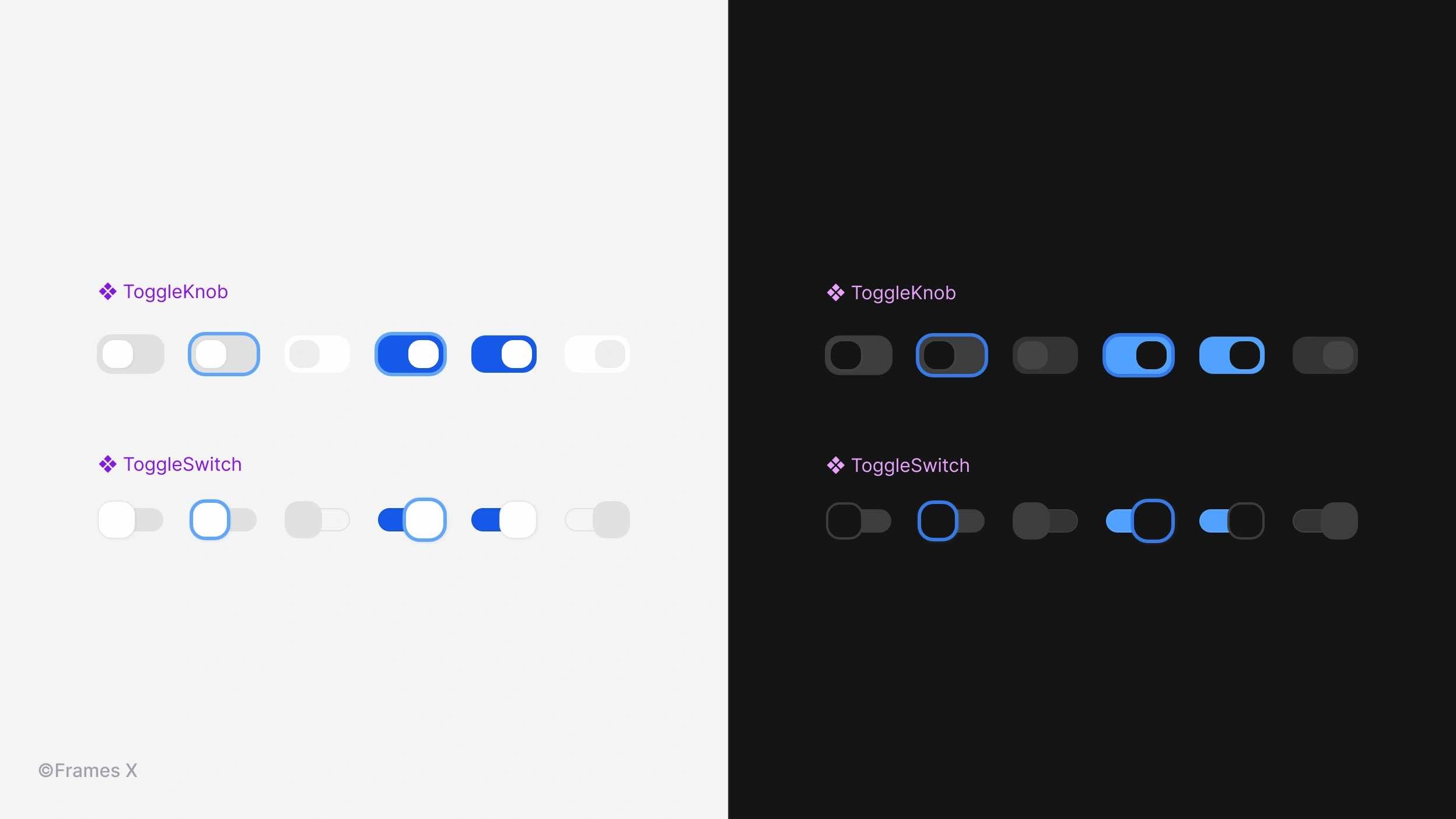
Updated Toggle Component
We have redesigned our Toggle component to standardize the heights, allowing them to match other form elements seamlessly. Additionally, we have added disabled states for the Switch and Knob variants.
That's a wrap! We can't wait to see the incredible designs you create using our new web design system and UI kit. Stay tuned for more exciting updates!

