Figma Tabs
Figma Tabs
Preview
Figma Tabs
Figma Tabs Component
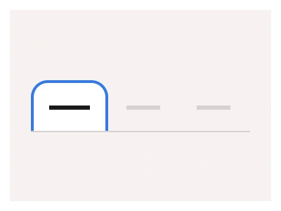
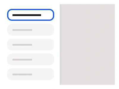
The Tab component consists of a set of logically connected buttons or toggles.
You can use tabs to allow users to switch between any content views/areas and customize each Tab UI component using nested tabs component properties.
Tabs UI Best Practices
Maintain consistent styling when working with multiple tabs and multiple UI sections.
Use predesigned prototype interactions to support keyboard navigation and create animated transitions between tabs.
Frames X includes Figma Tabs optimized for interactive design. This expanded set offers more variants than the original UI-focused tabs, covering all possible tab compositions.
Tabs Anatomy
| Set | Variants | Properties | Copy to Figma |
|---|---|---|---|
| Tablist | 36 | Size Large, Default, SmallPosition Top, Bottom, Left, RightItems x4, x6, x8 | |
| TablistLine | 36 | Size Large, Default, SmallPosition Top, Bottom, Left, RightItems x4, x6, x8 | |
| TablistFolded | 36 | Size Large, Default, SmallPosition Top, Bottom, Left, RightItems x4, x6, x8 |
Copy to Figma
| Set | Copy to Figma |
|---|---|
| TabsVertical | |
| TabsToggle | |
| TabsLine | |
| TabsFill |
Figma Tabs
Tabs
figma tabs
figma tabs component
tabs design figma
Interactive component