Oct 16, 2024
Dmitriy Bunin
Exploring Unicode Symbols for Web Design
Copy and paste symbols for unique interface and typography design
copy paste symbols
text symbols
Copy and paste design symbols
Unicode text icons are often overlooked, yet they can be powerful tools in the hands of capable designers. These typographic symbols, rendered as tiny icons, can offer smart and lightweight solutions for interface design. However, like any design element, they come with their own set of advantages and challenges.
That's why we've created Copy Paste Design Symbols—a place where you can find, copy, and paste Unicode symbols suitable for UI and web design duties. The symbols are ad-free, categorized, and ready to be pasted into your web projects.
→ Copy and Paste Design Symbols
So, let's continue with our beef.
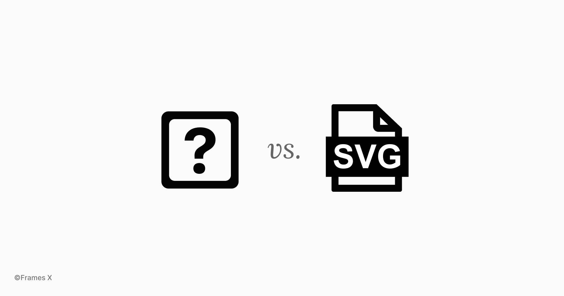
SVG icons vs. Unicode symbols
Unicode symbols pros:
Lightweight. No additional HTTP requests, better performance, and reduced page load times.
Scalable. Symbols scale with the font. While this may not always be an advantage, it helps to maintain baseline alignment between the symbol and the text in 100% of cases, which is very helpful for visual design.
Easy to use and customize. Simply copy and paste symbols into your HTML editor or your Figma canvas. Modify symbols as you would do with regular text, apply different weights, and easily add them to headlines and labels.
Unicode symbols cons:
A limited selection of unique symbols per font.
Font dependent. Symbol appearance is 100% based on the font and text size. Symbols may be inconsistent because different browsers will render fonts differently.
Lack of outline or monochrome icons. Most Unicode symbols have a single variant.
Unicode icons are not visible If the font doesn’t support text symbols ¯\_(ツ)_/¯
SVG Icons Pros and Cons
SVG icons, compared to Unicode symbols, have fewer drawbacks and have become the standard for designers and developers for a reason.
SVG icons are font-independent, making it easier to change their size without losing icon quality or thinking about the font dependency. They also support JavaScript and CSS animations, making them incredibly useful for user interfaces.
One of the best things about SVG icons is that there are tons of free icon packs out there. Seriously, you can find pretty much any icon you could ever need. This means you don't have to spend time designing your own icons or hunting around for the perfect symbol to fit your idea.
There are SVG icons for every metaphor or idea that are available for free online. That’s why we also created the Best Free UI Icon Packs article to help you find the perfect free icons for your project.
→ Discover the Best Free Icon Packs
However, SVG icons aren't without drawbacks, either. They tend to be larger, and each SVG icon typically needs a separate HTTP request, potentially slowing down site performance.
Deep dive into Unicode symbols for UI design
Neither SVG nor Unicode symbols are perfect, so as smart designers, we can recognize both and use the best of both to create unique and high-performing designs.
While Emojis are also part of the Unicode character set, this article will focus on ASCII symbols. ASCII typography symbols offer a cleaner and more neutral look that's perfect for applications and websites.
Let's explore scenarios where symbols can enhance the user experience.
Unicode symbols for UI components
Using Unicode symbols for UI components sounds weird and may not be the best idea for designing systems or producing UIs. However, it can be an effective technique for rapid prototyping and concept exploration.
Using text icons for UI components can be particularly useful when we need to iterate quickly on designs without moving an entire icon pack into our design file.
Let's explore a few examples:
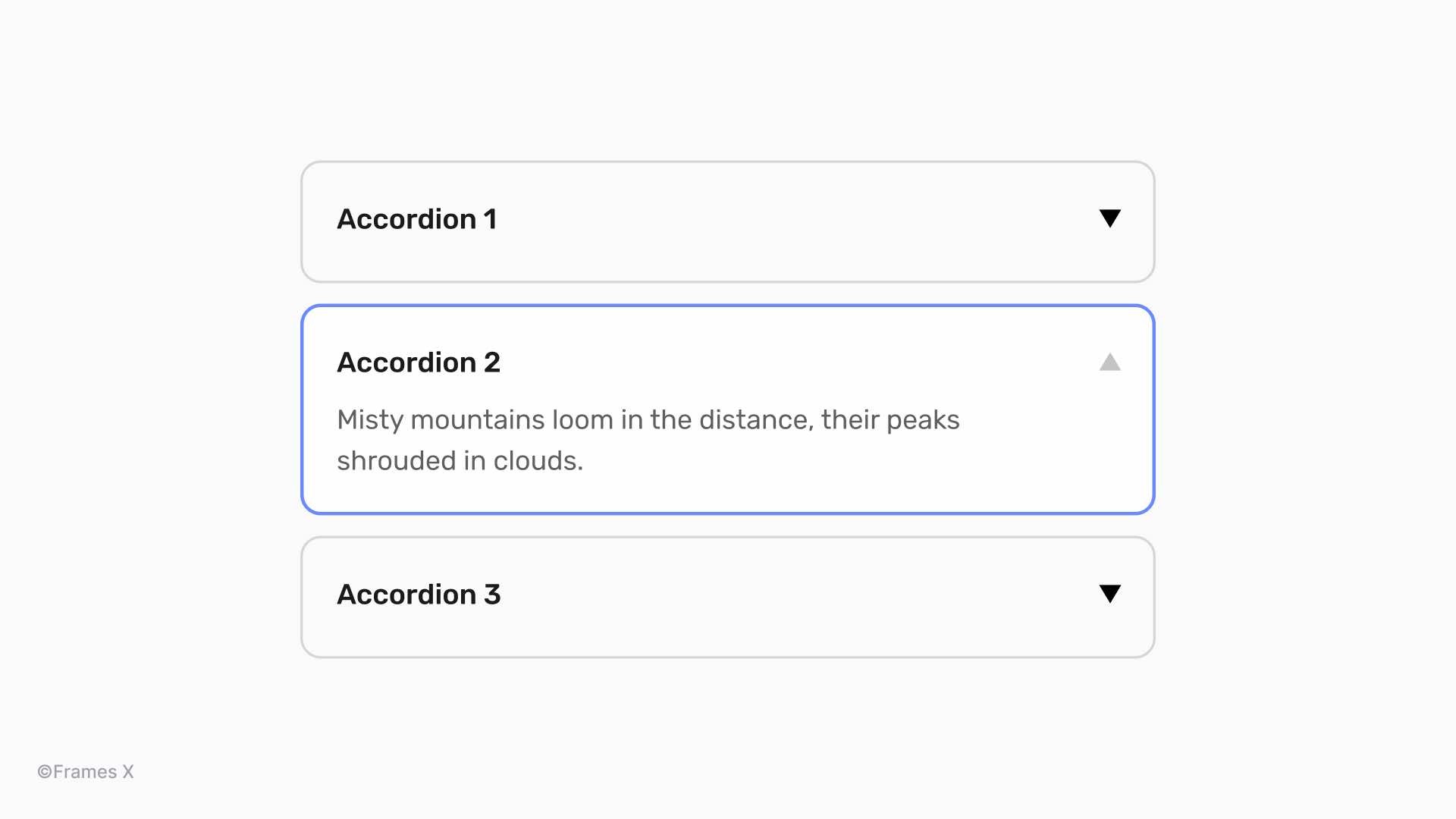
Accordion component
An accordion component with "▼" for closed accordions and "▲" for open ones. It may sound unusual, but it can definitely look striking when the element's sizing is properly aligned.
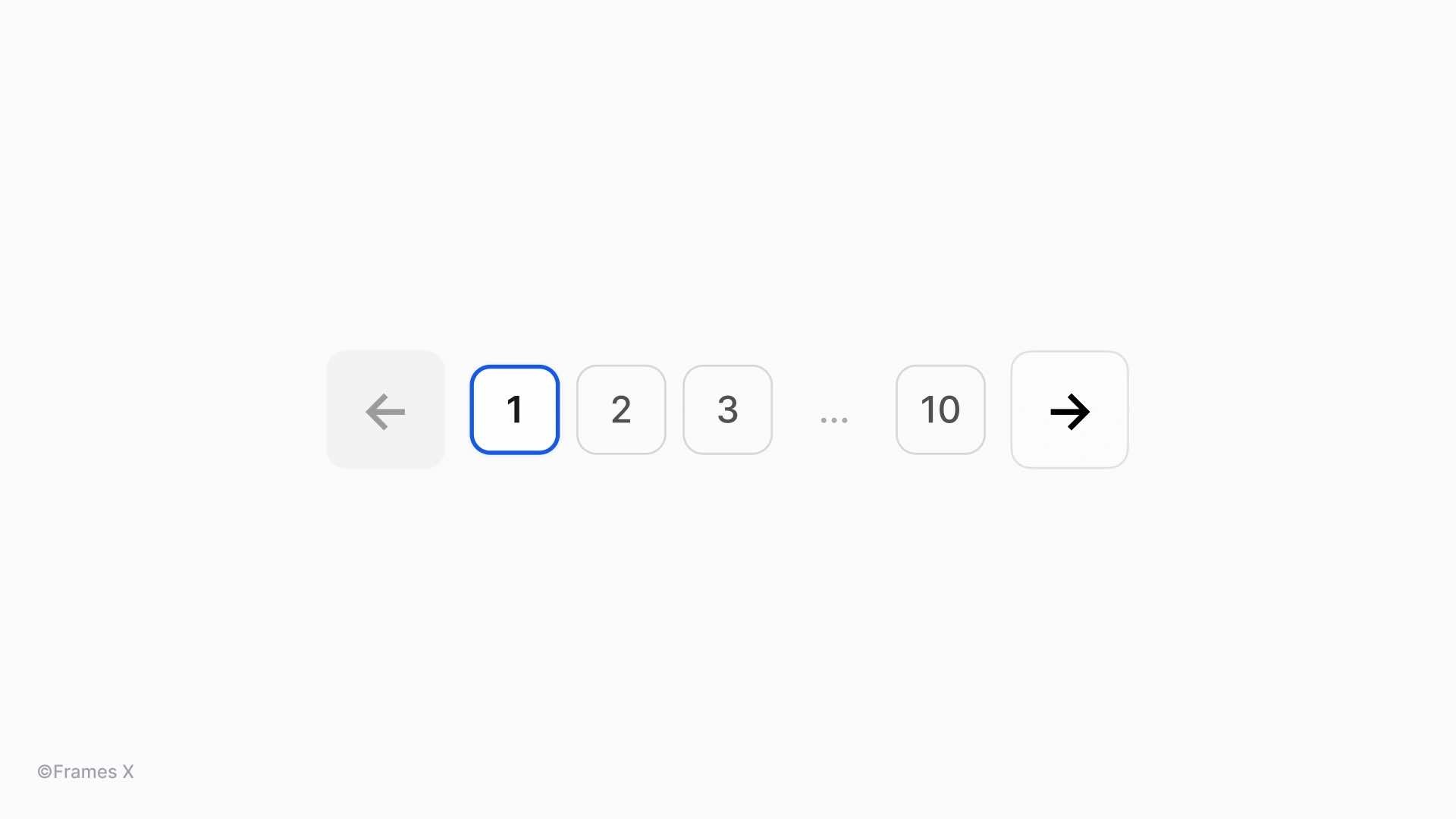
Pagination component
Pagination or page controls component with "←" and "→" arrows. These simple yet effective directional cues can function as navigation buttons. Arrow symbols are among the most trustworthy text icons, supported by most open-source fonts and browsers.
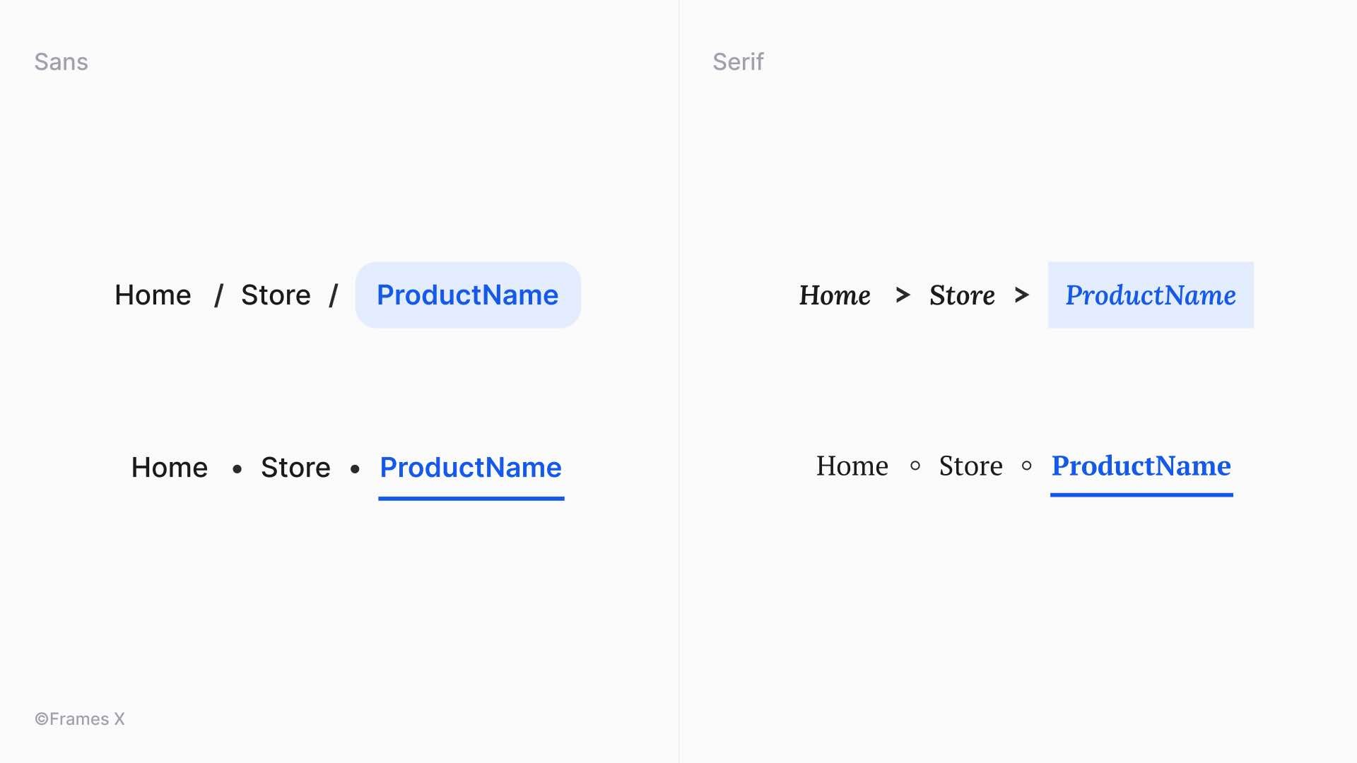
Breadcrumbs component
Breadcrumbs component with "•" or "◦" as separator elements for pages. We can also use other symbols for this purpose, such as "/" or">" depending on your UI style.
In this particular example, we wanted to highlight that sometimes outlined symbols can better match with Serif fonts crips.
Text fields validation
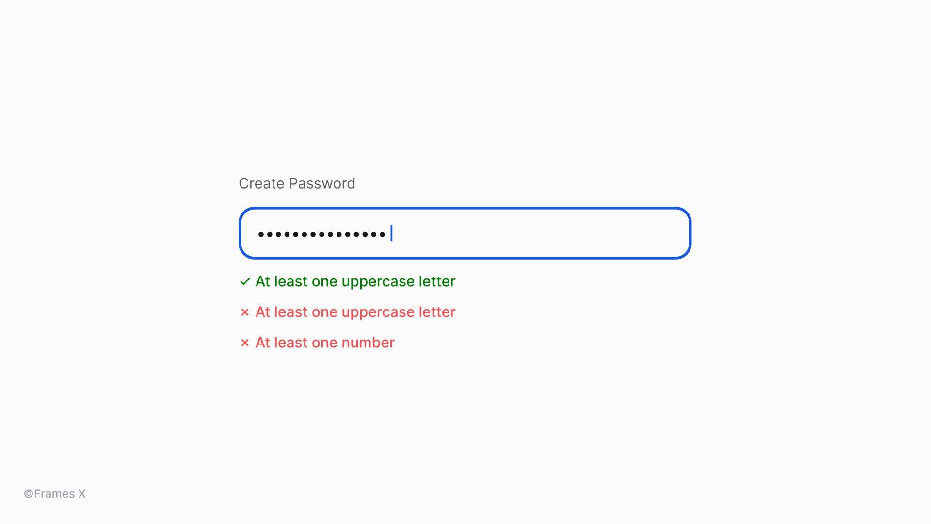
Input forms and field labels with "✓" and "✕" symbols. When combined with text labels or captions, these symbols can provide great visual feedback without any SVG icons added.
For password fields, we could also use a tiny helper "•" symbol instead of SVG circles for hidden password characters.
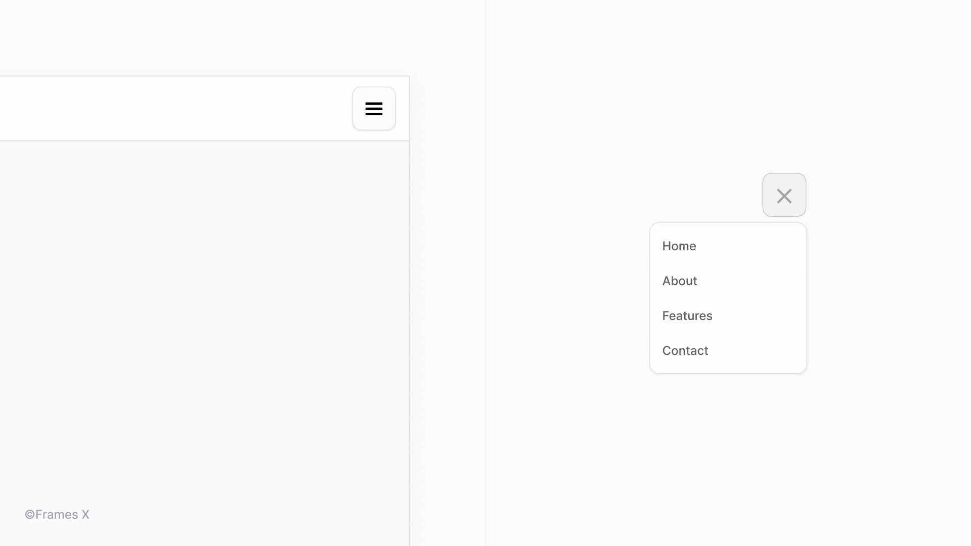
Toggle and Menu components
Toggle buttons or menu icons using the "☰" and "✕" symbols. However, those components are most likely to suffer from compatibility issues since menus and buttons are usually nested inside other components.
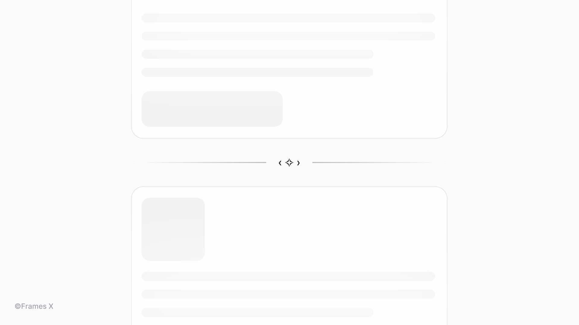
Using Unicode symbols for splitting content
Unicode symbols are great for breaking content into parts or sections, creating logical breaks in your design. Compared to SVG dividers, symbols scale with text, providing excellent flexibility and elegant solutions for your content.
Their use can add a logical structure and a brand element to your design, giving it an authentic vibe.
Unicode symbols as a Figma icon component
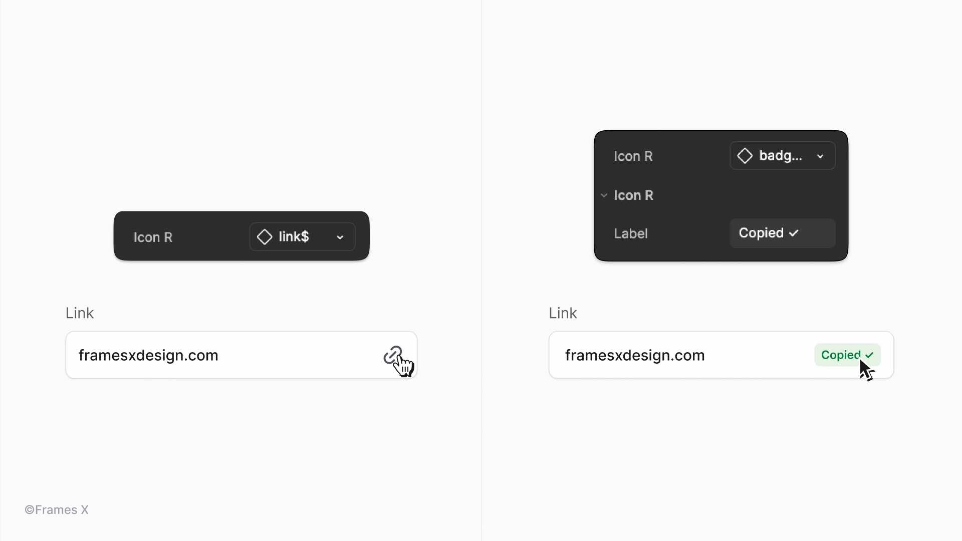
One cool trick we can do with Symbols is to include "a symbol component" in your design system as a swappable icon. This will allow you to switch between standard SVG icons and text symbols, giving you access to more flexible component design.
This trick can be helpful when you want to replace certain icons with labels. By updating the instance, you can switch the icon to a text label or symbol, adding extra meaning or elements to the design.
Using Unicode symbols to create Unique CTAs and Links
You can use symbols to enhance your call-to-actions, emphasize key components, or list items in long-form content.
Arrows (→, ←, ↑, ↓) and pointy shapes (▶, ◀, ▲, ▼) are the safest go-to symbols - they're common in most browsers and work with most fonts. Use them to draw attention to important elements, improving readability and user engagement in text-heavy pages.
Using Unicode symbols to enhance headlines and titles
Unicode symbols can enhance headlines and email titles, adding an extra punch, strengthening your message, and potentially increasing CTA results. Emojis and Unicode symbols often perform well in marketing contexts. A few researches made on this topic:
A Return Path study found emojis typically increase email open rates. For example, New Year's emails with champagne bottles or confetti emojis saw a 22% open rate compared to 18% without.
However, a Search Engine Journal study found non-emoji subject lines had slightly higher open rates (17.9% vs 16.9% for symbol subject lines).
Despite conflicting data, properly chosen symbols can positively impact CTA effectiveness. Let's explore a few examples of how text symbols can improve our message.
10 Fonts with Unique Unicode Symbols
Some fonts have unique symbols hidden inside them. They are like little secret items in video games, which you can unlock only by digging into each font character set.
We've curated fonts featuring the most practical and distinctive text symbols. These typefaces offer a wide range of unique characters so that you can try them out.
Symbola font - Extensive symbol coverage.
Noto Sans Symbols - Google's font with broad Unicode support.
Segoe UI Symbol - Microsoft's symbol-rich font.
DejaVu Sans - Open-source font with many unique glyphs.
Code2000 - Extensive symbol set.
Everson Mono - Monospaced font with rare Unicode characters.
STIX font - Scientific and technical symbols.
Cambria Math - Mathematical and technical symbols.
Asana Math - Font rich in mathematical symbols.
Last Resort - Fallback font showing Unicode ranges.
When to avoid Unicode symbols in web design
Avoid vague symbols that might be interpreted differently by users. For example, avoid using "@" or "#" unless they're used in their primary contexts (email and hashtag). Always evaluate the potential for misinterpretation when working with symbols.
Don't clutter the interface with too many symbols. Use them purposefully to enhance user experience, not to complicate it.
Avoid using symbols for critical information. Don't rely on symbols for important messages or warnings. Always accompany symbols with text to ensure the message is understood.
Don't use symbols for page names and <h1> tags since this can harm your search engine indexing and make your site less discoverable.
Be mindful of cultural sensitivities. Some symbols might have meanings or connotations in different cultures. For example, religious symbols, even in simple ASCII form, should be used cautiously to avoid potential offense.
Conclusion
As we wrap up, it's clear that Symbols can have both good and bad impacts on the interface. But text icons can certainly level up your UI or even become the star of the show.
The key is to strike a balance where symbols enrich UI or typography without overshadowing the message.
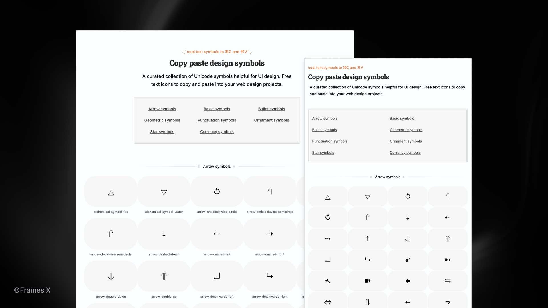
We embrace this philosophy in our work. That's why you can spot Unicode symbols sprinkled throughout our website, each one carefully chosen to add a touch of personality.
We understand the frustration of finding the right symbol. Many sites are cluttered by ads and misleading buttons, making the search even more challenging.
That's why we created Copy and Paste Design Symbols—a curated collection of Unicode symbols for UI and web design. It's a no-fluff, ad-free zone where you can find, copy, and paste Unicode symbols.
We've organized everything into intuitive categories so you can quickly jump to the needed glyph for your project.
→ Visit Copy Paste Design Symbols Page
Thank you for embarking on this symbolic journey with us. Now, let's create something beautiful!
Posts
Frames X Root: Wireframe UI Kit
Perfect Figma Tabs
Frames X v2.7: Design System at Scale
Best Figma Plugins for Designers
Figma UI Color Palettes
How to Design a WYSIWYG UI
Frames X v2.6: Universal UI kit
Best Free Icon Packs
Frames X v2.5: World-largest UI kit
Figma Tips and Tricks
Frames X v2.4: Typography variables
Frames X v2.3: Data-driven components
Intro Guide to Figma Variables
Frames X v2.2: eCommerce templates
«
«
«
More posts like this
»
»
»
Frames X Root: Ultimate Figma Wireframe UI Kit
Frames X Root: Wireframe UI Kit
wireframe ui kit
figma ui kit
The Perfect Figma Tabs Component
Perfect Figma Tabs
free ui kit
freebie figma
Frames X v2.7: Figma Design System at Scale
Frames X v2.7: Design System at Scale
figma ui kit
design system
Best Figma Plugins for Design and Development
Best Figma Plugins for Designers
design system
best figma plugins