Figma Dialog
Figma Dialog
Preview
Figma Dialog
Figma Dialog Component
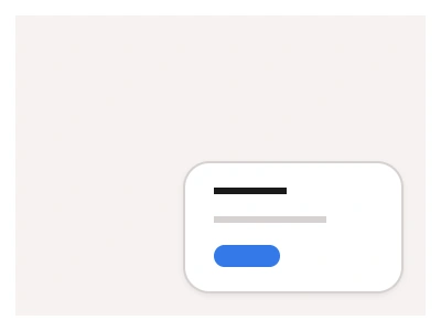
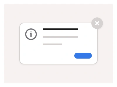
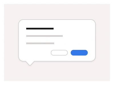
The Dialog component is a floating window over the main content that provides crucial information or guides users through your website or application interface.
You can use dialogs by pinning them to one of the corners of the screen for events that require users to take action. Compared to Modals or Toasts, its purpose is to grab user attention on specific tasks or messages without interrupting the flow.
Dialog UI Best Practices
Catch focus within the Dialog and return it properly when closed.
Provide obvious ways to close, including using the escape key and overlay click.
Use Dialog Properties to adjust size and positioning for different screen sizes.
Dialog Anatomy
| Set | Variants | Properties | Copy to Figma |
|---|---|---|---|
| Dialog | 8 | Type Default, InvertedSize Medium, LargeExpanded True, False |
Figma Dialog
Dialog
dialog example
dialog component
figma dialog
Interactive component