Figma Progress
Figma Progress
Preview
Figma Progress
Figma Progress Component
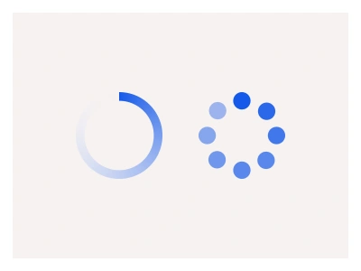
The Progress component displays the completion of a task using linear or circular indicators. Use Progress components for tasks exceeding 2–3 seconds. The Figma progress components include linear and circled variants.
Progress Anatomy
| Set | Variants | Properties |
|---|---|---|
| ProgressBar | 99 | Type Default, Top, BottomSize Large, Medium, SmallState 00%, 10%, 20%, 30%, 40%, 50%, 60%, 70%, 80%, 90%, 100% |
| ProgressSegmented | 99 | Type Default, Top, BottomSize Large, Medium, SmallState 00%, 10%, 20%, 30%, 40%, 50%, 60%, 70%, 80%, 90%, 100% |
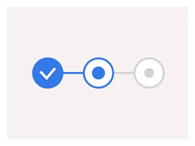
| ProgressIndicator | 15 | Size Large, Medium, SmallState Default, Incomplete, Complete, Error, Indeterminate |
| ProgressCircular | 9 | Size Large, Medium, SmallState Any%, Succes, Error |
The progress family is four sets — ProgressBar and ProgressSegmented with 99 variants each at 0 to 100 percent in ten steps, Default, Top and Bottom label placements and three sizes; a ProgressIndicator with Incomplete, Complete, Error and Indeterminate states; and ProgressCircular at 80, 120 and 200px with success and error states.
Progress AI Prompt
Paste this into Claude, ChatGPT, or Figma Make:
Build a progress component family in Figma as four sets. ProgressBar: a rounded track with an accent fill, a State property stepping from 00% to 100% in tens, a Type that places the percentage label on Top, Bottom or hides it in Default, and Large, Medium and Small heights. ProgressSegmented: the same track split into ten segments that fill one by one, same states, types and sizes. ProgressIndicator: a labelled bar at 58, 44 and 32px with Default, Incomplete in grey, Complete in green with a tick, Error in red with a warning icon, and Indeterminate with a sliding highlight. ProgressCircular: a ring at Large 200, Medium 120 and Small 80px with a centred percentage and Any%, Success and Error states where the ring recolours and the centre shows a tick or cross. Build the fill as a resizable layer so any percentage can be set manually between steps, and keep the sizes small enough to nest the circular ring inside a button for inline loading.
Compared to linear indicators, the circled progress bar can be easily integrated into buttons or other UI elements by nesting its instance without disrupting the overall design.
Figma Progress
Progress
progress bar
loading bar
progress component
Interactive component