

Learn how to create UI color palettes in Figma with our definitive guide and free Color UI palette file
This guide will teach you how to create a UI color palette for your project using Figma and include general tips on color accessibility and color psychology.
Creating a color palette is an essential step when starting a new project. Numerous tools and features in Figma can help you create a palette that reflects your brand and the ideas behind the interface.
A professionally designed UI color palette will support the project's scalability by establishing a solid base for numerous UI color decisions made over time.
On this page, we'll cover everything you need to create color palettes and you will find our practical Frames X UI Color Palette for your web and mobile app designs in Figma.
Get the free UI color palette for Figma
On this page, we'll cover everything you need to create professional UI color palettes. You'll also find the free-to-download Frames X UI Color Palette for your web and mobile app designs in Figma.
Duplicate the Frames X UI color palette from the Figma community.

Getting started with UI color palettes
Colors are the foundation of every visual system. Colors allow us to differentiate design elements, understand what’s important, and how we consume the content.
When choosing and combining colors, one should consider different screens, lighting conditions, color perception, and many other factors that may affect color contrast.
The Frames X UI color palette covers this wide range of accessibility scenarios and provides practical solutions for each of them. Our framework offers a great foundation and will help you:
Define color and color names for every UI element in your project
Modify color themes and color modes (light and dark interfaces)
Help to have fewer debates over color names and usage purposes
You can start working with the Frames X UI color palette as you read this guide, so feel free to duplicate the FramesX UI colors variables palette file.
Note: You can change the default color groups (State, Base, Text) in the File by clicking on the corresponding color variable from the “Local Variables” menu, which is accessible from the right Figma sidebar.

Choosing colors to fit your interface
When starting a project with new branding, the key challenges include maintaining brand consistency across interfaces and balancing brand presence with UI accessibility.
The technical aspects of your color palette will be crucial, as branding elements can impact performance and load times. The UI color palette scalability is essential for brand growth.
So the ideal color palette for a UI design project should include certain important groups of colors every UI project should have. Such as:
Neutral colors (usually gray or alpha transparency colors).
Primary and accent colors for call-to-action clickable elements.
Feedback colors to show interface feedback states, such as green for confirmation and red for error messages.
One concept we think is important to become familiar with is — using value-based (semantic) names for UI colors.
For example, you can use ColorName-500 as the base color. Lighter shades are represented by lower numbers (e.g., color-400, color-300), while darker shades are represented by higher numbers (e.g., color-600, color-700).
This numbering range indicates the total number of shades in your color palette and helps you scale or shrink color groups as needed.
Now that we have learned this let's dive into UI color groups.

Neutral UI color palette
Neutral colors dominate user interface design. They are used for backgrounds, text, icons, and vector shapes. This palette typically consists of grayscale and is used as the base hue in design systems.
When designing neutral UI colors, aim for a minimal set of surface colors. This approach simplifies customization and enhances interface flexibility. However, neutral colors serve purposes beyond customization. They often complement and harmonize with your primary or brand color palette, creating a cohesive visual design.
Consider how your neutral colors work with your Brand/Primary color palette to achieve color-balanced UI. For example, if your primary color is blue, it could be beneficial to use blue-gray colors as your neutral palette.

Brand UI color palette
Primary or Brand colors typically represent brand identity across your interface. Ideally, For brand colors, it's enough to have 3 to 5 colors easily associated with your brand.
Using brand colors for UI elements will strengthen your brand awareness. Yet, using exact brand colors for buttons is not always a good idea since such styling do not always have enough contrast.
To avoid this mistake. If your brand color lacks contrast, pick a more vibrant version of the same color to ensure that your elements' text is easily readable.
When selecting a primary color palette, it's important to avoid low-contrast colors at all and aim for the best possible visibility for your CTAs. For example, it's recommended to avoid using colors like 00ff00 as your primary color.
To check if your primary UI color palette is ready, you can use Figma plugins like Contrast to check the contrast ratio quickly.

Accent UI color palette
Accent or secondary colors help grab user attention and support the primary colors. Use the secondary colors group sparingly to make the UI elements stand out. You can apply them to elements such as chips, badges, and labels.
Usually, a project may have 1 to 6 secondary colors. Limiting it to only one or two colors would bring more consistency to your palette. However, If your project has multiple sub-products, each could have its own primary and secondary UI color palette.

Feedback UI color palette
Feedback UI colors translate common interface states (such as "success," "error," or "warning"), enhancing UI message clarity.
For example, the green color has a positive connotation. People have the muscle memory to associate it with success and confirmation status. And red is present in our brain to warn us about something that went wrong.
You should use feedback colors whenever:
You want to highlight a vital UI status, positive or alert info.
You want to validate text fields or controls like toggles and checkboxes.
You want to give fast visual feedback, like a new in-app message.
Note: Don't apply feedback UI colors if they have no purpose and are used only for decoration. For example, if you need a green shade, consider using a Teal color group instead of Green since it is reserved for a positive UI state.

Validating your UI color palette
After identifying each group of colors, it is important to validate them by making sure they meet accessibility standards.
Our top-pick tools to help you validate color contrast:
Contrast plugin for Figma by WillowTree.
Color contrast plugin by Aleksandra Walczak.
Intro to Frames X's UI color system
Frames X palette is focused on easy scaling and seamless customization. All Included colors utilize current web content accessibility guidelines (Understanding WCAG Guidelines) with post-processing of the APCA model, which is an ideal combination for creating ideal contrast for user interface colors.
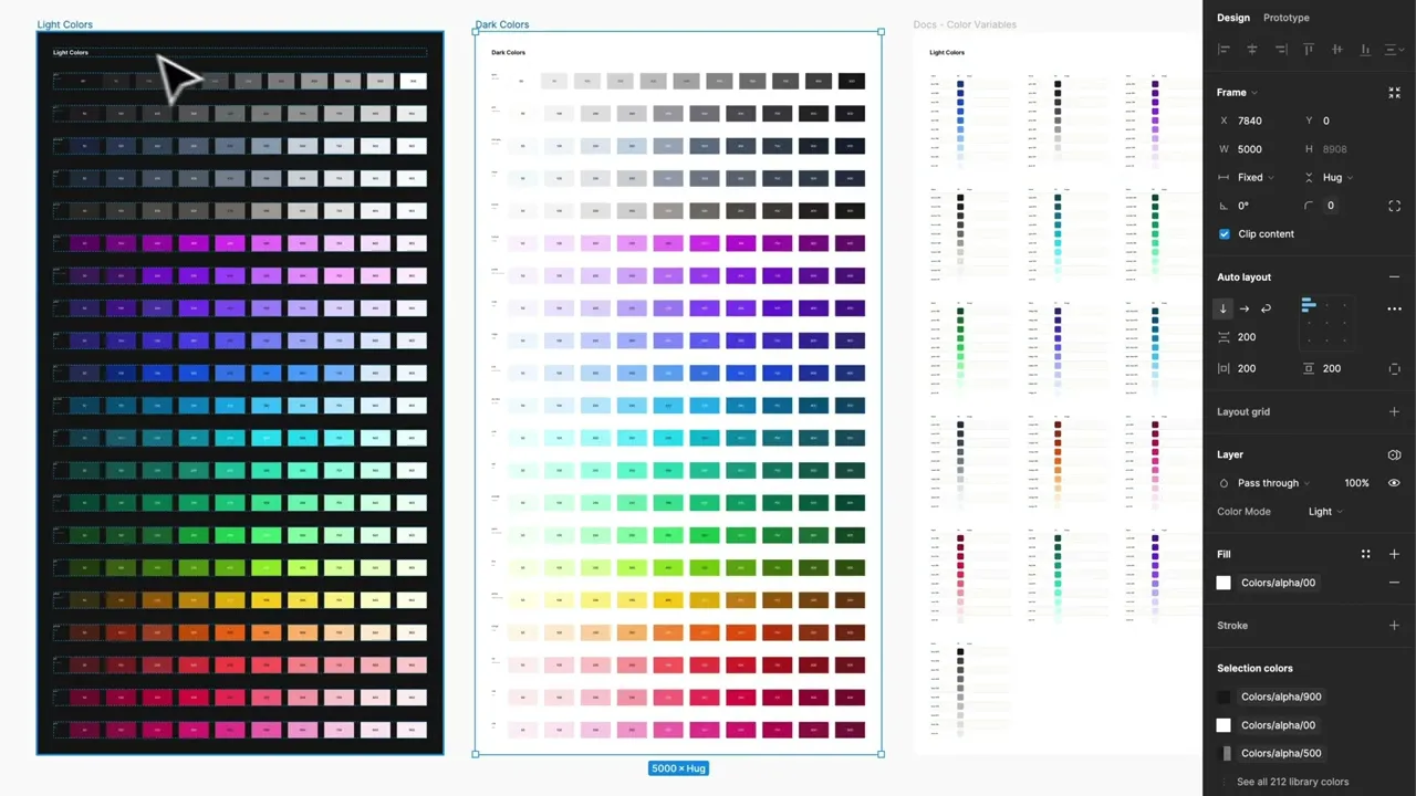
Like in many design frameworks, Frames X, each color group includes ten shades to display the full spectrum of UI-applicable colors powered by Figma features such as Variables and Color Styles.
Frames X color system ensures consistent contrast within and between each group, with every color name index corresponding to its saturation level (contrast ratio).
This way, Frames X's UI color palette allows colors to reflect elevation and hierarchy through the interface and helps to achieve consistent results when combined with custom branding. See our UI color palette in action ↓
Precise UI color contrast ratio
When using the Frames X UI color palette, you can achieve consistent contrast between color groups by selecting color variables from the same saturation range. This approach ensures visual harmony and readability across your interface. "Same saturation range" refers to colors with similar intensity, e.g., Purple-500 vs. Blue-500.

This is unique to our palette feature, allowing you to confidently set your active brand colors by choosing from a range of 500-700 colors, e.g., Teal-600 and Green-600, and for backgrounds and UI surfaces, from 50 to 100.
Contrast ratio is expressed as a ratio of the luminance of the brightest color to the luminance of the darkest color. The ratio ranges from 1:1 (no contrast) to 21:1 (black on white or vice versa).
Interpreting the Numbers:
4.5:1 means the lighter color is 4.5 times as light as the darker color.
3:1 means the lighter color is 3 times as light as the darker color.
Text Size Considerations:
Normal text: Less than 18 point (or 14 point bold)
Large text: At least 18 point (or 14 point bold)

Optimized dark mode for accessible UI design
Frames X's UI color palette uses less saturated dark mode colors to maintain accessibility and increase eye comfort in a dim interface environment.
The dark color palette communicates hierarchy using desaturated fill colors instead of only reversing the values from light colors, as most design frameworks do.
Tip: You can switch between color modes anytime and expect the same accessibility levels. To switch from one color mode to another, you can select any elements with color variables applied and use the appearance control from the right sidebar in Figma.

Tailwind and Bootstrap compatible palette
Frames X UI color palette can help you easily transition your designs to Tailwind or Bootstrap. Frames X color palette is fully compatible with Tailwind and Bootstrap naming conventions, providing the same number of pre-designed colors.
Frames X UI color palette shares the same number of color steps and saturation levels while providing a more vibrant contrast between similar colors.

Tips on working with Frames X UI colors palette
Frames X color palette aims to help you solve the most common design system scenarios, such as finding the right primary, secondary, and accent colors, updating your colors globally, sorting, grouping, and naming your colors, as well as sharing your colors with your team.
Our palette includes guidelines that explain where and why specific colors are used for each section and element. These guidelines help you make and communicate color choices effectively while demonstrating the reasoning behind each selection.
Preview Frames X UI Colors Palette

Note: Proper communication is the key in all of these scenarios. However, it's very common in the design industry to reshape, rename, and rearrange your colors throughout the project lifespan. So, the way you translate your decisions can become more crucial as your project grows.
Using colors from a Team library in Figma
When starting a new project, you could add Frames X UI color palette as your Team library. Why? To save yourself a massive amount of time instead of manually adding colors or using third-party tools.
A separate color Team library will help you better communicate your design decisions while staying consistent across multiple projects and designs
When colors become a separate Figma library, your team can grab the colors they need without messing up your workflow. Plus, it's a great way to keep everyone in sync—no more confusion about which colors to use in different projects or files.

Finding colors faster in Figma
Tagging your colors can greatly improve your speed working in Figma. By adding symbols to a style or variable's name, you'll be able to quickly filter any Figma elements using keyboard shortcuts.
For example, the Frames X UI colors palette, by default, uses a "$" symbol to tag and prioritize the most frequently used styles across our UI kits designs.
Discover more helpful Tips and Tricks for Designing in Figma.

A well-crafted UI color palette in Figma isn't just about aesthetics—it's the secret weapon that can impact your work in any way. Beyond mere aesthetics, a color palette in Figma boosts productivity and ensures design consistency.


