Figma Select
Figma Select
Preview
Figma Select
Figma Select Component
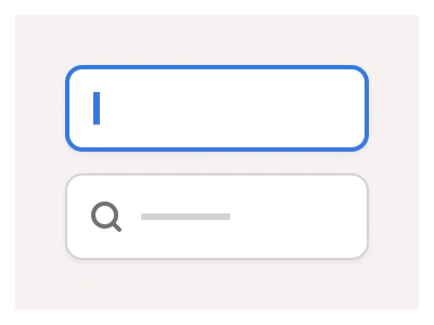
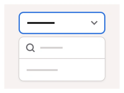
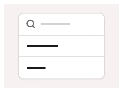
The Select component allows users to select from a predefined list of options. It includes a text input and a pop-up with a Dropdown list component.
By adjusting the Select's nested properties, you can customize the number of items available in the Dropdown component instance. Additionally, you can modify the UI style of the Select from a classic variant to underlined to make it better align with the current layout.
Select Box Anatomy
| Set | Variants | Properties |
|---|---|---|
| Select | 24 | Type Secondary, DefaultSize Large, Medium, SmallState Disabled, Focused, Hover, Default |
Select is one set of 24 variants — Default and Secondary types, Small, Medium and Large sizes, with Default, Hover, Focused and Disabled states — a text field that opens a nested Dropdown list whose item count is a property.
Select Box AI Prompt
Paste this into Claude, ChatGPT, or Figma Make:
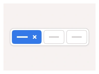
Build a select component in Figma as one set of 24 variants: Default type with a border and Secondary type with an underline only, Small, Medium and Large sizes, and Default, Hover, Focused and Disabled states. Field: a label above, the field with placeholder or selected text and a chevron on the right, a helper line below; Hover tints the border, Focused shows an accent ring and flips the chevron, Disabled lowers the opacity. Attach the dropdown list to the Focused variants as a nested instance: a floating card listing four to eight options with an Items property, each option with an optional leading icon, a Hover highlight and a Selected row with a tick, plus an optional search field at the top and a group label row. Add an Error state with a red border and message, and a Multi Boolean that shows selected values as chips inside the field. Wire Default to Focused and an option click back to Default with the value filled, keep spacing per size on auto layout, and bind colours to variables.
Figma Select
Select
select component
select dropdown
figma select
Interactive component