Figma Button Examples
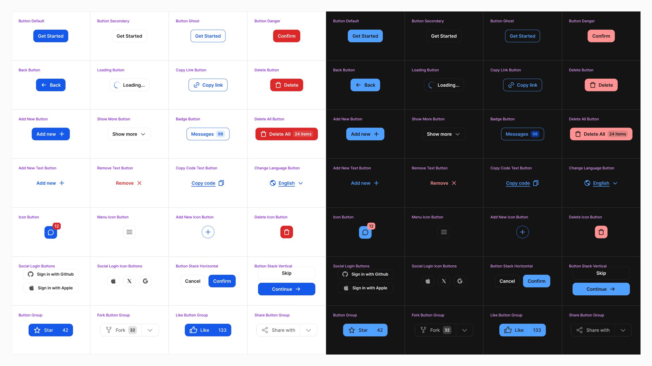
Figma Buttons UI Kit
A collection of high-quality buttons for Figma. The file include best practices for creating buttons using Figma variables and variants. It includes multiple types of buttons, such as regular buttons, icon buttons, and button groups.
Perfect resource for product designers and design system creators looking to improve their button design with the latest Figma features.
How to use Button Examples in Figma
You can customize each button by adjusting component properties such as Size, Type, and State directly in the right sidebar.
Use Prototype mode to preview interaction behaviors and see how buttons respond in different UI scenarios.
Use variable modes to update the button's appearance and switch between them.
Resource name
Button Examples
Features
Components & Variables
Format
Figma
Size
225 KB
More Figma resources
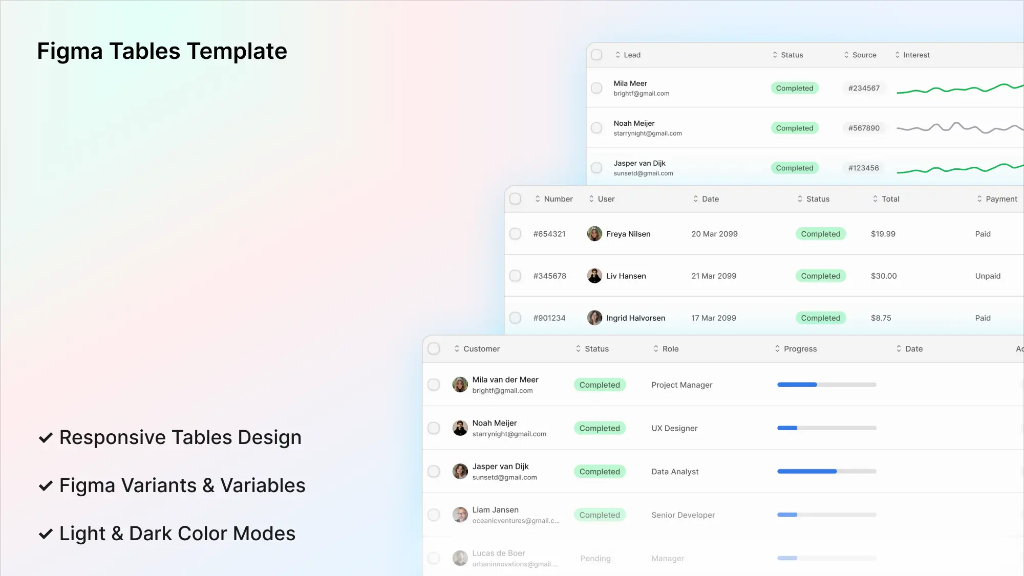
Figma Tables Template
figma tables
table template
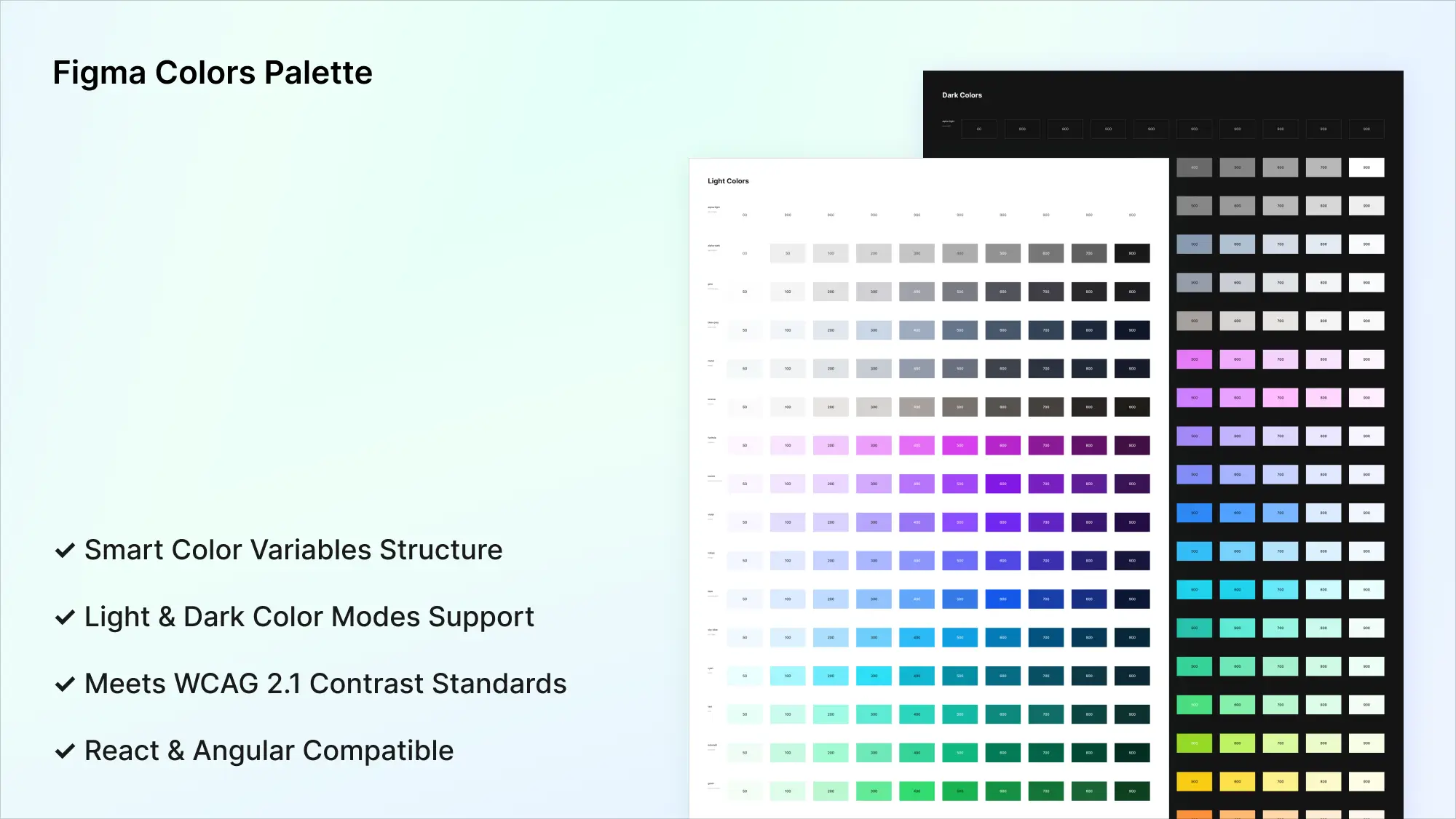
Figma Colors Palette
ui colors
figma colors
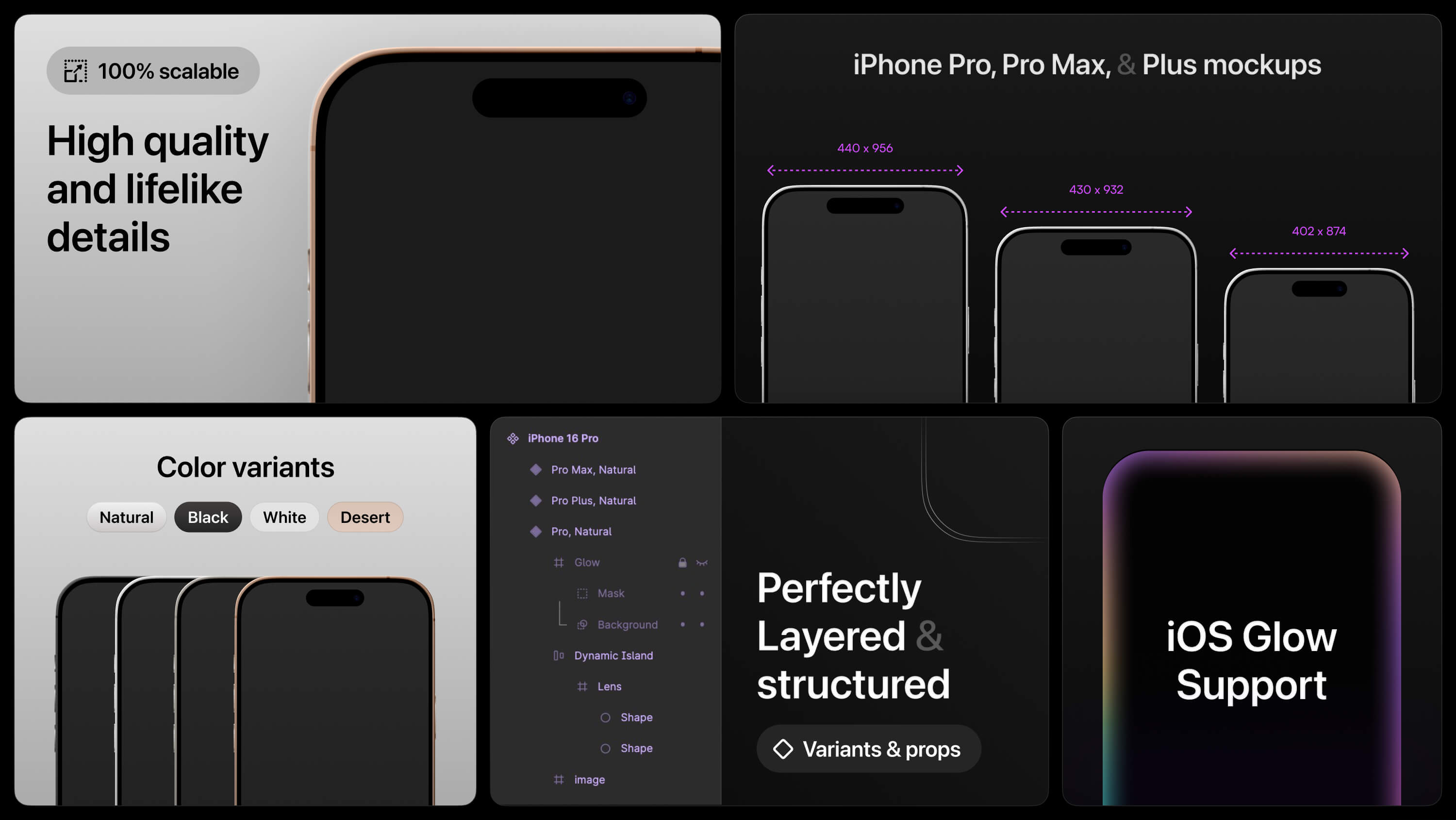
Figma iPhone Mockup
figma iphone 16
iphone mockup
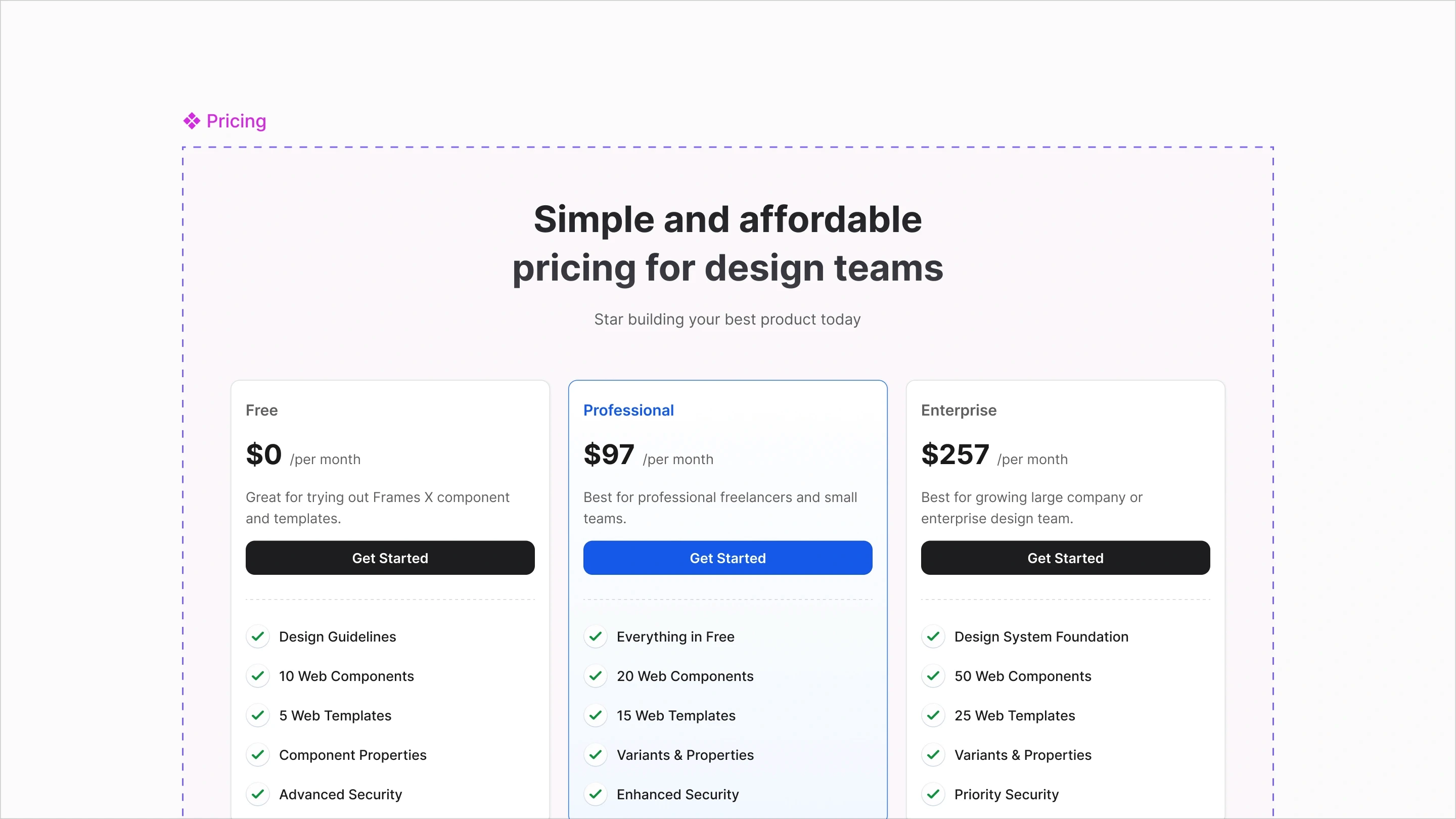
Figma Pricing Template
figma pricing
pricing template
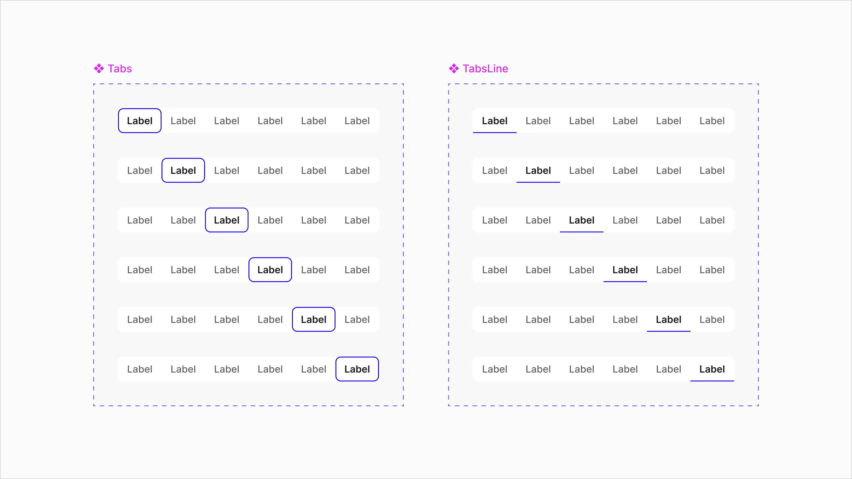
Figma Tabs Template
ui tabs
tabs component
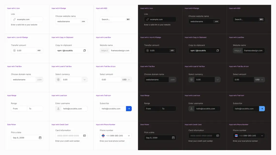
Figma Forms Examples
figma forms
input component
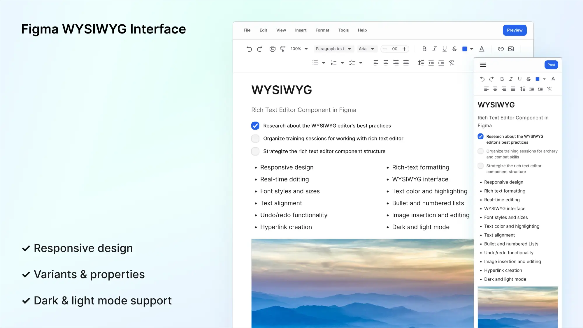
Figma WYSIWYG Interface
wysiwyg interface
text editor
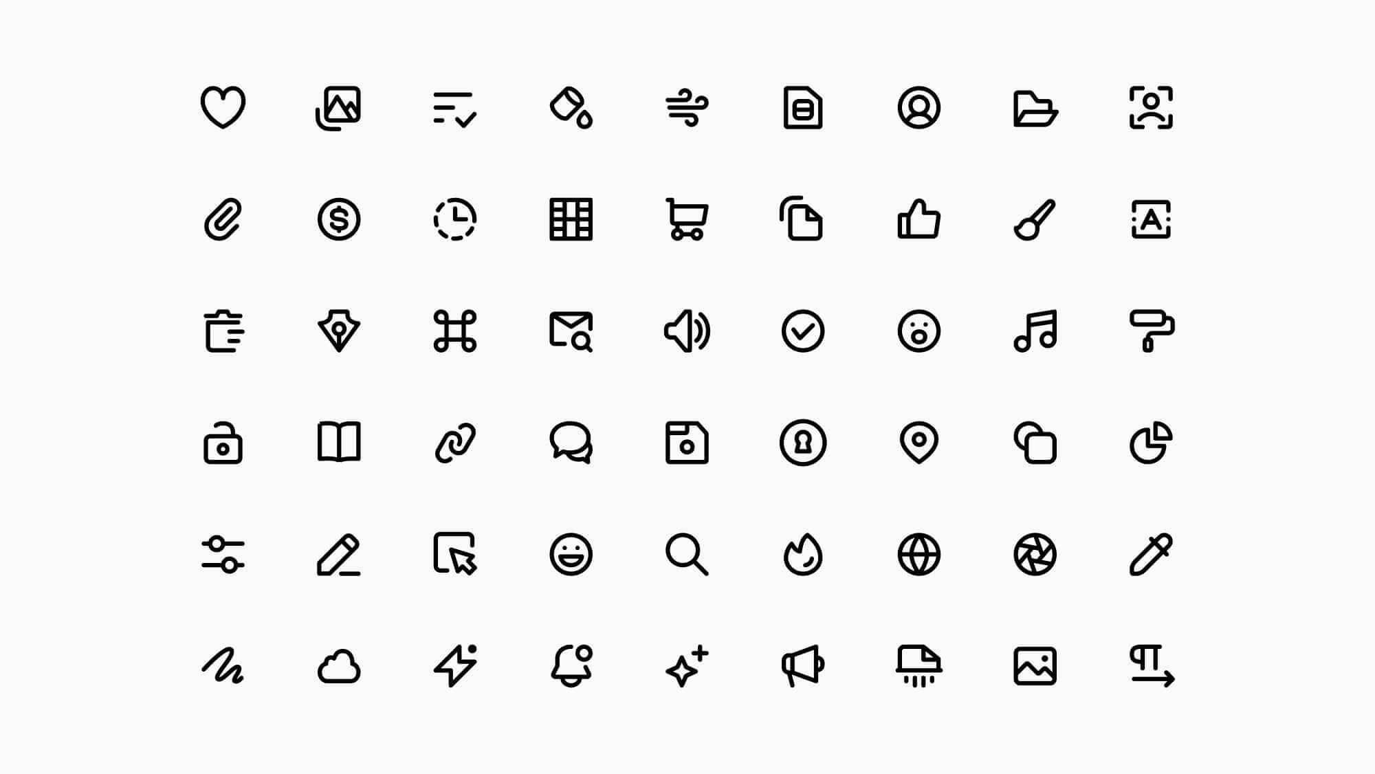
Super Basic Icons
ui icons
free icons
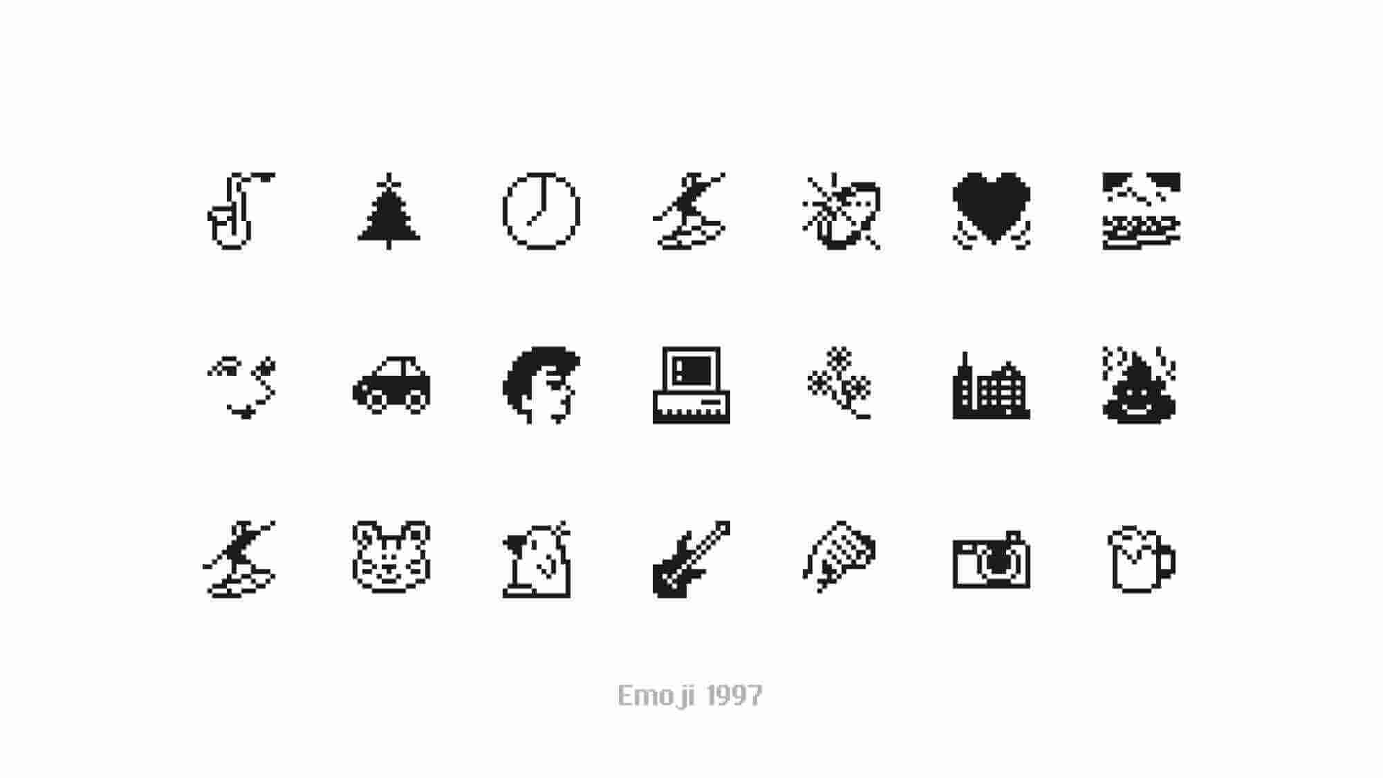
Emoji 1997 SVG Icons
emoji
free icons
Free icons to copy and paste


