Figma Footer Bar
Figma Footer Bar
Preview
Figma Footer Bar
Figma Footer Bar Component
The Footer Bar component anchors the bottom of a website or application, providing a crucial finishing touch to your interface, such as navigation links, branding elements, or extra calls to action.
Footer Bar Anatomy
| Set | Variants | Properties |
|---|---|---|
| FooterBar | 10 | Type Navigation, Columns, Logo, Social, SubscribeAlign Left, Center |
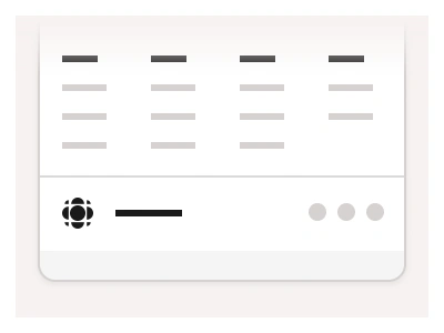
The FooterBar set has ten variants — Navigation, Columns, Logo, Social and Subscribe types, each aligned Left or Center — spanning a slim logo-and-social bar to a four-column link grid.
Footer Bar AI Prompt
Paste this into Claude, ChatGPT, or Figma Make:
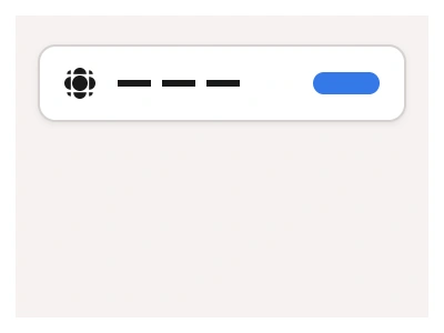
Build a FooterBar component in Figma as one component set of ten variants: five types, each in Left and Center alignment. Navigation: a slim bar with the logo and brand name on the left and a row of text links. Columns: a taller footer with four link columns, each a bold column title over three or four muted link rows. Logo: just the logo mark, brand name and a copyright line. Social: logo and name on the left, three round social icon buttons on the right. Subscribe: a headline, a short supporting line, an email input and a primary button side by side. In the Center alignment stack the same content centred on the vertical axis. Keep the bar full-width with auto layout, the links as nested text components with a hover style, and a top divider stroke on every type so the footer separates from the page content above it. Bind text, fills and the divider to colour variables so the component restyles across themes without detaching instances.
Figma Footer Bar
Footer Bar
footer example
footer bar component
figma footer bar
Interactive component
Premium Figma UI Kit & design resources
Explore high-quality Figma components, templates, and UI elements.