Figma Button Group
Figma Button Group
Preview
Figma Button Group
Figma Button Group
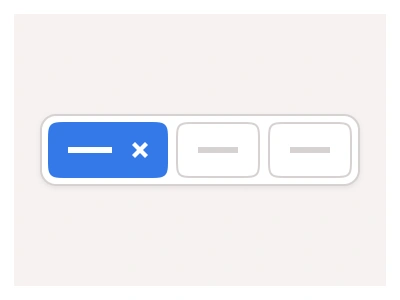
The Button Group component combines multiple Buttons or Toggles into one flexible component.
Button groups provide multiple options for logically linked actions, pages, or links. You can use button groups to switch between UI sections, create toolbars, and split buttons, or group related actions together (e.g., "Previous/Next," "Bold/Italic/Underline")
Button Groups UI Best Practices
Only group buttons that are truly related in function - don't group actions just because they appear on the same screen. If actions or options are not related to each other, consider using Tabs instead.
Combine button groups with other UI elements to create advanced filters or controls. Adapt button styles from primary to secondary to match with surrounding elements.
ButtonGroup composes the kit's Button instances into one row for linked actions — segmented toggles, toolbars, split buttons and Previous/Next pairs — with primary and secondary styles and a configurable item count.
Button Group AI Prompt
Paste this into Claude, ChatGPT, or Figma Make:
Build a button group component in Figma that composes existing Button instances. Base: a horizontal row of two to six buttons sharing one rounded border, inner dividers between them and only the outer corners rounded, with an Items property to set the count. Styles: Primary with a filled accent, Secondary with a white fill and grey border, and Ghost with no border. Sizes: Small, Medium and Large matching the kit's Button heights. States per item: Default, Hover, Active with a tinted fill for the selected segment, and Disabled. Variants: a segmented control where exactly one item is active; a toolbar with icon-only buttons such as Bold, Italic and Underline; a split button with a main label and a chevron dropdown segment; and a Previous/Next pager with arrow icons. Build each item as a nested Button instance so labels, icons and states swap from the kit, and keep the group on auto layout so adding an item never breaks the shared border.
Figma Button Group
Button Group
button group example
button group component
figma button group
Interactive component
Premium Figma UI Kit & design resources
Explore high-quality Figma components, templates, and UI elements.