Oct 5, 2024

Dmitriy Bunin
Frames X Root: The Ultimate Figma Wireframe UI kit
Unleashing maximum creativity with Figma wireframes
wireframe UI kit
Figma wireframes
Figma is famous for its advanced features, such as variables, components, and auto layout - the holy trinity of modern design tools. These features enable designers to craft detailed design systems that mirror real-world programming concepts.
While these features are super helpful for complex design system projects, they can sometimes overshadow the pure creativity and ideation that wireframes actually need.
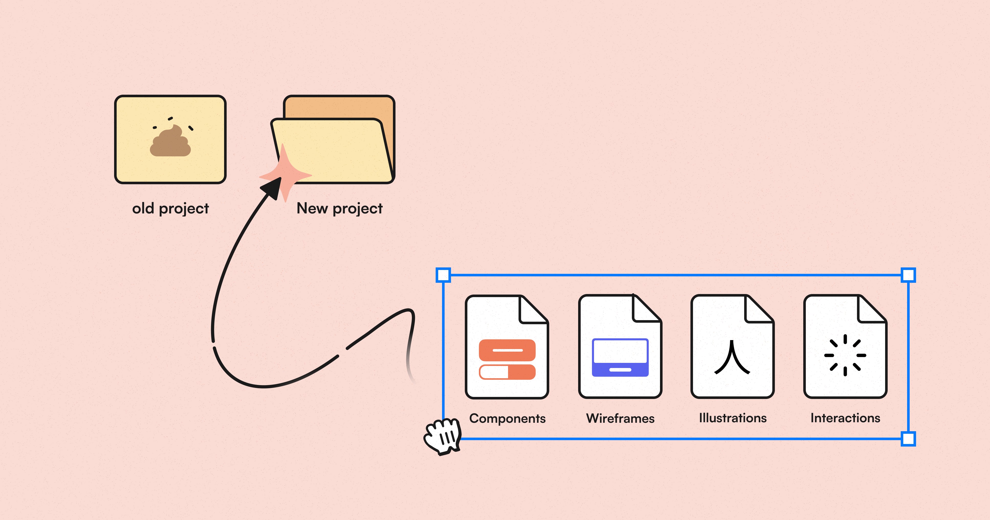
Enter Frames X Root—The Ultimate Figma Wireframe UI Kit!
In an era dominated by all-in-one, enterprise-level design systems, Frames X Root offers a refreshing alternative. It uses Figma's advanced features and polished UI resources for unhinged design, freeing you from the constraints of complex business logic and rigid UI kits.
With Frames X Root, you can:
Focus on actual design without wrestling with overly complex UI kits. Explore the power of Figma variables, experiment, and customize them easily.
Prototype rapidly. Move from rough wireframes to polished concepts in a few clicks.
Create wireframes faster using pre-built Figma components, wireframe examples, and illustrations.
Frames X Root isn't just a tool—it's your Figma UI design sandbox! With Root, you can focus on framing your ideas. In a world of intricate design systems, Frames X Root roots for pure design joy.
Watch Frames X Root UI kit promo video ↓
Reimagining wireframe with Figma variables
Frames X Root is the evolution of our popular Root UI kit, now supercharged with Figma variables and our extensive experience building reusable UI kits and design systems.
Root playful style infuses your work with a cartoonish, chunky vibe. This funky style encourages the free flow of ideas, helping you take concepts on the screen less seriously.
But don't let the fun fool you, Frames X Root is built for scalability. When you're ready to move into more complex territory, you can seamlessly transition from wireframes to a full-fledged design system.
This transformation is possible due to our world-famous Figma variable structure and our expertise in crafting reusable UI kits. You can find more information about how we use Figma variables from our Intro to Figma variables guide.
From low-fidelity wireframes to high-fidelity designs
Using Figma variables, you can switch the main font Rubik to low-fidelity alternatives such as Flow (Font B) or Redacted (Font C), instantly adding that pure wireframe aesthetic to your work.
This simple font swap is more than just a visual change—it's a powerful tool in your design process. When needed, you can shift from low-fidelity wireframes that emphasize structure and layout to more refined, detailed designs.
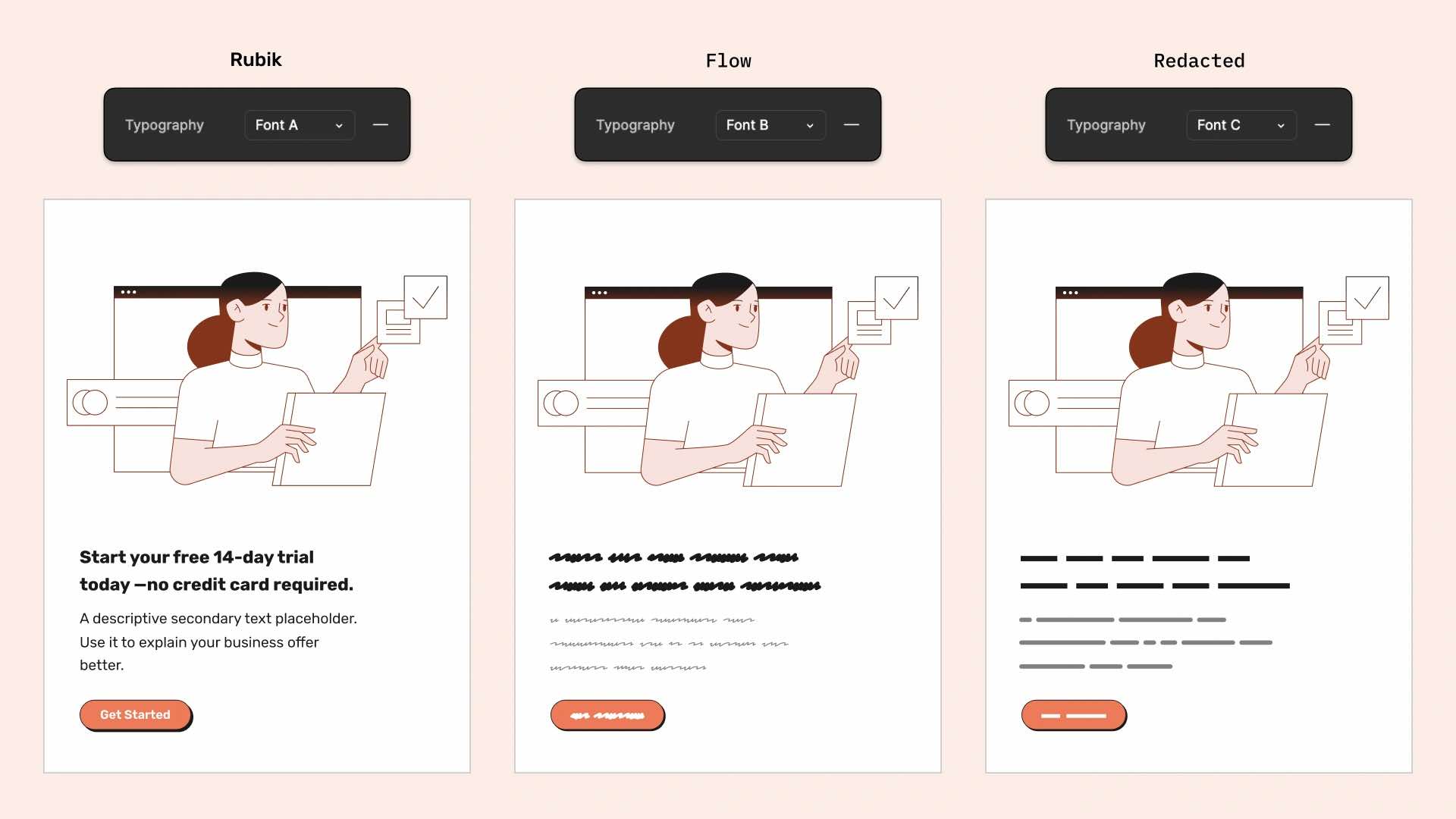
Use this Figma trick to brainstorm initial concepts or lay the groundwork for future design systems. For example, if the text copy of your project is not ready yet or you haven't done it, you can always switch to wireframe mode and stay focused on what is more important at the moment.
To switch, you only need to change the Typography variables available in the UI kit. e.g., switch Font A to Font B. You can also add your fonts or replace existing ones from the Figma variables menu. Additionally, we've found more free fonts you can use with our wireframes UI Kit:
Featured fonts are great for creating wireframes, as they provide a hand-drawn or sketchy look that perfectly matches Root UI kit aesthetics.
All mentioned fonts are free for personal use, but be sure to check the specific license terms before using them in commercial projects.
Frames X Root: Figma variables for color theming
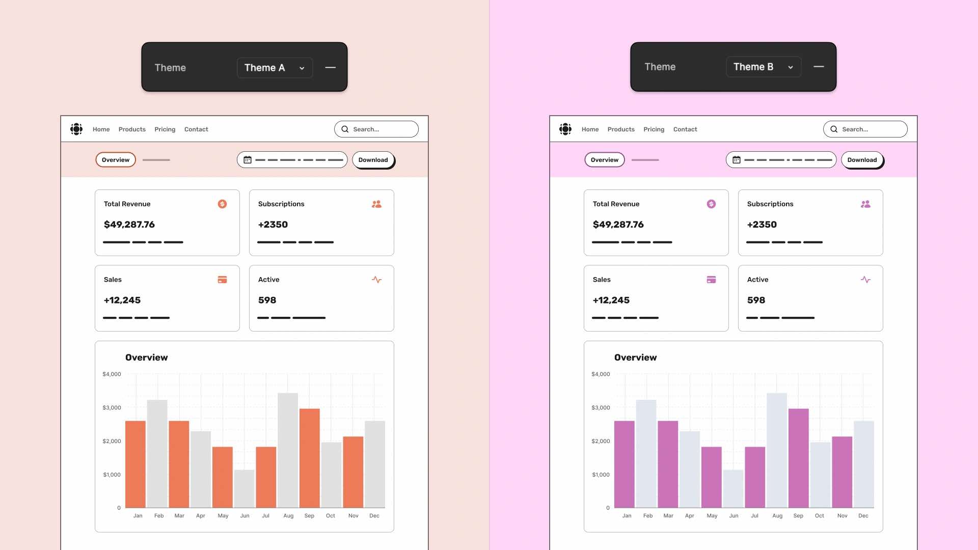
Frames X Root offers you full flexibility not only with typography but also with colors. Our wireframes implement a dual-layer color system: Color Modes and Themes.
Color Modes are responsible for the standard light and dark colors, allowing you to test your ideas in both light and dark mode designs.
Themes, on the other hand, are tailored for brand-specific customization. With Themes, you can swap out the primary orange color with any color you want for your brand and both light and dark modes will follow.
With Frames X Root, you only need to manage 10 key colors, making visual experiments super easy and fun. You can restyle the entire project in seconds and test multiple color palettes.
With this structure, you can add more color palettes as your Theme modes and test as many different styles as your Figma plans allow.
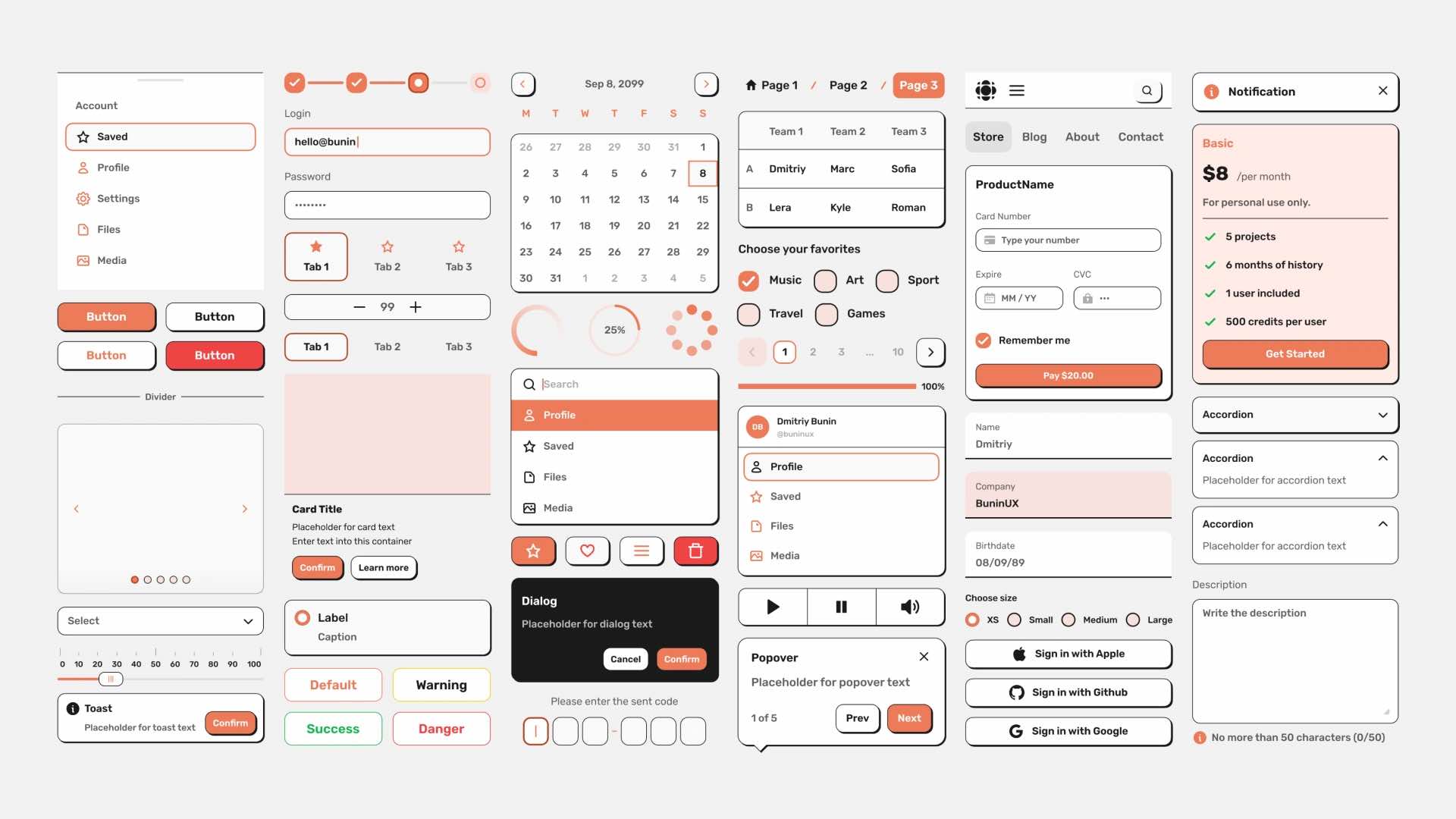
Wireframe components for rapid prototyping
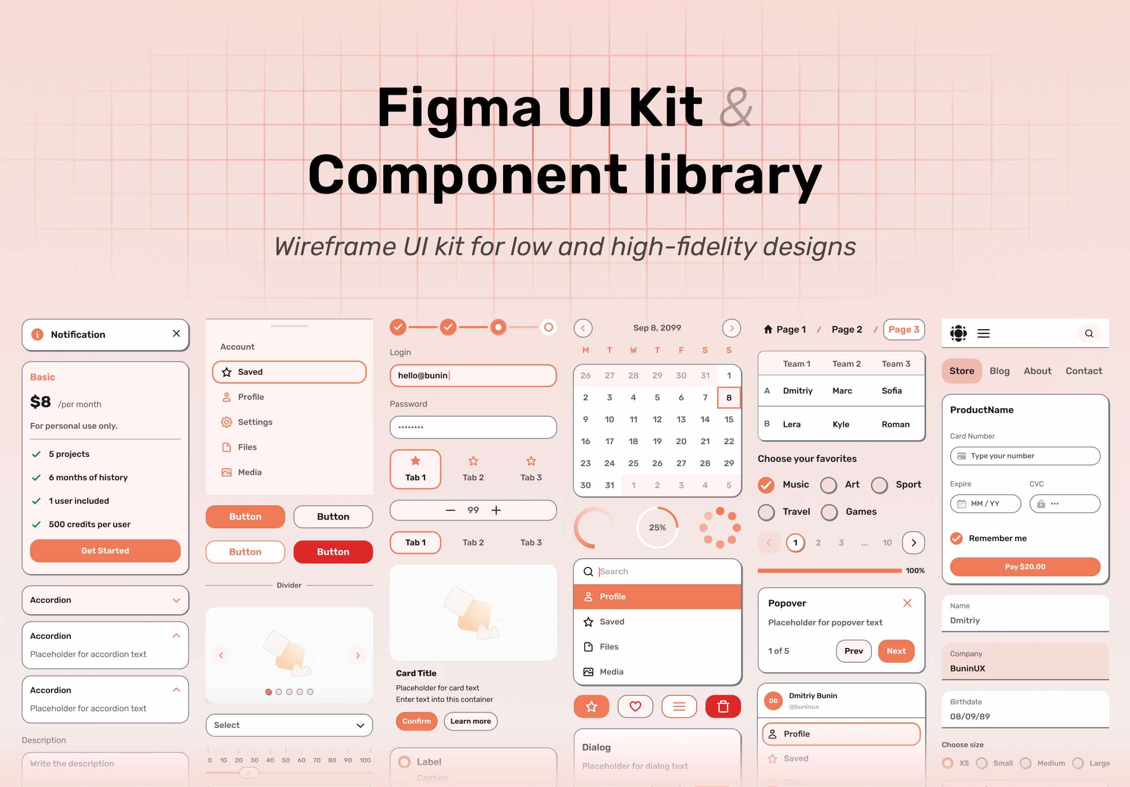
In addition to variables, The Frames X Root UI kit includes 80 component types and more than 500+ component variants. These practical Figma components provide an extensive toolkit for efficient and professional wireframing.
Our most common UI components feature built-in animations for standard interactions such as click, press, and hover states. These pre-made interactions will help you create prototypes and animate static wireframes.
You can find and test all animated components on the Interactive Playground page by clicking the Play (▷) icon.
Frames X Root components are simple yet highly customizable. You can use Figma component properties to adjust the size, state, and other UI details, creating higher fidelity wireframes.
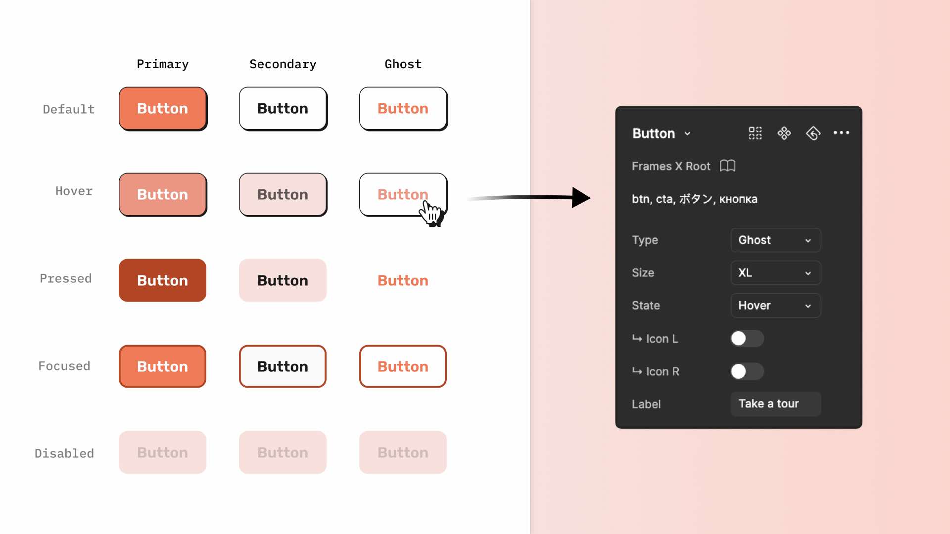
Bonus: Additionally, our wireframes UI kit includes tags to help you find components faster in Figma. Simply type the first letter of the Tag, and Figma will highlight the rest.
Figma components visualizer
Frames X Root UI kit features a powerful Theme Visualizer, a dedicated page that dynamically displays component appearances based on your Figma variables configuration.
This tool allows real-time previews of style changes across all components, enabling precise customization for your wireframe designs.
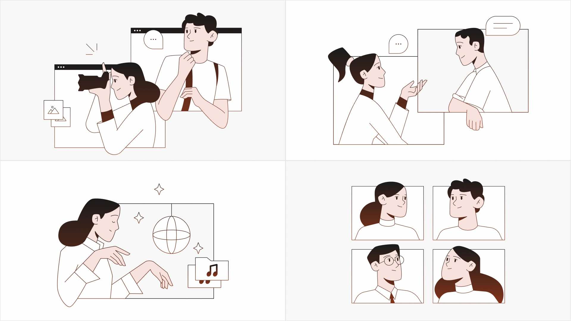
Root wireframe illustrations
Due to wireframes' minimalistic style and sometimes unrealistic content, designed wireframes can sometimes leave viewers confused about what they're looking at, especially if they're not familiar with the technical aspects of design.
Our UI kit offers a solution to this issue. It includes 24 unique illustrations and over 100+ graphics elements to enrich your wireframes. These visual elements add extra flavor and depth to your designs, making the whole project or idea easier to understand.
Each illustration depicts a popular website or application concept or topic, giving the design more meaning. All root illustrations are compatible with Figma variables and feature resizable SVG shapes, ensuring they fit easily into your projects.
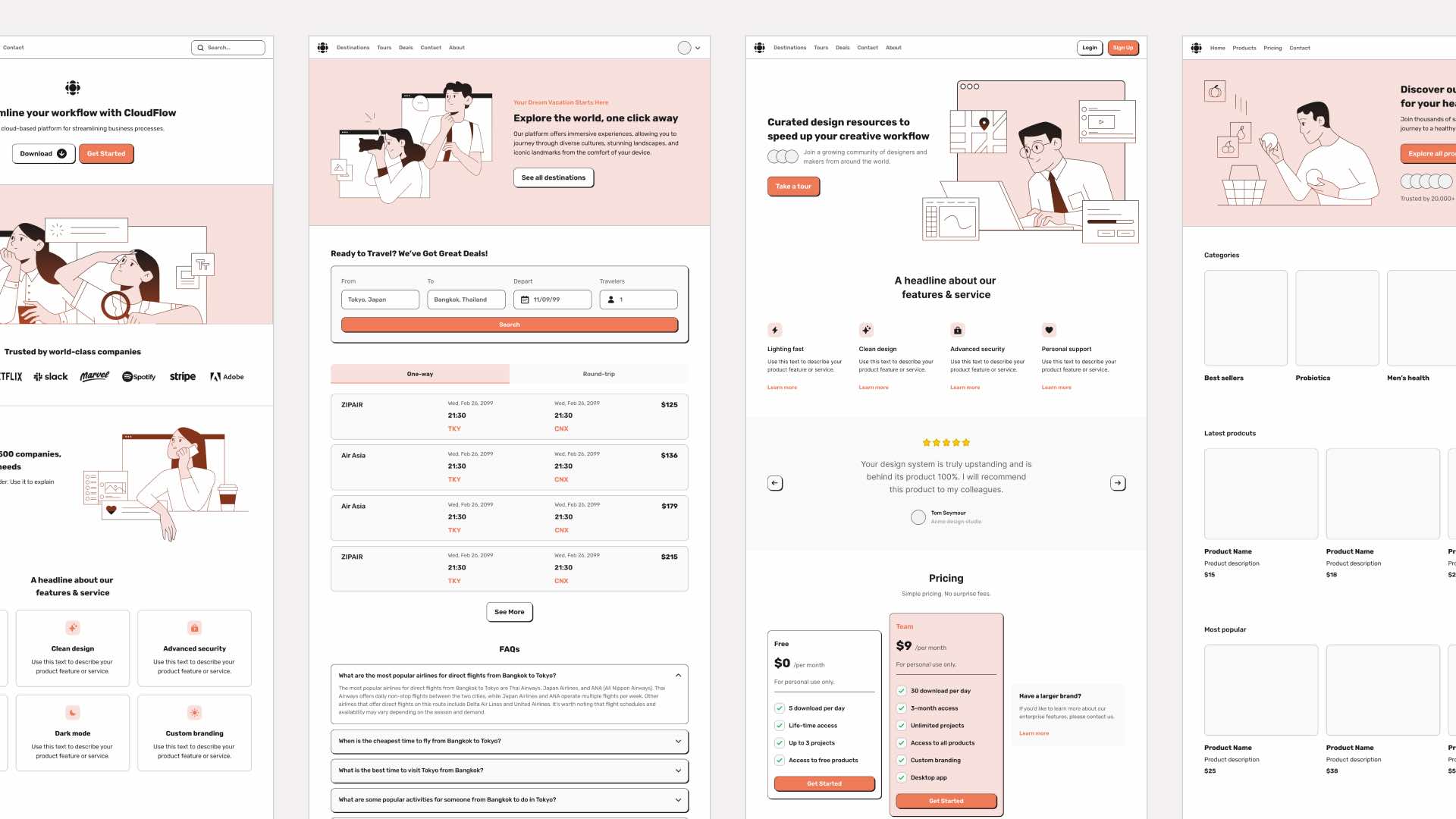
Wireframes examples
In addition to its powerful wireframing tools, Frames X Root provides a set of wireframe templates. These boilerplates are an ideal foundation to kickstart your project, offering inspiration and saving time on your wireframing journey.
These pre-built wireframe examples are not only 100% resizable but also fully support Figma's variables, allowing you to transform and use them as a playground or constructor for your ideas.
Every template is built from unique and reusable blocks. Each block can be customized further, dragged around, and combined to create unique layouts and wireframes.
Conclusion: benefits of using a wireframes
The importance of wireframes in interfaces should be considered. Can you imagine building your own house without a preliminary plan and design project? That may be an unwise decision.
The same goes for your digital product or brand. If you want your work to look like you envisioned it, a design process with wireframes will be extremely helpful. Meanwhile, skipping this phase might be the reason why people don’t even start using your product.
That's the wrap!
Frames X Root is built to encourage creativity in early-stage ideation with its intentionally rough style. Unlike more opinionated UI kits, Frames X Root's intentionally chunky, playful style helps prevent attachment to specific designs while you're still in the initial stages of development.
Our wireframe UI kit includes everything from UI elements and icons to full-made wireframe examples—all following one unique, vibrant style.
Preview and download the full version below to level up your design process.
Figma is famous for its advanced features, such as variables, components, and auto layout - the holy trinity of modern design tools. These features enable designers to craft detailed design systems that mirror real-world programming concepts.
While these features are super helpful for complex design system projects, they can sometimes overshadow the pure creativity and ideation that wireframes actually need.
Enter Frames X Root—The Ultimate Figma Wireframe UI Kit!
In an era dominated by all-in-one, enterprise-level design systems, Frames X Root offers a refreshing alternative. It uses Figma's advanced features and polished UI resources for unhinged design, freeing you from the constraints of complex business logic and rigid UI kits.
With Frames X Root, you can:
Focus on actual design without wrestling with overly complex UI kits. Explore the power of Figma variables, experiment, and customize them easily.
Prototype rapidly. Move from rough wireframes to polished concepts in a few clicks.
Create wireframes faster using pre-built Figma components, wireframe examples, and illustrations.
Frames X Root isn't just a tool—it's your Figma UI design sandbox! With Root, you can focus on framing your ideas. In a world of intricate design systems, Frames X Root roots for pure design joy.
Watch Frames X Root UI kit promo video ↓
Reimagining wireframe with Figma variables
Frames X Root is the evolution of our popular Root UI kit, now supercharged with Figma variables and our extensive experience building reusable UI kits and design systems.
Root playful style infuses your work with a cartoonish, chunky vibe. This funky style encourages the free flow of ideas, helping you take concepts on the screen less seriously.
But don't let the fun fool you, Frames X Root is built for scalability. When you're ready to move into more complex territory, you can seamlessly transition from wireframes to a full-fledged design system.
This transformation is possible due to our world-famous Figma variable structure and our expertise in crafting reusable UI kits. You can find more information about how we use Figma variables from our Intro to Figma variables guide.
From low-fidelity wireframes to high-fidelity designs
Using Figma variables, you can switch the main font Rubik to low-fidelity alternatives such as Flow (Font B) or Redacted (Font C), instantly adding that pure wireframe aesthetic to your work.
This simple font swap is more than just a visual change—it's a powerful tool in your design process. When needed, you can shift from low-fidelity wireframes that emphasize structure and layout to more refined, detailed designs.
Use this Figma trick to brainstorm initial concepts or lay the groundwork for future design systems. For example, if the text copy of your project is not ready yet or you haven't done it, you can always switch to wireframe mode and stay focused on what is more important at the moment.
To switch, you only need to change the Typography variables available in the UI kit. e.g., switch Font A to Font B. You can also add your fonts or replace existing ones from the Figma variables menu. Additionally, we've found more free fonts you can use with our wireframes UI Kit:
Featured fonts are great for creating wireframes, as they provide a hand-drawn or sketchy look that perfectly matches Root UI kit aesthetics.
All mentioned fonts are free for personal use, but be sure to check the specific license terms before using them in commercial projects.
Frames X Root: Figma variables for color theming
Frames X Root offers you full flexibility not only with typography but also with colors. Our wireframes implement a dual-layer color system: Color Modes and Themes.
Color Modes are responsible for the standard light and dark colors, allowing you to test your ideas in both light and dark mode designs.
Themes, on the other hand, are tailored for brand-specific customization. With Themes, you can swap out the primary orange color with any color you want for your brand and both light and dark modes will follow.
With Frames X Root, you only need to manage 10 key colors, making visual experiments super easy and fun. You can restyle the entire project in seconds and test multiple color palettes.
With this structure, you can add more color palettes as your Theme modes and test as many different styles as your Figma plans allow.
Wireframe components for rapid prototyping
In addition to variables, The Frames X Root UI kit includes 80 component types and more than 500+ component variants. These practical Figma components provide an extensive toolkit for efficient and professional wireframing.
Our most common UI components feature built-in animations for standard interactions such as click, press, and hover states. These pre-made interactions will help you create prototypes and animate static wireframes.
You can find and test all animated components on the Interactive Playground page by clicking the Play (▷) icon.
Frames X Root components are simple yet highly customizable. You can use Figma component properties to adjust the size, state, and other UI details, creating higher fidelity wireframes.
Bonus: Additionally, our wireframes UI kit includes tags to help you find components faster in Figma. Simply type the first letter of the Tag, and Figma will highlight the rest.
Figma components visualizer
Frames X Root UI kit features a powerful Theme Visualizer, a dedicated page that dynamically displays component appearances based on your Figma variables configuration.
This tool allows real-time previews of style changes across all components, enabling precise customization for your wireframe designs.
Root wireframe illustrations
Due to wireframes' minimalistic style and sometimes unrealistic content, designed wireframes can sometimes leave viewers confused about what they're looking at, especially if they're not familiar with the technical aspects of design.
Our UI kit offers a solution to this issue. It includes 24 unique illustrations and over 100+ graphics elements to enrich your wireframes. These visual elements add extra flavor and depth to your designs, making the whole project or idea easier to understand.
Each illustration depicts a popular website or application concept or topic, giving the design more meaning. All root illustrations are compatible with Figma variables and feature resizable SVG shapes, ensuring they fit easily into your projects.
Wireframes examples
In addition to its powerful wireframing tools, Frames X Root provides a set of wireframe templates. These boilerplates are an ideal foundation to kickstart your project, offering inspiration and saving time on your wireframing journey.
These pre-built wireframe examples are not only 100% resizable but also fully support Figma's variables, allowing you to transform and use them as a playground or constructor for your ideas.
Every template is built from unique and reusable blocks. Each block can be customized further, dragged around, and combined to create unique layouts and wireframes.
Conclusion: benefits of using a wireframes
The importance of wireframes in interfaces should be considered. Can you imagine building your own house without a preliminary plan and design project? That may be an unwise decision.
The same goes for your digital product or brand. If you want your work to look like you envisioned it, a design process with wireframes will be extremely helpful. Meanwhile, skipping this phase might be the reason why people don’t even start using your product.
That's the wrap!
Frames X Root is built to encourage creativity in early-stage ideation with its intentionally rough style. Unlike more opinionated UI kits, Frames X Root's intentionally chunky, playful style helps prevent attachment to specific designs while you're still in the initial stages of development.
Our wireframe UI kit includes everything from UI elements and icons to full-made wireframe examples—all following one unique, vibrant style.
Preview and download the full version below to level up your design process.
If you still have any questions not covered on this page, or if you need additional support, please let me know at hello@buninux.com. I’m always here to help as quickly as possible.
Frames X Root is free to all Frames X design system subscribers and Lifetime license owners. If you have an ongoing license, you don't need to buy this kit.
Keep designing and evolving. Make love, not war. And see you in the next article! ♥
Posts
The Perfect Figma Tabs Component
Frames X v2.7: Figma Design System at Scale
Best Figma Plugins for UI Design and Design Systems
Best Practices for UI Color Palettes in Figma
WYSIWYG UI: How to Design a Text Editor in Figma
Frames X v2.6: Universal UI Kit and Component Library
Best Free Icons Pack for UI Design and Development
Frames X v2.5: Largest UI kit in the World Updated
Figma Tips and Tricks to Work Efficiently
Frames X v2.4: Typography Variables, Components and Charts