Sep 24, 2024

Dmitriy Bunin
Frames X v2.7: Figma design system at scale
What's new in Frames X UI Kit v2.7
Figma UI kit
design system
Hey there! We're thrilled to share the release of Frames X 2.7!
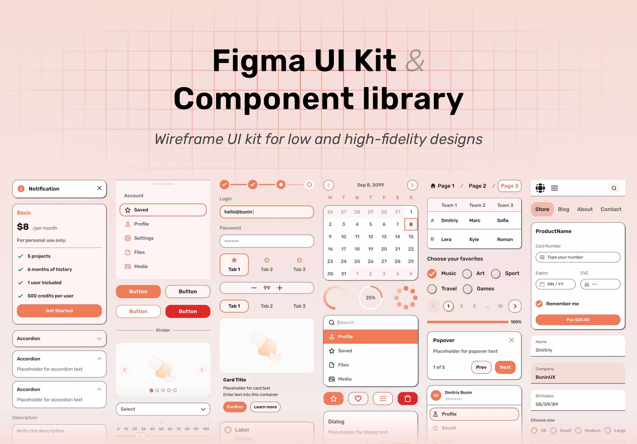
This update introduces a new wireframe UI kit: Frames X Root—A revival of our popular Root Wireframe Kit. Frames X Root offers the perfect toolset for rapid wireframing and ideation.
Frames X Root UI kit key features:
Cute and unique style with its own vibe to make your wireframes stand out
Flow and Redacted fonts for clutter-free, minimal wireframes and mockups
100% Integration with Figma variables for efficient workflow
80 Components for reliable designs and wireframes
UI components interactions examples for even-faster prototyping
Additionally, Frames X 2.7 includes:
New components and updates to previous ones
New radar charts and responsive design templates
Effects page rework and new inner shadow styles
Frames X 2.7: New wireframe UI kit for Figma, design templates, components, and effects
FramesX 2.7 expands its toolset, introducing a whole new UI kit, new Figma components, charts, templates, and styles. With this update, FramesX reinforces its position as the most comprehensive design system available for Figma to ever exist!
Our commitment to customization and quality ensures that FramesX remains your go-to choice for unparalleled UI kit experience. So, without further ado, let's dive into the update.
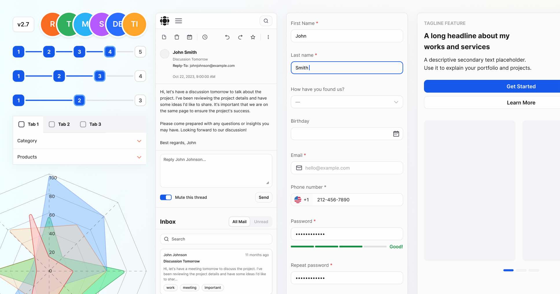
Frames X Root UI kit
We're excited to introduce Frames X Root UI Kit! Frames X Root is a joyful, wireframe-styled UI kit made as an addition to our design system. This compact and powerful tool enables faster prototyping and design compared to our main library.
With its unique aesthetics, Frames X Root empowers you to create unique, clean wireframes and mockups. Frames X Root includes 80 versatile UI components you can use to create unique design, prototupes, and wireframes.
The new wireframe UI kit adheres to Frames X Figma Variables, ensuring you have the same customization and theming toolset as the main library but with the benefit of faster operation.
Click the image link below to learn more ↓
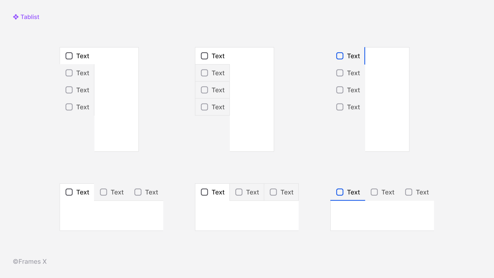
New Tablist UI component
We've introduced the Tablist components to help you create both horizontal and vertical tab panels. This versatile component offers three distinct styles and placements. You can customize the Tablist's direction and style to match it with any surface or layout.
Tablist UI helps organize design content into smaller, more digestible sections, improving user navigation and overall readability.
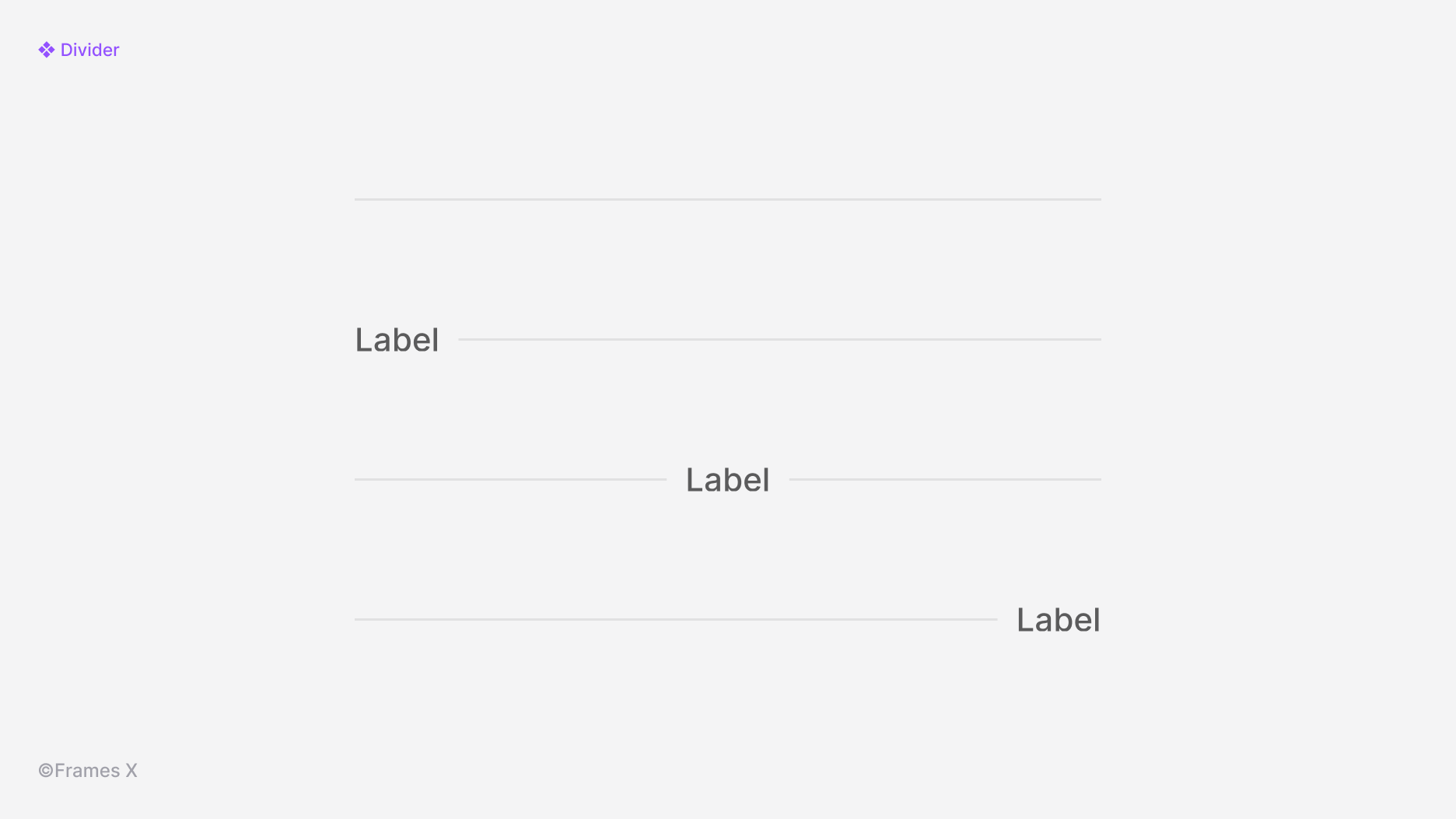
New Divider UI component
We've added a new Divider component to our design system. This versatile element allows you to visually separate content either horizontally or vertically with a thin line.
Frames X divider offers label text with multiple placement options, providing greater flexibility and customization than popular React solutions such as Material U divider.
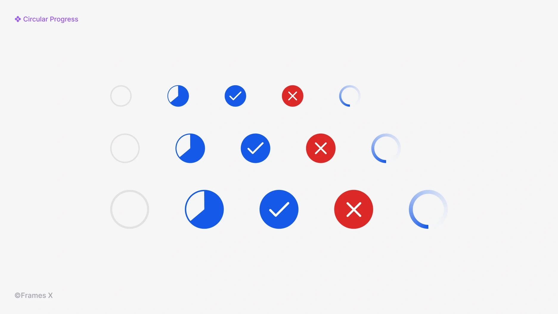
New Circular Progress UI component
We've added a new Circular Progress Bar component. Circle indicators can be integrated into any part of your interface to track the progress or completion status of a task.
The circle progress bar, compared to the linear indicators, can be easily integrated into buttons or other UI elements without messing up the design.
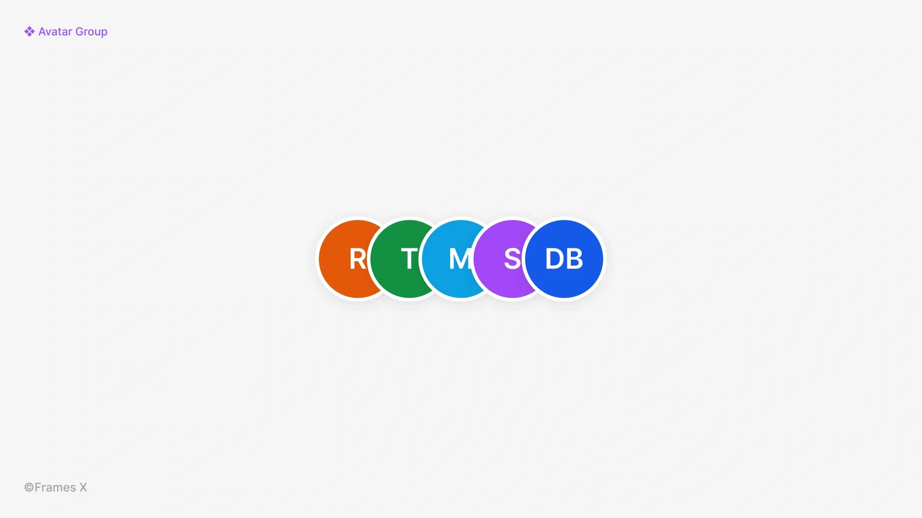
Updated Avatar Group components
We've added new Avatar Groups components. Avatar Groups enable a stacked display of multiple avatar components. Avatars with names, compared to image avatars, can improve general privacy in applications where user confidentiality is important.
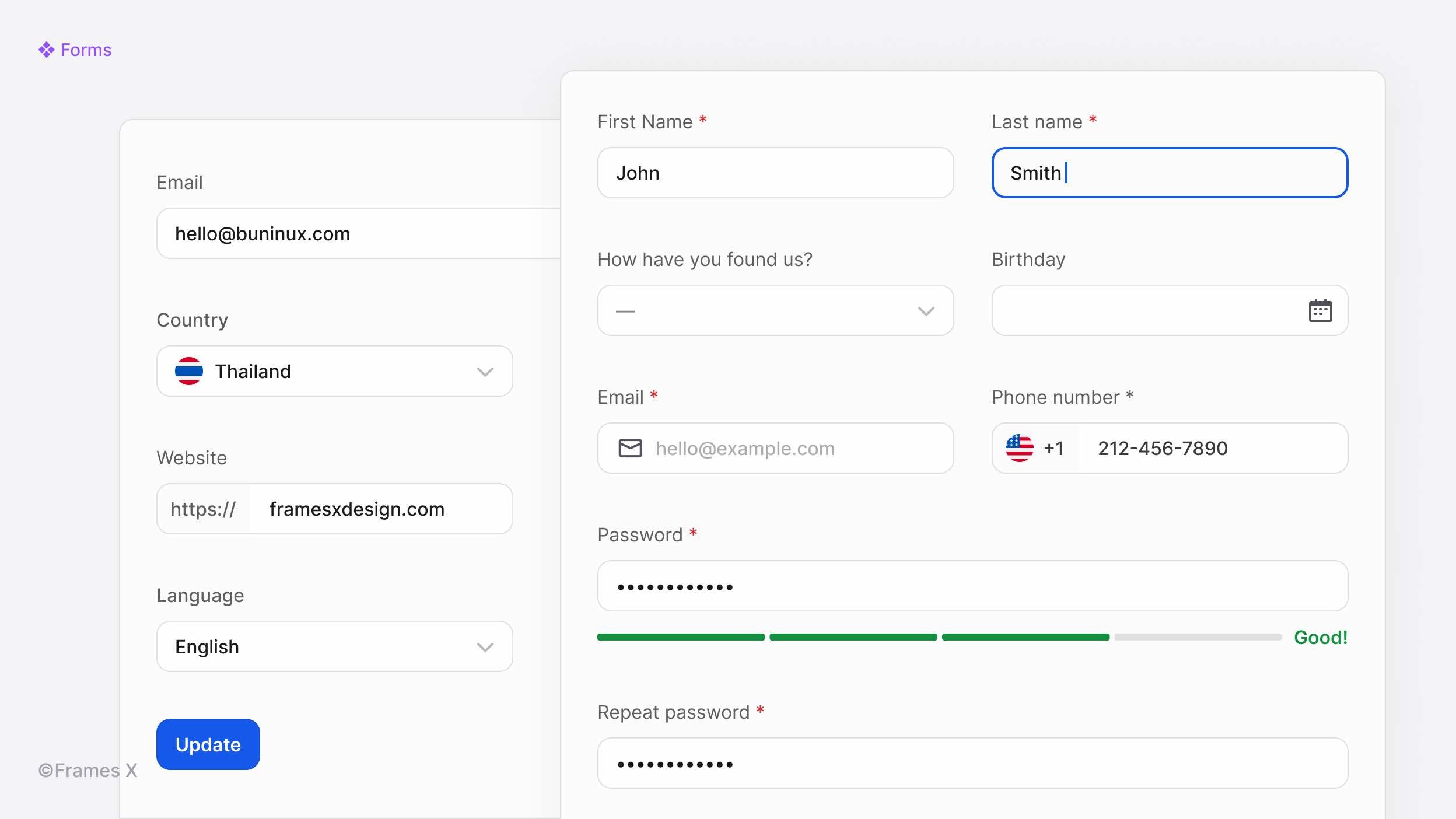
New UI Forms in Figma
We've added new Figma Forms templates and examples to help you better understand the difference between inputs and forms and use FramesX forms effectively.
The new Forms page contains examples and patterns to help you understand how we manage forms and their fields. Examples include User profiles, Settings, Registration, and Account Confirmation forms.
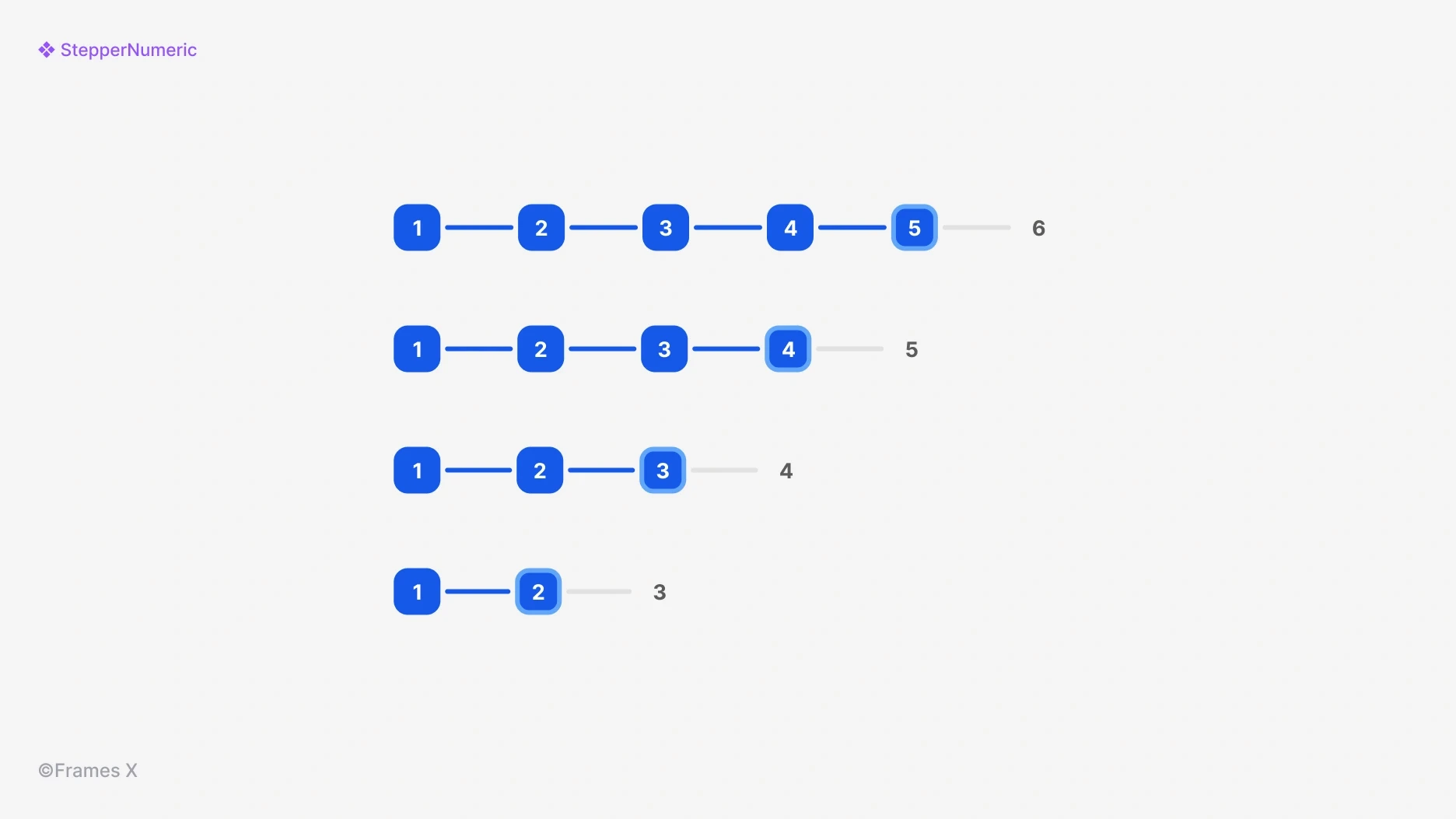
New Numeric Stepper UI component
We've introduced a new Stepper UI design: a Numeric Stepper component. This addition displays progress steps in numerical order, helping users better understand the total number of steps they need to complete.
Use the updated Stepper UI to break down a process into sequential interface steps and adjust the number of steps and Stepper type with updated component properties.
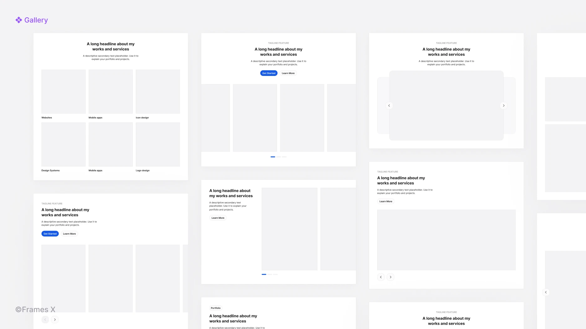
New Gallery UI blocks
We've added new Gallery UI templates to our Figma website builder.
Gallery UI contains multiple images, videos, or photos in a scrollable container. This new component allows users to browse through collections of products or related visual content.
You can use Gallery variants to create e-commerce and portfolio UI sections that showcase all of your products or focus user attention on a particular one.
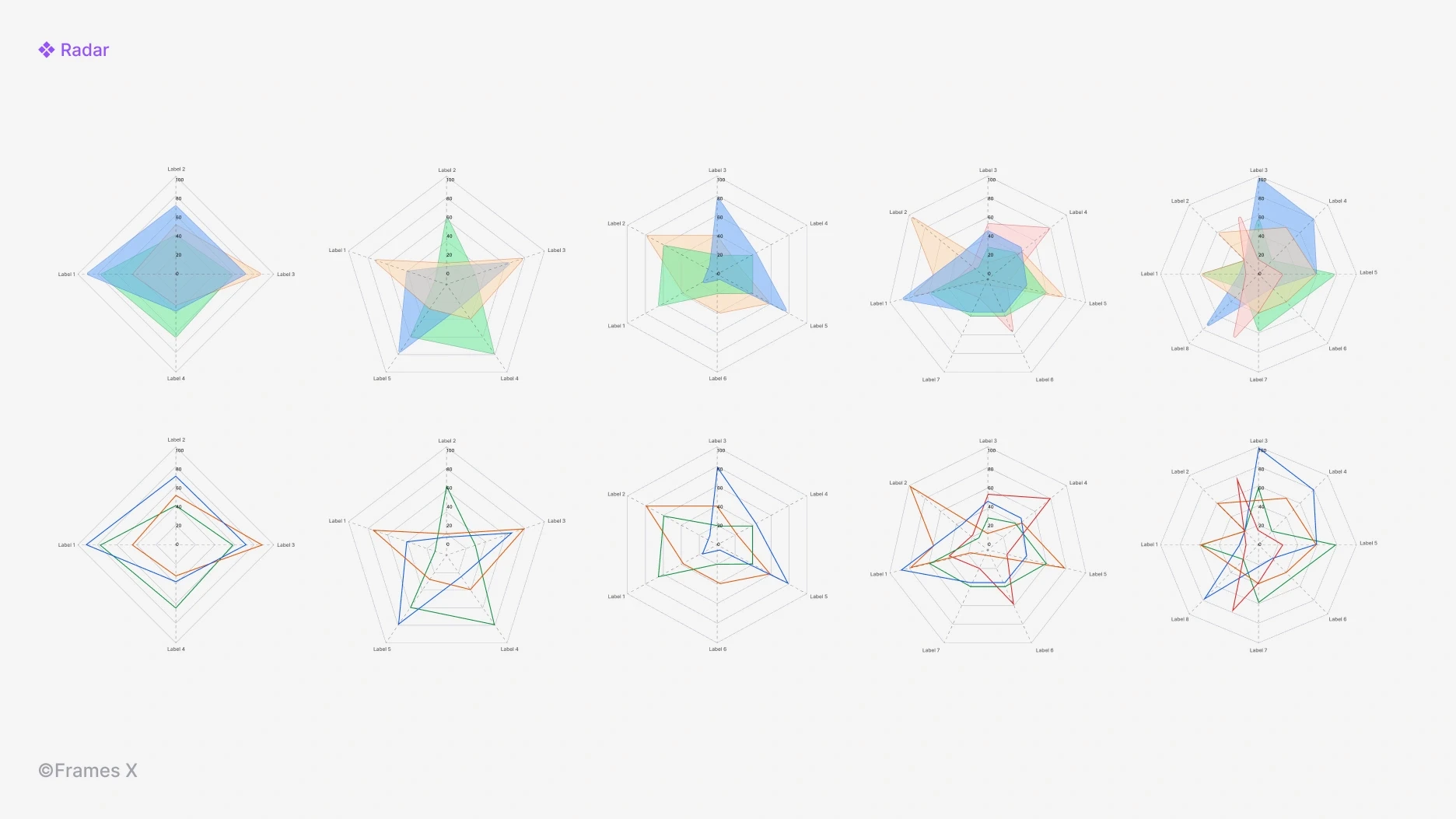
New Radar charts
We've added new Radar chart maker designs to our data visualization set.
Radar charts, also known as spider or radar diagrams, display data with multiple variables in a circular graph. You can use radar diagrams to compare different things or show how common factors relate to each other.
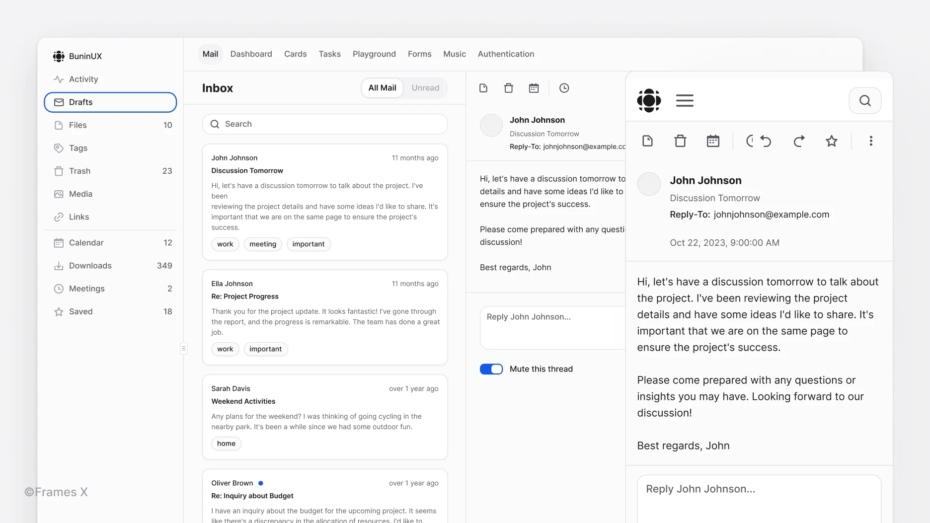
New Mail app dashboard template
We've added a new Mail application template to the Frames X design system.
The new Mail application design in Figma features an inbox view with a tagged email list, sender and subject information, a right-side panel showing open conversations, and an email preview with a composition interface.
You can utilize the new Mail UI Figma template to test user flows for common email actions such as creating, reading, and organizing messages.
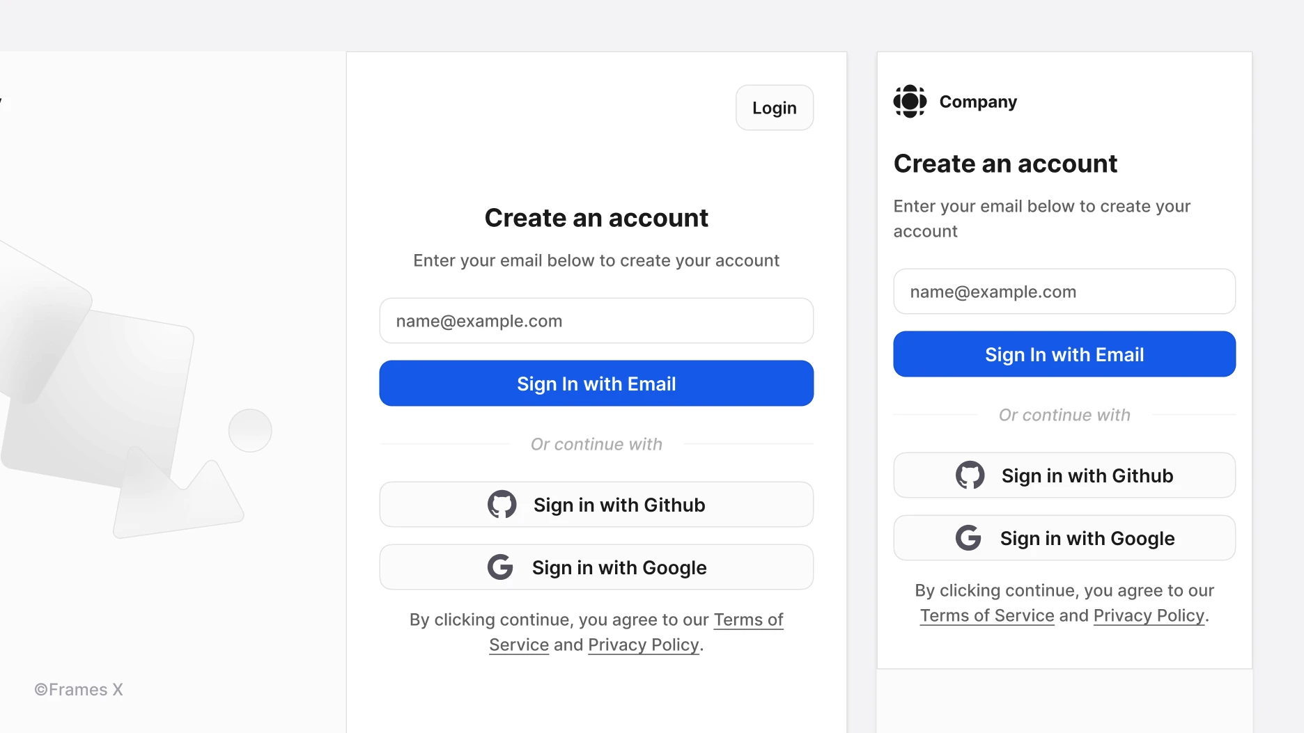
New Authentication template
We've added a new Authentication UI template to the Frames X design system. The new authentication page contains the login and registration flow template.
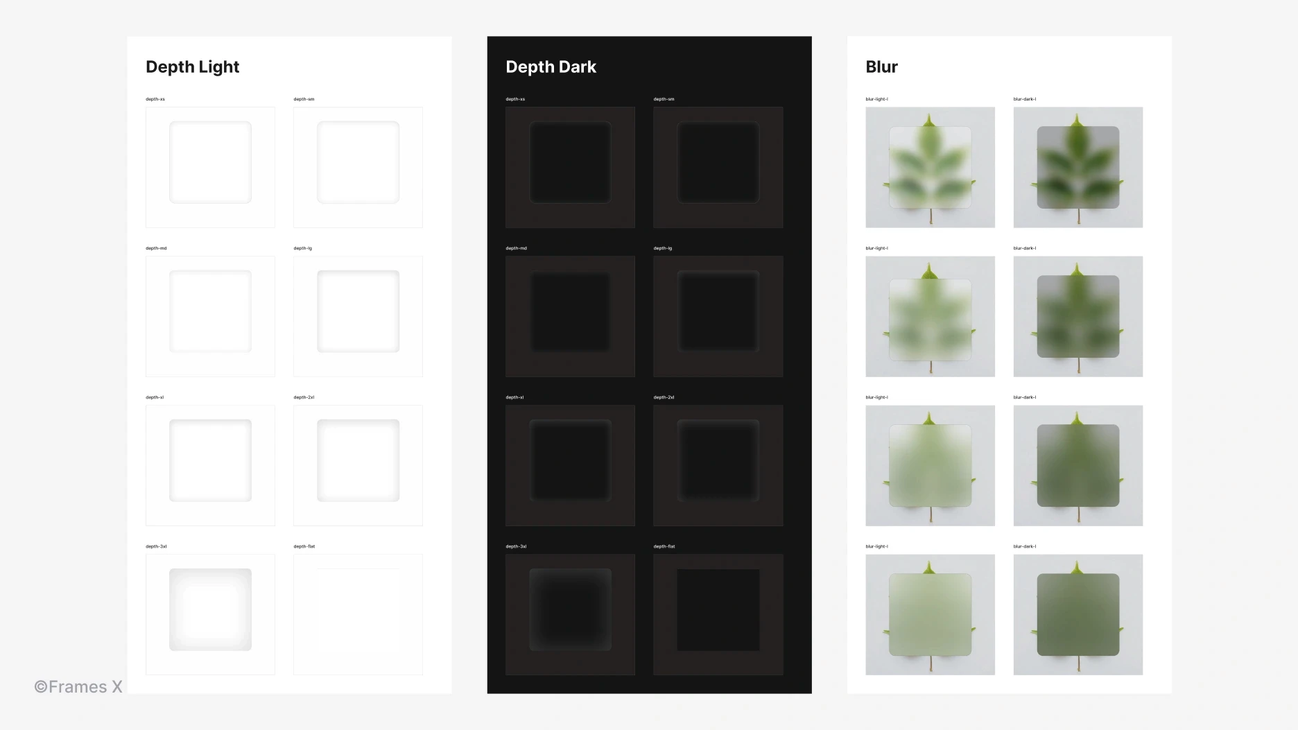
New Depth styles and Effects page update
We've added new Depth styles with inner shadow properties that create a sense of depth within elements and surfaces. You can use these Figma styles to create realistic, skeuomorphic, and neumorphic designs.
While these new inner shadow styles are not used throughout the system, we encourage you to experiment with these effects styles in your daily design work.
Hey there! We're thrilled to share the release of Frames X 2.7!
This update introduces a new wireframe UI kit: Frames X Root—A revival of our popular Root Wireframe Kit. Frames X Root offers the perfect toolset for rapid wireframing and ideation.
Frames X Root UI kit key features:
Cute and unique style with its own vibe to make your wireframes stand out
Flow and Redacted fonts for clutter-free, minimal wireframes and mockups
100% Integration with Figma variables for efficient workflow
80 Components for reliable designs and wireframes
UI components interactions examples for even-faster prototyping
Additionally, Frames X 2.7 includes:
New components and updates to previous ones
New radar charts and responsive design templates
Effects page rework and new inner shadow styles
Frames X 2.7: New wireframe UI kit for Figma, design templates, components, and effects
FramesX 2.7 expands its toolset, introducing a whole new UI kit, new Figma components, charts, templates, and styles. With this update, FramesX reinforces its position as the most comprehensive design system available for Figma to ever exist!
Our commitment to customization and quality ensures that FramesX remains your go-to choice for unparalleled UI kit experience. So, without further ado, let's dive into the update.
Frames X Root UI kit
We're excited to introduce Frames X Root UI Kit! Frames X Root is a joyful, wireframe-styled UI kit made as an addition to our design system. This compact and powerful tool enables faster prototyping and design compared to our main library.
With its unique aesthetics, Frames X Root empowers you to create unique, clean wireframes and mockups. Frames X Root includes 80 versatile UI components you can use to create unique design, prototupes, and wireframes.
The new wireframe UI kit adheres to Frames X Figma Variables, ensuring you have the same customization and theming toolset as the main library but with the benefit of faster operation.
Click the image link below to learn more ↓
New Tablist UI component
We've introduced the Tablist components to help you create both horizontal and vertical tab panels. This versatile component offers three distinct styles and placements. You can customize the Tablist's direction and style to match it with any surface or layout.
Tablist UI helps organize design content into smaller, more digestible sections, improving user navigation and overall readability.
New Divider UI component
We've added a new Divider component to our design system. This versatile element allows you to visually separate content either horizontally or vertically with a thin line.
Frames X divider offers label text with multiple placement options, providing greater flexibility and customization than popular React solutions such as Material U divider.
New Circular Progress UI component
We've added a new Circular Progress Bar component. Circle indicators can be integrated into any part of your interface to track the progress or completion status of a task.
The circle progress bar, compared to the linear indicators, can be easily integrated into buttons or other UI elements without messing up the design.
Updated Avatar Group components
We've added new Avatar Groups components. Avatar Groups enable a stacked display of multiple avatar components. Avatars with names, compared to image avatars, can improve general privacy in applications where user confidentiality is important.
New UI Forms in Figma
We've added new Figma Forms templates and examples to help you better understand the difference between inputs and forms and use FramesX forms effectively.
The new Forms page contains examples and patterns to help you understand how we manage forms and their fields. Examples include User profiles, Settings, Registration, and Account Confirmation forms.
New Numeric Stepper UI component
We've introduced a new Stepper UI design: a Numeric Stepper component. This addition displays progress steps in numerical order, helping users better understand the total number of steps they need to complete.
Use the updated Stepper UI to break down a process into sequential interface steps and adjust the number of steps and Stepper type with updated component properties.
New Gallery UI blocks
We've added new Gallery UI templates to our Figma website builder.
Gallery UI contains multiple images, videos, or photos in a scrollable container. This new component allows users to browse through collections of products or related visual content.
You can use Gallery variants to create e-commerce and portfolio UI sections that showcase all of your products or focus user attention on a particular one.
New Radar charts
We've added new Radar chart maker designs to our data visualization set.
Radar charts, also known as spider or radar diagrams, display data with multiple variables in a circular graph. You can use radar diagrams to compare different things or show how common factors relate to each other.
New Mail app dashboard template
We've added a new Mail application template to the Frames X design system.
The new Mail application design in Figma features an inbox view with a tagged email list, sender and subject information, a right-side panel showing open conversations, and an email preview with a composition interface.
You can utilize the new Mail UI Figma template to test user flows for common email actions such as creating, reading, and organizing messages.
New Authentication template
We've added a new Authentication UI template to the Frames X design system. The new authentication page contains the login and registration flow template.
New Depth styles and Effects page update
We've added new Depth styles with inner shadow properties that create a sense of depth within elements and surfaces. You can use these Figma styles to create realistic, skeuomorphic, and neumorphic designs.
While these new inner shadow styles are not used throughout the system, we encourage you to experiment with these effects styles in your daily design work.
Frames X is the most robust and largest Figma UI library in the world. Download Frames X design system now to receive all future updates and enhance your design workflow—complete UI design projects faster and get paid more.
And, as always, see you in the next update!
Posts
The Perfect Figma Tabs Component
Best Figma plugins for UI design and design systems
Best practices for UI color palettes in Figma
WYSIWYG UI: How to design a text editor in Figma
Frames X v2.6: Universal UI kit and component library
Best free icons pack for UI design and development
Frames X v2.5: Largest UI kit in the world updated
Figma tips and tricks to work efficiently
Frames X v2.4: Typography variables, new components and charts
Frames X v2.3: Enhanced tools for data-driven design