Aug 23, 2024

by
Dmitriy Bunin
WYSIWYG UI: How to design a text editor in Figma
WYSIWYG web text editor component in Figma

What is the WYSWYG UI?
A Rich-Text Editor, or WYSIWYG, which stands for "What You See Is What You Get," is a popular interface pattern that was first introduced in word processors like Microsoft Word in 1974 and was initially designed by Charles Simonyi and Butler Lampson. Back then, it was a revolutionary way to allow users to see an instant output of their work as a digitally printed document.
Fast-forward to today. The WYSIWYG UI pattern remains popular and is used in various applications and software design, such as blogs, newsletters, web builders, and many other types of software where users can work and manipulate long-formatted text.
WYSIWYG is a popular UX pattern thanks to its speed. It allows users to make edits quickly and experiment with the content all in one place. The WYSIWYG component also integrates well with development frameworks like React, Angular, and Vue.js due to its common UI controls, such as nested buttons and collapsing menus.
WYSIWYG is a great for content creation because users can see exactly how their content will appear as they create or edit it, making the process more intuitive.
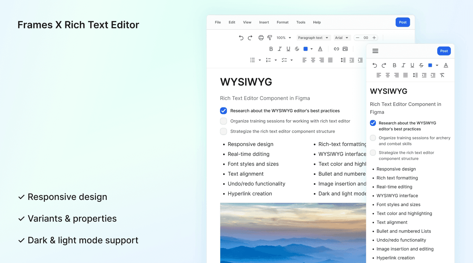
WYSWYG UI Component structure
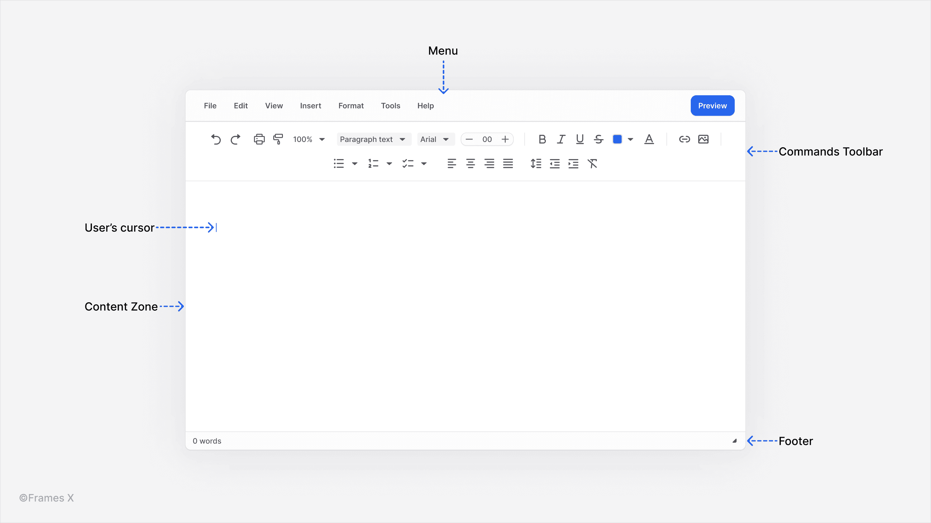
Rich text editors generally consist of several key components:
Editing Area: This is the main workspace where users create and edit content; this area displays the content as it will appear when published.
Toolbar: This contains buttons for common formatting options. It usually includes options like bold, italic, underline, alignment, etc. It may be customizable, context—or cursor-sensitive.
Menu Bar: This part provides access to more advanced features and settings. It often includes the File, Edit, View, Insert, Format, and Help menus. At the bottom, there is additional document information or additional interface controls, such as a grabber for stretching the WYSIWYG area content.
Depending on the product specs, there could be more parts to it, such as collaboration or file management tools.
Utilizing Figma features for designign WYSIWYG UI
Why do we want to create a WYSIWYG text editor in Figma first?
Efficiency. Once the component is created, it can be integrated into other components, layouts, and places around your product.
Responsiveness. The Figma responsive features can help us explore different UI layouts without going into the development stage. We will be able to see how the text editing experience will look at the scale of your app or software, how it will match with other responsive parts of your interface, and how it will behave when operated.
Accessibility. WYSIWYG can involve a lot of precision work because the user will usually need to aim at the toolbar before performing any action due to the dense amount of commands available in the app. That's why outlining your design first is crucial, as it will help prevent further UX errors during the implementation phase and save development costs.
So here are 10 tips for designing WYSIWYG interfaces and elevating the digital experience of your product.
1. Keep the WYSWYG interface minimal and clear
Due to the limited amount of space in WYSWYG apps, use a clean-styled design to present all available controls. Always make sure to use intuitive labels and self-explanatory icons to decrypt actions behind every presented command.
A minimal interface design often translates to improved performance, as it will require fewer resources to render and operate, resulting in a smoother experience across various devices and platforms.
2. Limit stylistic choices and emphasize SEO-friendly features
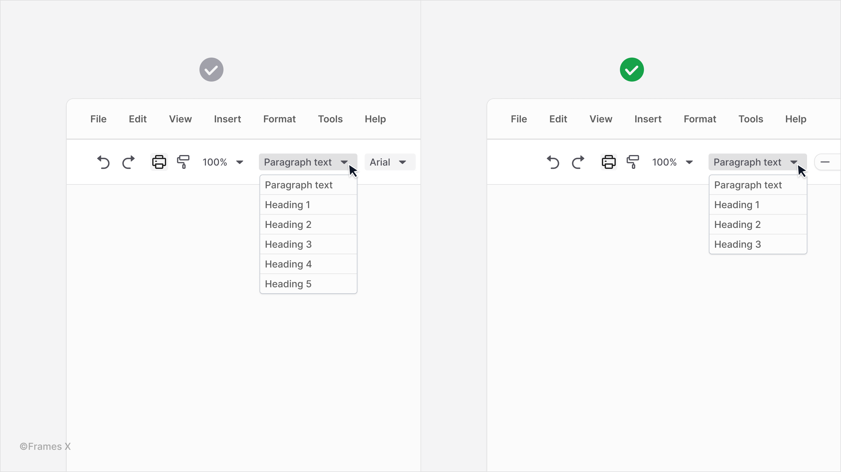
Search engines like Google analyze your website's structure, paying particular attention to headlines and titles, especially H1 (Heading 1), H2 (Heading 2), and H3 tags. These top-level headings play a crucial role in helping search engine crawlers understand your content's purpose and organization.
If you want your WYSIWYG text editor to promote more traffic gains for its users, it's crucial to provide them with H1, H2, and H3 headings to help capture site-ranking keywords.
It's recommended to have only one H1 on each page, but a user may use several H2s and H3s per page, so it's crucial to make them always visible in the toolbar.
Design your WYSIWYG editor to your users' needs. Consider the primary type of content your users create when designing your WYSIWYG editor. If your main goal is to produce search engine-friendly content, do the following things:
Simplify heading options: Focus on essential heading levels (H1, H2, H3) to encourage proper content structure;
Simplify font choices: Offer a limited set of fonts to maintain consistency and reduce decision-making time;
Prioritize SEO-friendly features: Emphasize tools that help create well-structured, crawlable content;
Avoid feature overload: Keep the interface clean and intuitive by including only the most relevant formatting options.
3. Create a clear visual hierarchy for your text editor UI
Creating a clear visual hierarchy means carefully considering factors, like grouping related actions and commands. You can use size and color to indicate importance and employ consistent design patterns throughout the interface. This thoughtful organization significantly enhances the overall usability and effectiveness of WYSIWYG tools.
Note: It's important to understand the main goal behind why the content editor is used in the first place so you can know which actions to prioritize. And when you know, you can use high-contrast colors and consistent font scaling to distinguish between numerous menus and toolbar options.
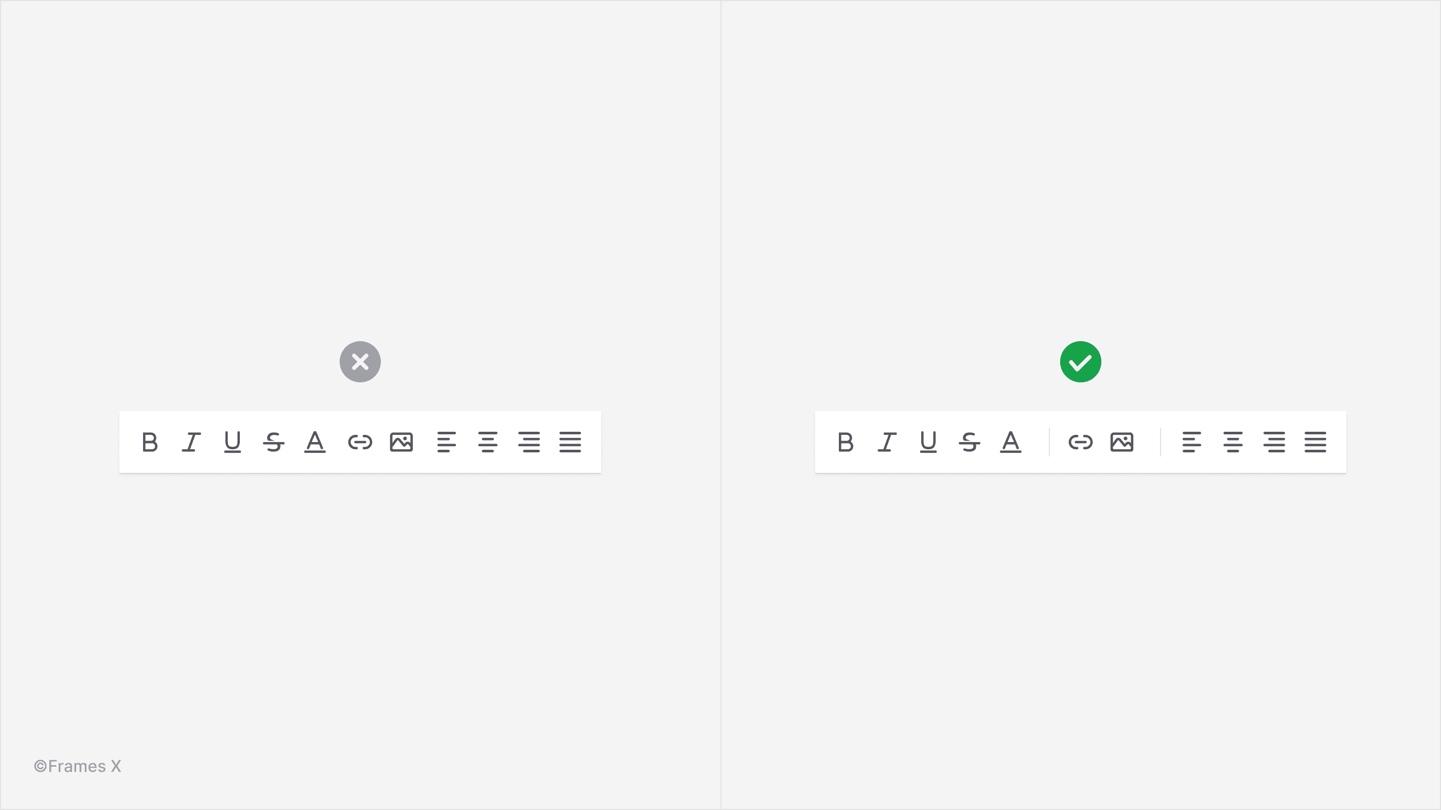
4. Group related actions in the toolbar
Strategically categorizing toolbar icons can help users understand the toolset. Explaining how one action relates to the others in the group will help the user become more familiar with your app interface.
Note: Even if a user is unfamiliar with a particular icon or label, they can use other commands in the group to identify the action and create muscle memory to associate with an unknown command.
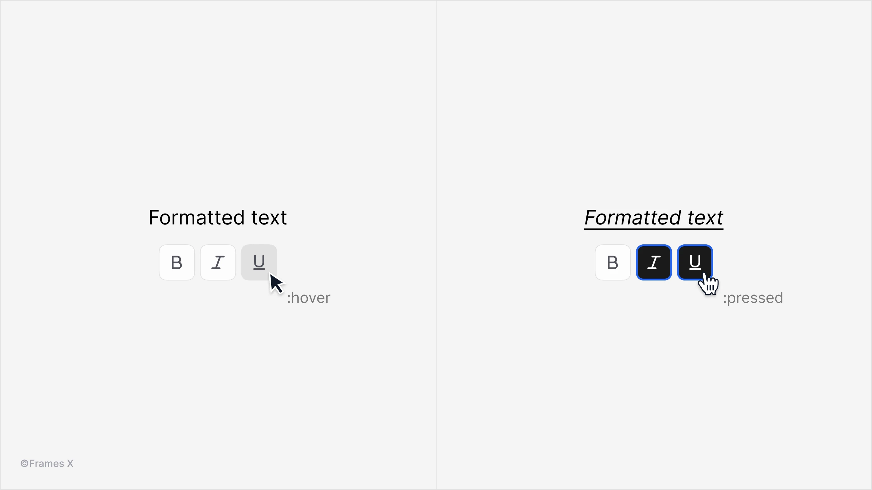
5. Always provide clear visual response to any interaction
WYSIWYG text editors are complex interfaces requiring varied user interactions. Implement tactile feedback and clear state changes to highlight key actions, enhancing usability and user comprehension of the editing process.
6. Provide contextual help with tooltips on hover
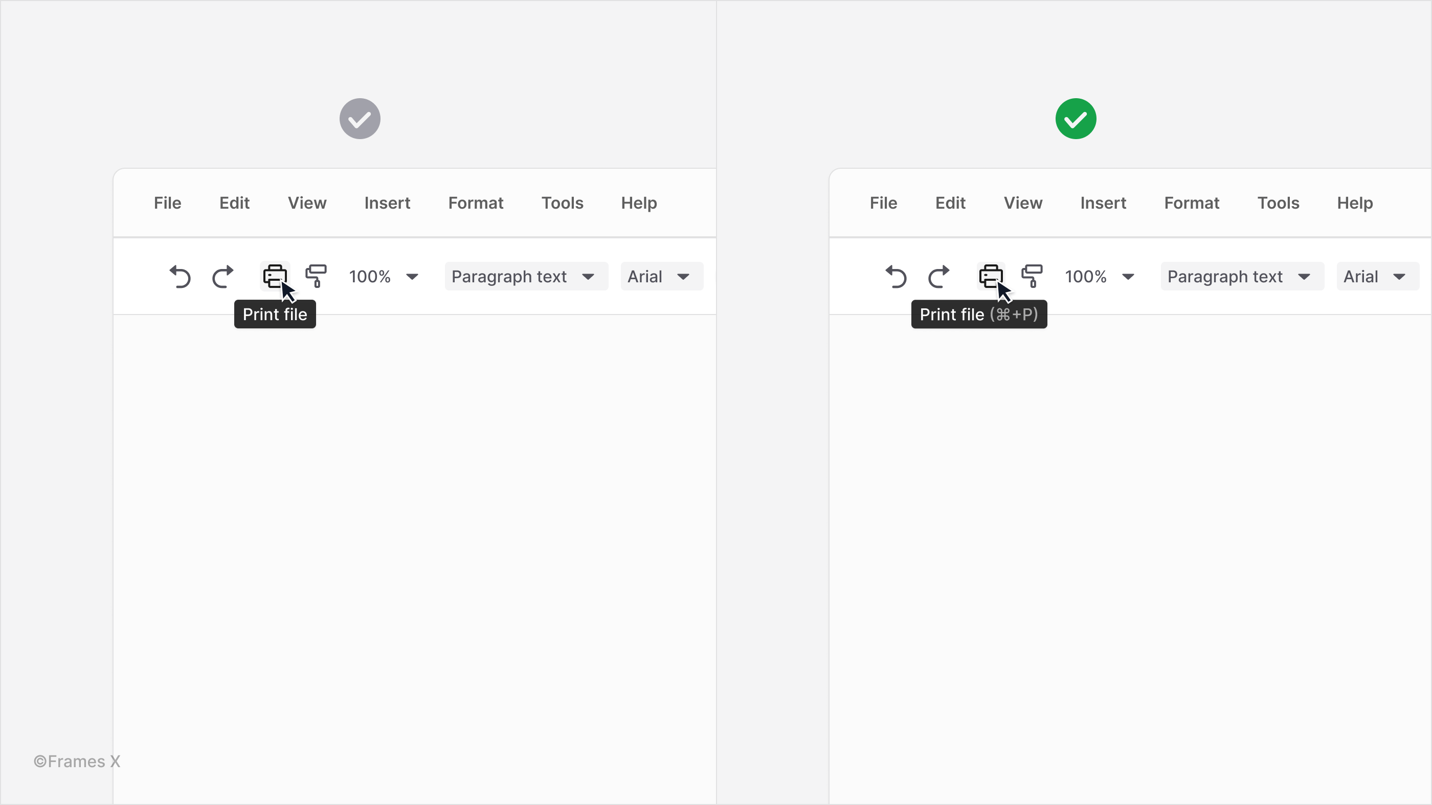
Hovering over icons or commands should trigger concise, informative tooltips, elucidating their functions in clear, accessible language. It's a good idea to promote the use of hotkeys and include them in tooltips to educate users about keyboard shortcuts that can save them time and effort in the long run.
7. Balance UX vs. UI with responsive design
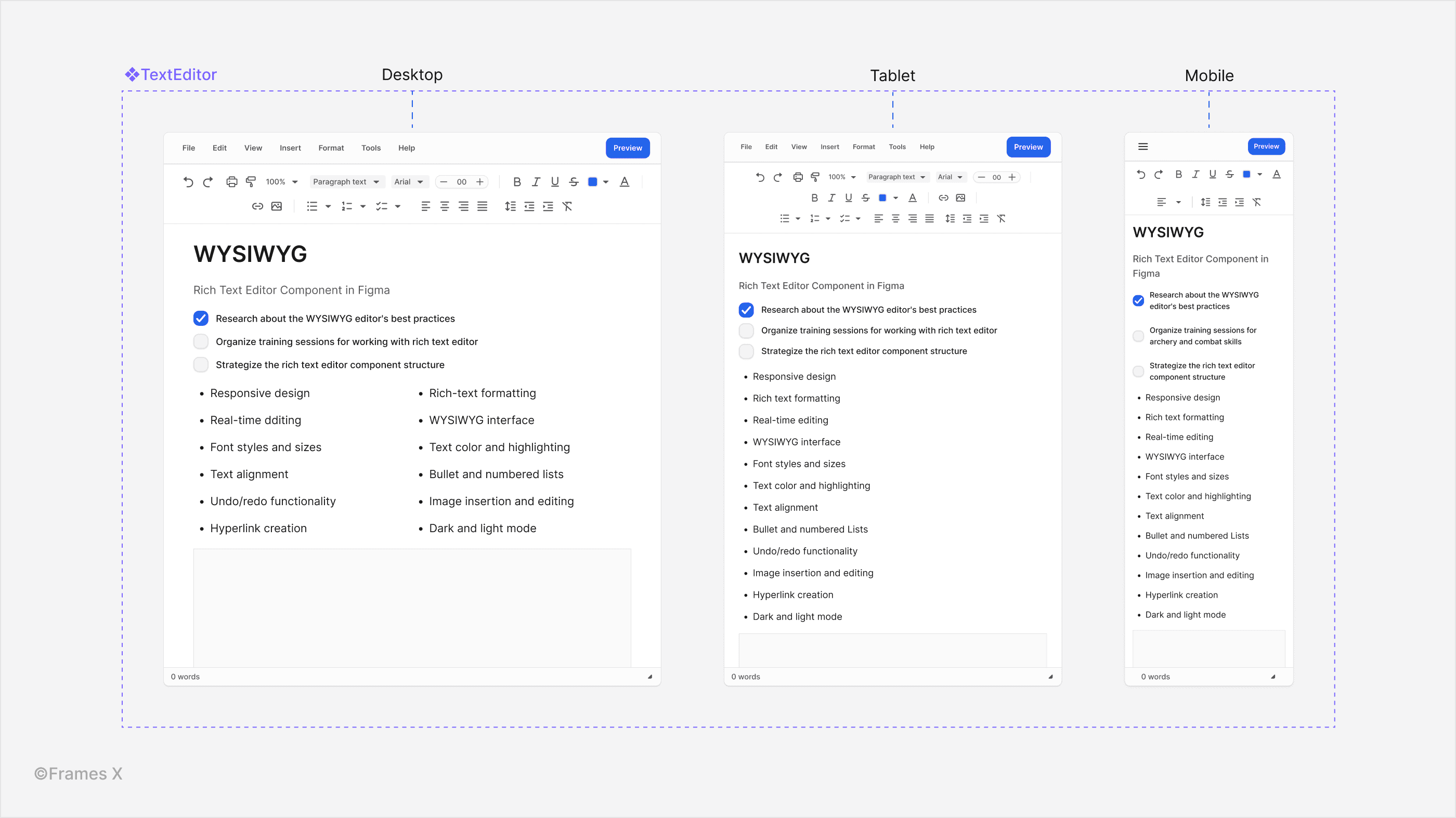
Design the WYSIWYG interface to be responsive so the user can access the same or a similar number of actions and tools while operating your product on different devices/systems.
When polishing your designs, verify that all essential features are accessible and function correctly across different platforms and screen sizes to avoid unnecessary UI refactoring.
8. Optimize your toolbar UI for multiple devices
Providing users with multiple toolbar variants is important as they become more familiar with your product and may want to add or remove commands to it to better suit their needs. Therefore, it is crucial to design your toolbar with customization in mind, especially when it comes to its compatibility with different devices and platforms.
Tip: To ensure that your toolbar works seamlessly on various screen sizes and resolutions, consider making certain button groups collapsible under a dropdown. Remove unnecessary commands on the mobile so the toolbar can accommodate the same amount of actions on smaller screens, sacrificing as little usability and functionality as possible.
9. Always show the Undo/Redo commands
Include both commands so users can easily revert changes or redo actions. A widely accepted shortcuts for these commands are CMD+Z to undo and CMD+SHIFT+Z to redo.
This universal interface pattern promotes a sense of control and reduces the stress associated with making mistakes.
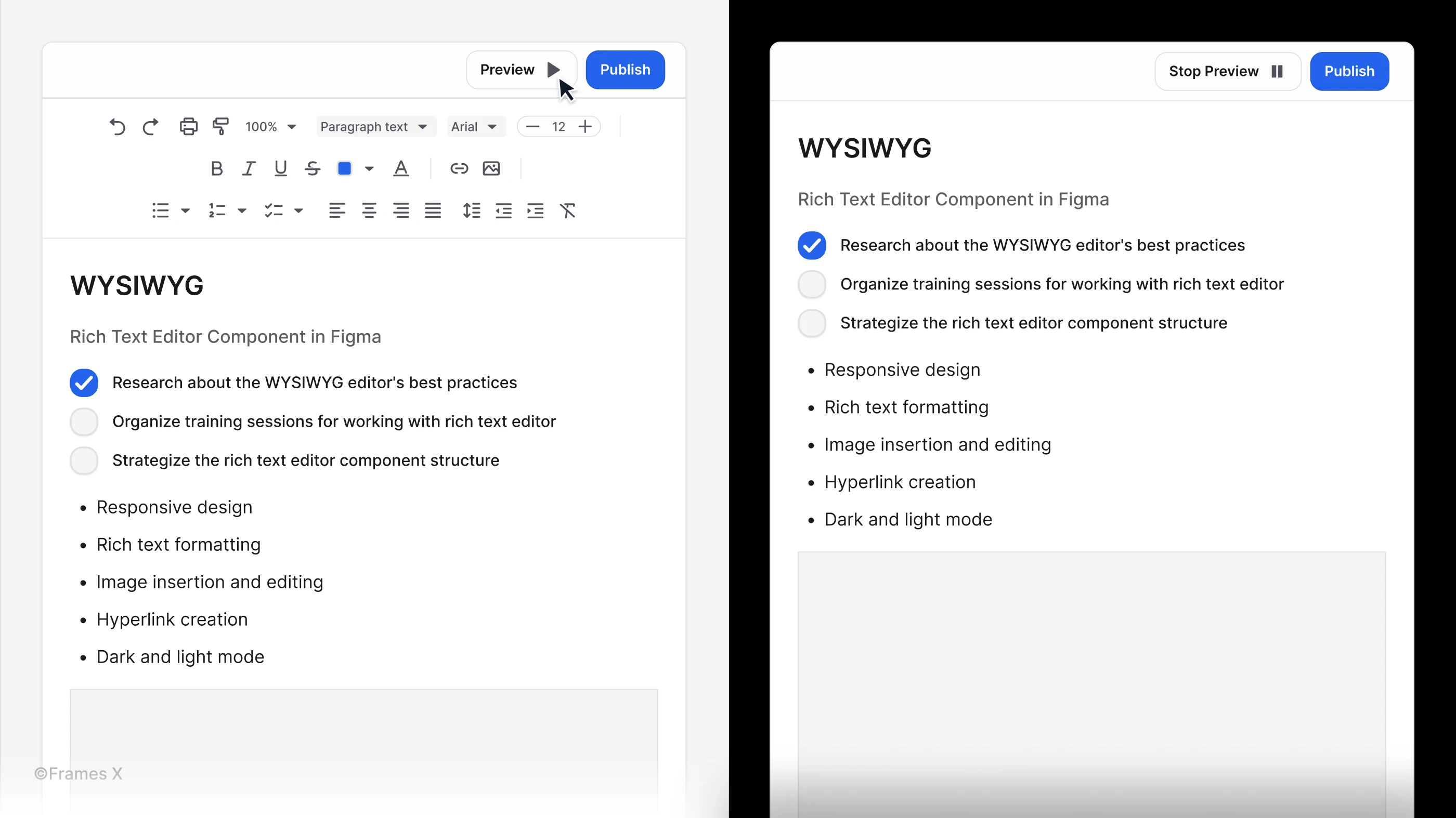
10. Allow users to preview the output before posting it live
It's important to give users the ability to preview content before publishing to ensure it looks as expected when put online. This preview feature will ensure users feel safe working with your product or app.
That's it!
Follow these tips to create a trustworthy and user-friendly text editor UI. And if you're looking for a component that you can drag and drop into your current Figma project immediately — we've got you covered.
Follow the link below to download our perfectly designed custom-made component that supports variables and advanced auto layout features in Figma.
What is the WYSWYG UI?
A Rich-Text Editor, or WYSIWYG, which stands for "What You See Is What You Get," is a popular interface pattern that was first introduced in word processors like Microsoft Word in 1974 and was initially designed by Charles Simonyi and Butler Lampson. Back then, it was a revolutionary way to allow users to see an instant output of their work as a digitally printed document.
Fast-forward to today. The WYSIWYG UI pattern remains popular and is used in various applications and software design, such as blogs, newsletters, web builders, and many other types of software where users can work and manipulate long-formatted text.
WYSIWYG is a popular UX pattern thanks to its speed. It allows users to make edits quickly and experiment with the content all in one place. The WYSIWYG component also integrates well with development frameworks like React, Angular, and Vue.js due to its common UI controls, such as nested buttons and collapsing menus.
WYSIWYG is a great for content creation because users can see exactly how their content will appear as they create or edit it, making the process more intuitive.
WYSWYG UI Component structure
Rich text editors generally consist of several key components:
Editing Area: This is the main workspace where users create and edit content; this area displays the content as it will appear when published.
Toolbar: This contains buttons for common formatting options. It usually includes options like bold, italic, underline, alignment, etc. It may be customizable, context—or cursor-sensitive.
Menu Bar: This part provides access to more advanced features and settings. It often includes the File, Edit, View, Insert, Format, and Help menus. At the bottom, there is additional document information or additional interface controls, such as a grabber for stretching the WYSIWYG area content.
Depending on the product specs, there could be more parts to it, such as collaboration or file management tools.
Utilizing Figma features for designign WYSIWYG UI
Why do we want to create a WYSIWYG text editor in Figma first?
Efficiency. Once the component is created, it can be integrated into other components, layouts, and places around your product.
Responsiveness. The Figma responsive features can help us explore different UI layouts without going into the development stage. We will be able to see how the text editing experience will look at the scale of your app or software, how it will match with other responsive parts of your interface, and how it will behave when operated.
Accessibility. WYSIWYG can involve a lot of precision work because the user will usually need to aim at the toolbar before performing any action due to the dense amount of commands available in the app. That's why outlining your design first is crucial, as it will help prevent further UX errors during the implementation phase and save development costs.
So here are 10 tips for designing WYSIWYG interfaces and elevating the digital experience of your product.
1. Keep the WYSWYG interface minimal and clear
Due to the limited amount of space in WYSWYG apps, use a clean-styled design to present all available controls. Always make sure to use intuitive labels and self-explanatory icons to decrypt actions behind every presented command.
A minimal interface design often translates to improved performance, as it will require fewer resources to render and operate, resulting in a smoother experience across various devices and platforms.
2. Limit stylistic choices and emphasize SEO-friendly features
Search engines like Google analyze your website's structure, paying particular attention to headlines and titles, especially H1 (Heading 1), H2 (Heading 2), and H3 tags. These top-level headings play a crucial role in helping search engine crawlers understand your content's purpose and organization.
If you want your WYSIWYG text editor to promote more traffic gains for its users, it's crucial to provide them with H1, H2, and H3 headings to help capture site-ranking keywords.
It's recommended to have only one H1 on each page, but a user may use several H2s and H3s per page, so it's crucial to make them always visible in the toolbar.
Design your WYSIWYG editor to your users' needs. Consider the primary type of content your users create when designing your WYSIWYG editor. If your main goal is to produce search engine-friendly content, do the following things:
Simplify heading options: Focus on essential heading levels (H1, H2, H3) to encourage proper content structure;
Simplify font choices: Offer a limited set of fonts to maintain consistency and reduce decision-making time;
Prioritize SEO-friendly features: Emphasize tools that help create well-structured, crawlable content;
Avoid feature overload: Keep the interface clean and intuitive by including only the most relevant formatting options.
3. Create a clear visual hierarchy for your text editor UI
Creating a clear visual hierarchy means carefully considering factors, like grouping related actions and commands. You can use size and color to indicate importance and employ consistent design patterns throughout the interface. This thoughtful organization significantly enhances the overall usability and effectiveness of WYSIWYG tools.
Note: It's important to understand the main goal behind why the content editor is used in the first place so you can know which actions to prioritize. And when you know, you can use high-contrast colors and consistent font scaling to distinguish between numerous menus and toolbar options.
4. Group related actions in the toolbar
Strategically categorizing toolbar icons can help users understand the toolset. Explaining how one action relates to the others in the group will help the user become more familiar with your app interface.
Note: Even if a user is unfamiliar with a particular icon or label, they can use other commands in the group to identify the action and create muscle memory to associate with an unknown command.
5. Always provide clear visual response to any interaction
WYSIWYG text editors are complex interfaces requiring varied user interactions. Implement tactile feedback and clear state changes to highlight key actions, enhancing usability and user comprehension of the editing process.
6. Provide contextual help with tooltips on hover
Hovering over icons or commands should trigger concise, informative tooltips, elucidating their functions in clear, accessible language. It's a good idea to promote the use of hotkeys and include them in tooltips to educate users about keyboard shortcuts that can save them time and effort in the long run.
7. Balance UX vs. UI with responsive design
Design the WYSIWYG interface to be responsive so the user can access the same or a similar number of actions and tools while operating your product on different devices/systems.
When polishing your designs, verify that all essential features are accessible and function correctly across different platforms and screen sizes to avoid unnecessary UI refactoring.
8. Optimize your toolbar UI for multiple devices
Providing users with multiple toolbar variants is important as they become more familiar with your product and may want to add or remove commands to it to better suit their needs. Therefore, it is crucial to design your toolbar with customization in mind, especially when it comes to its compatibility with different devices and platforms.
Tip: To ensure that your toolbar works seamlessly on various screen sizes and resolutions, consider making certain button groups collapsible under a dropdown. Remove unnecessary commands on the mobile so the toolbar can accommodate the same amount of actions on smaller screens, sacrificing as little usability and functionality as possible.
9. Always show the Undo/Redo commands
Include both commands so users can easily revert changes or redo actions. A widely accepted shortcuts for these commands are CMD+Z to undo and CMD+SHIFT+Z to redo.
This universal interface pattern promotes a sense of control and reduces the stress associated with making mistakes.
10. Allow users to preview the output before posting it live
It's important to give users the ability to preview content before publishing to ensure it looks as expected when put online. This preview feature will ensure users feel safe working with your product or app.
That's it!
Follow these tips to create a trustworthy and user-friendly text editor UI. And if you're looking for a component that you can drag and drop into your current Figma project immediately — we've got you covered.
Follow the link below to download our perfectly designed custom-made component that supports variables and advanced auto layout features in Figma.
Download Frames X WYSIWYG Component for Free — Get started with a perfectly structured rich text editor UI.
Best Figma plugins for UI design and design systems
Best practices for UI color palettes in Figma
Frames X v2.6: Universal UI kit and component library
Best free UI free icons for web design and development
Frames X v2.5: Largest UI kit in the world updated
Figma tips and tricks to work efficiently
Frames X v2.4: Typography variables, new components and charts
Frames X v2.3: Enhanced tools for data-driven design