Jun 13, 2024

Dmitriy Bunin
Frames X v2.5: Largest UI kit in the world updated
What's new in Frames X UI Kit v2.5
Figma UI kit
design system
Hey there! We are excited to share the release of Frames X 2.5!
This update extends our toolset beyond any other UI framework! With new robust components added and upgrades to existing ones, our design system is now more universal than ever, solidifying FramesX's position as the best UI kit for Figma to date.
Frames X 2.5: New components, UI interactions, refined Figma variables and Community chat
Our newly updated library now boasts over 42 versatile UI component categories, providing an extensive collection of interface elements for your projects. Key additions in this release include:
Refined Variables and Token naming conventions to better align our UI kit with the code export and latest LLM AI models.
New community chat for collaborative design, feedback sharing, and problem-solving.
33% Reduction in file size and performance improvements in working with UI kit components.
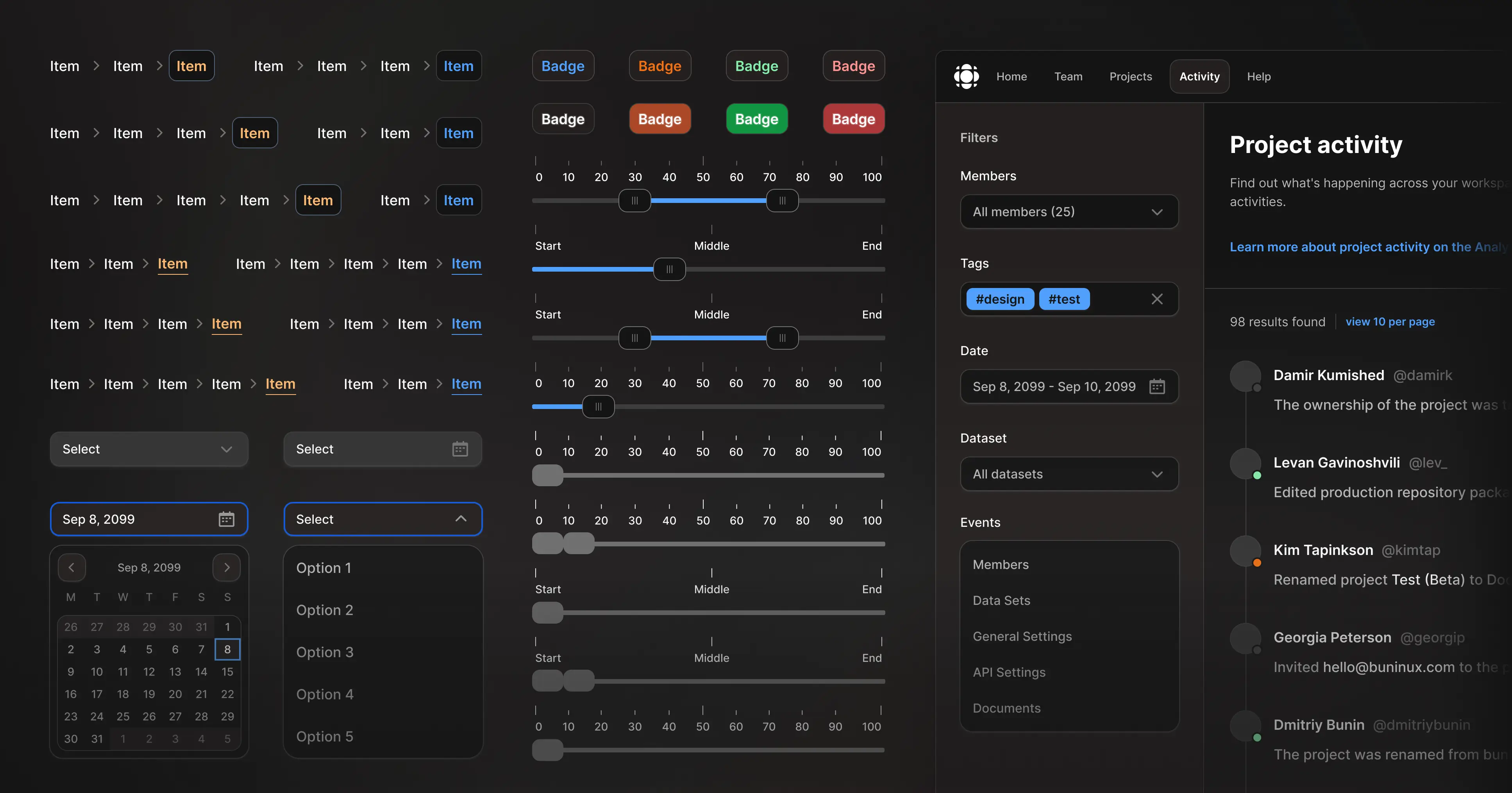
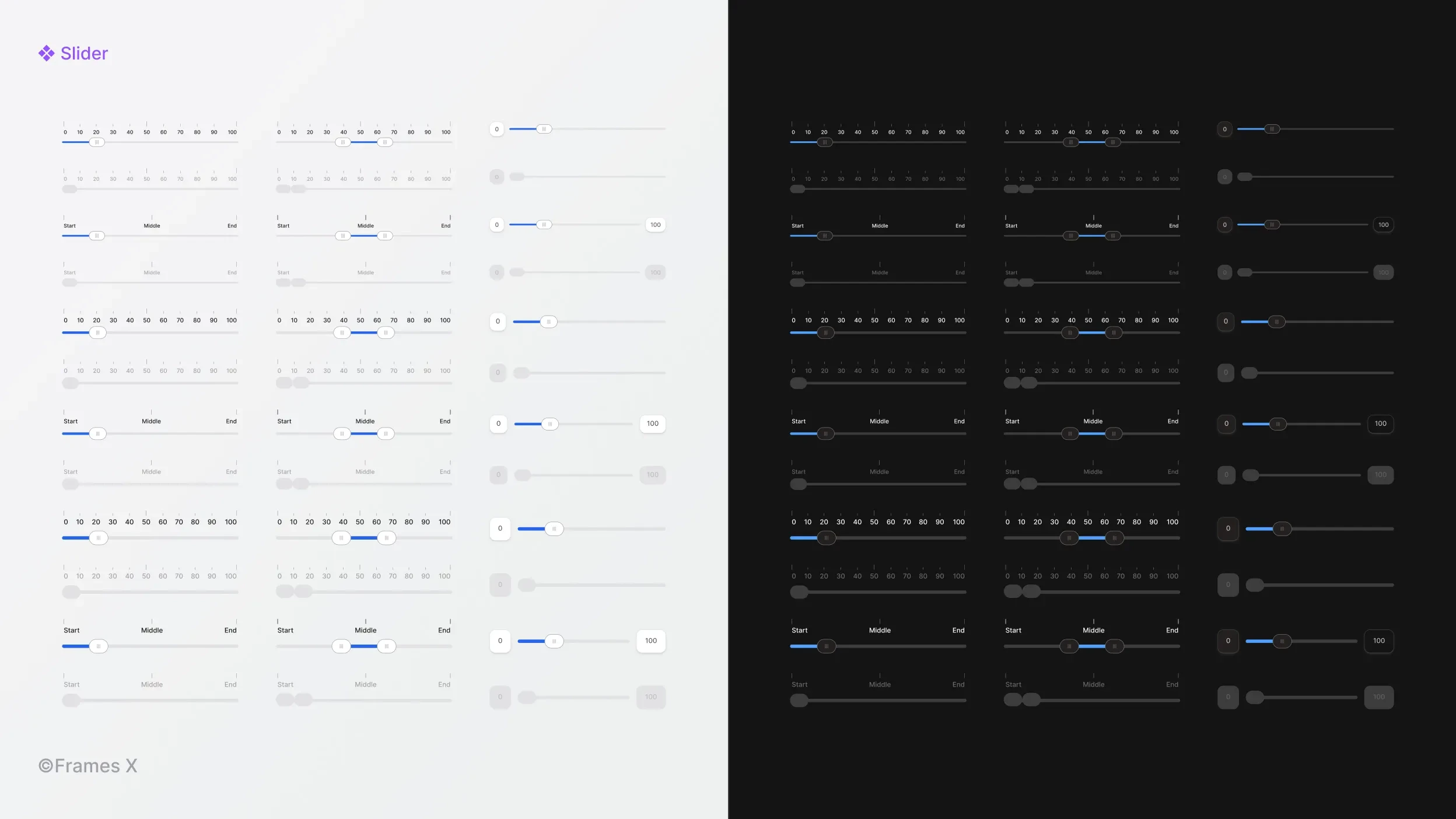
Updated Slider UI component
We've expanded our Slider component to include range-based and single-value sliders. We've also restructured these complex UI components to optimize every nested slider element for optimal performance in your designs.
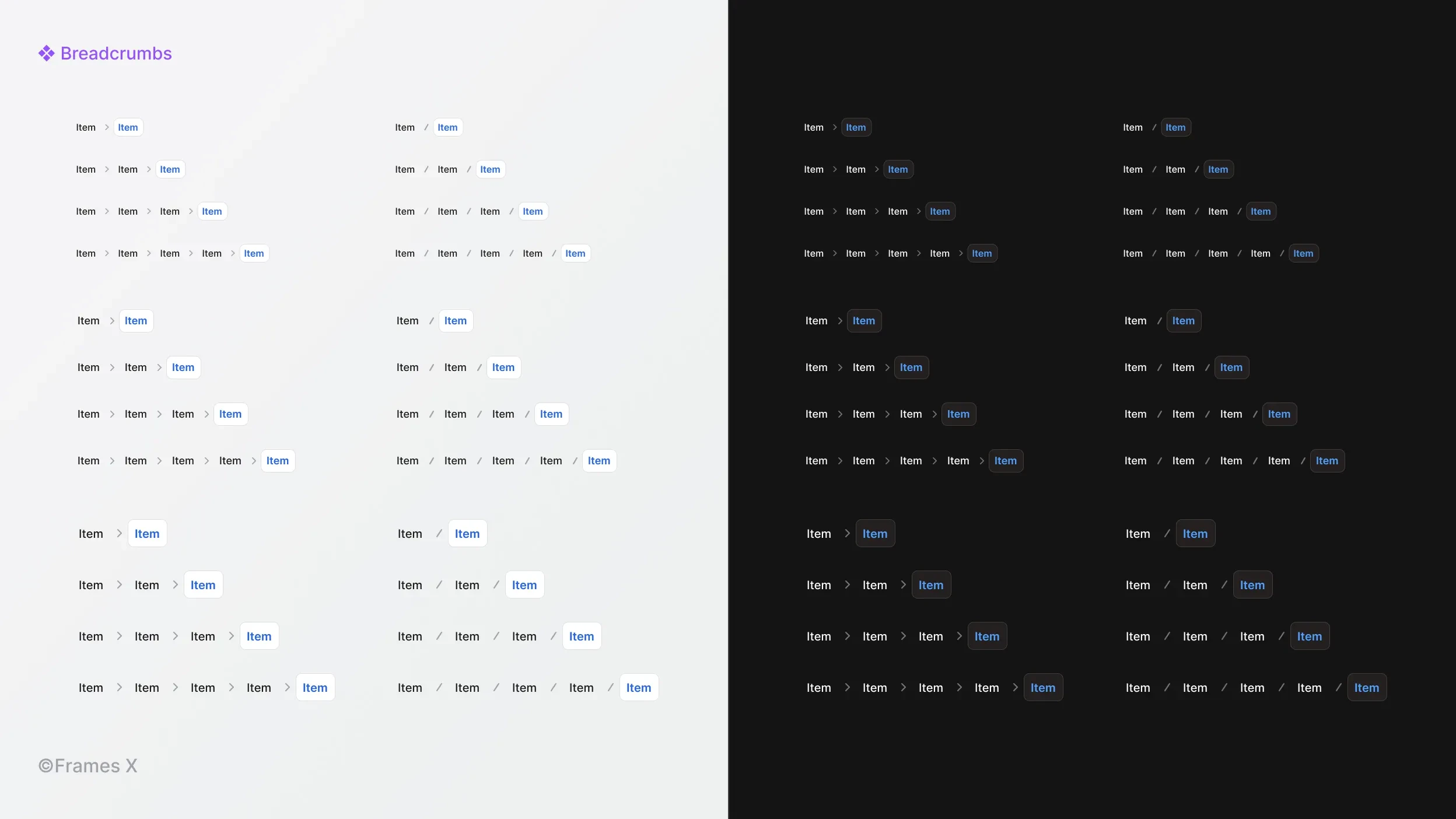
Updated Breadcrumbs UI component
We've reworked the Breadcrumbs component, introducing new pill-shaped variants and expanded sets with extra size variations. New Breadcrumbs are designed to better react to variables and modes, ensuring they adapt and help users navigate through your interfaces.
We've also added new variants to make the Breadcrumbs component more universal. This allows you to switch between breadcrumb separators and fit the navigation into any part of your user interface.
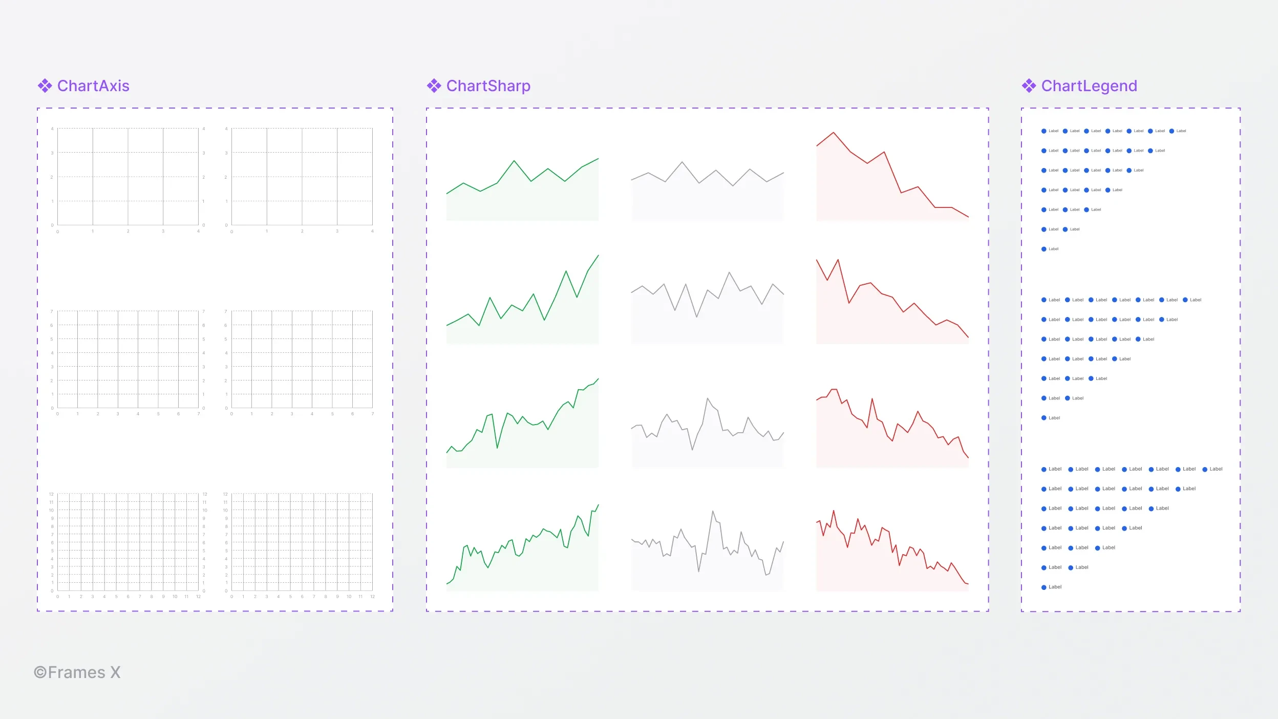
Updated Charts and Grid UI components
We've rolled out enhancements to our Charts and Grid components, introducing new Sharp Line charts with updated Grid and Legends components.
New improvements include restructuring charts, eliminating unused layers, and optimizing resizing. You can now expect better consistency between elements when resizing charts.
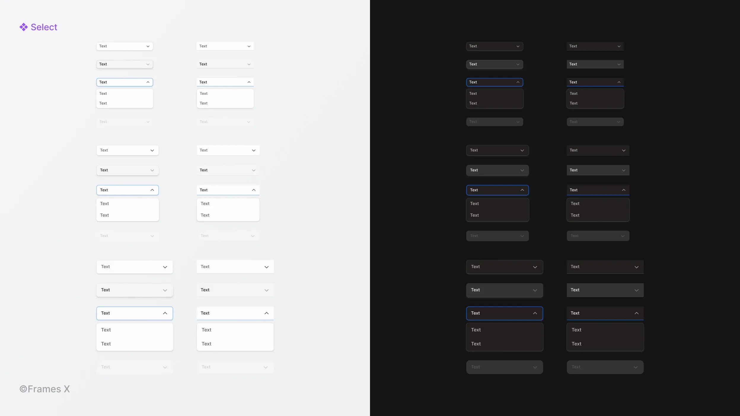
New Select UI component
We have introduced a new functional Select component. When interacted with, the Select displays a nested dropdown with a list of available actions.
The Select component is available in three sizes and two different styles, making it useful for your form designs duties.
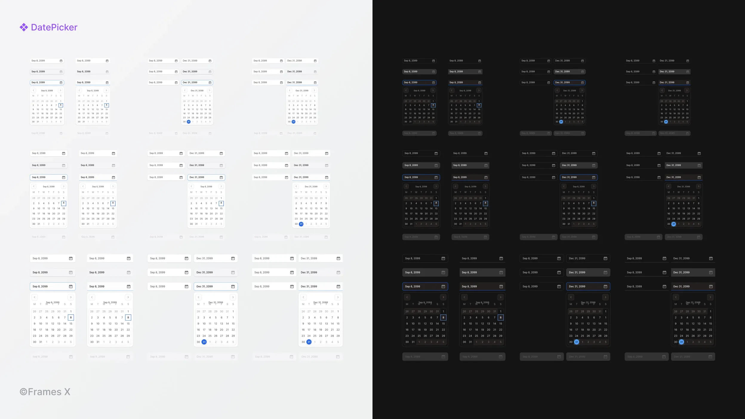
New Date Picker UI component
We've added a new Date Picker component, which consists of an input field and a calendar pop-up element.
Just like most components, Date Picker input comes in three different sizes and two distinct visual styles to adapt to any interface. The Date Picker component enables users to enter, edit, and select dates using a text-based input.
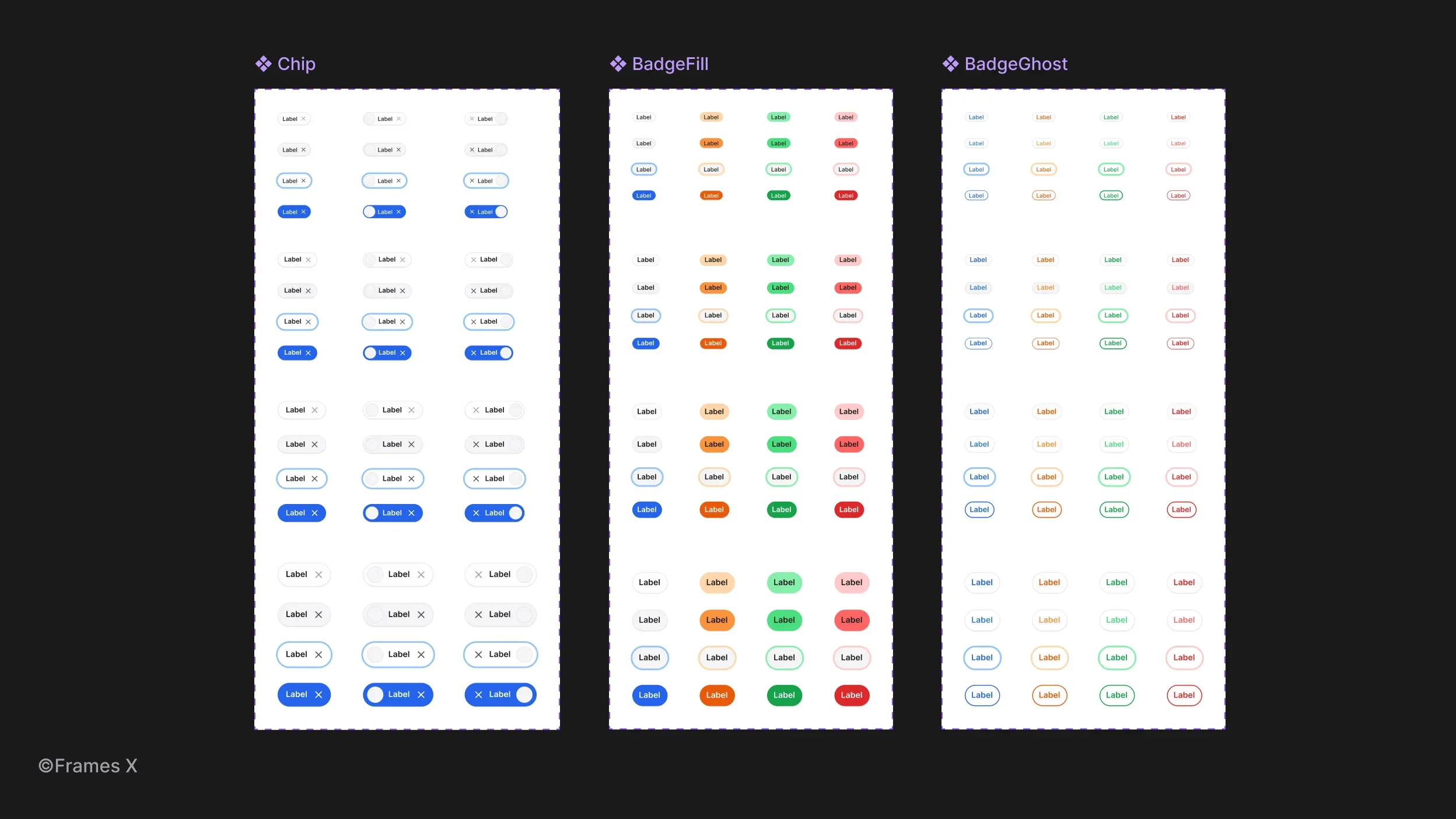
Updated Badges and Chips UI components
We've enhanced Badges and Chips UI with new, compact-size variants to help you use them in any situation and under any screen resolution. Additionally, we've added a new type of badge: a Ghost badge.
Ghost badges feature a subtle, semi-transparent background with lower contrast. The foreground text is highlighted using one of the primary brand colors, creating a more understated appearance compared to standard badges.
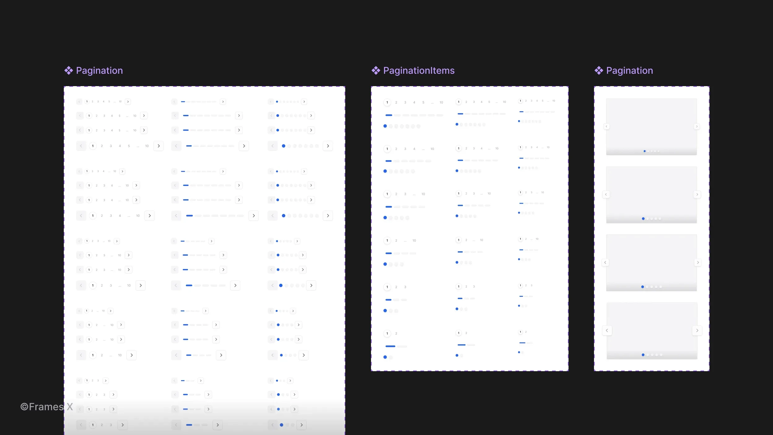
Updated Pagination UI component
We've updated the Pagination component with new functional variants, increasing the number of available steps per element.
This enhancement aims to help you detach the pagination UI less and give more control over its properties. You can now more confidently use pagination UI to split the content into separate pages, sections, and interface steps.
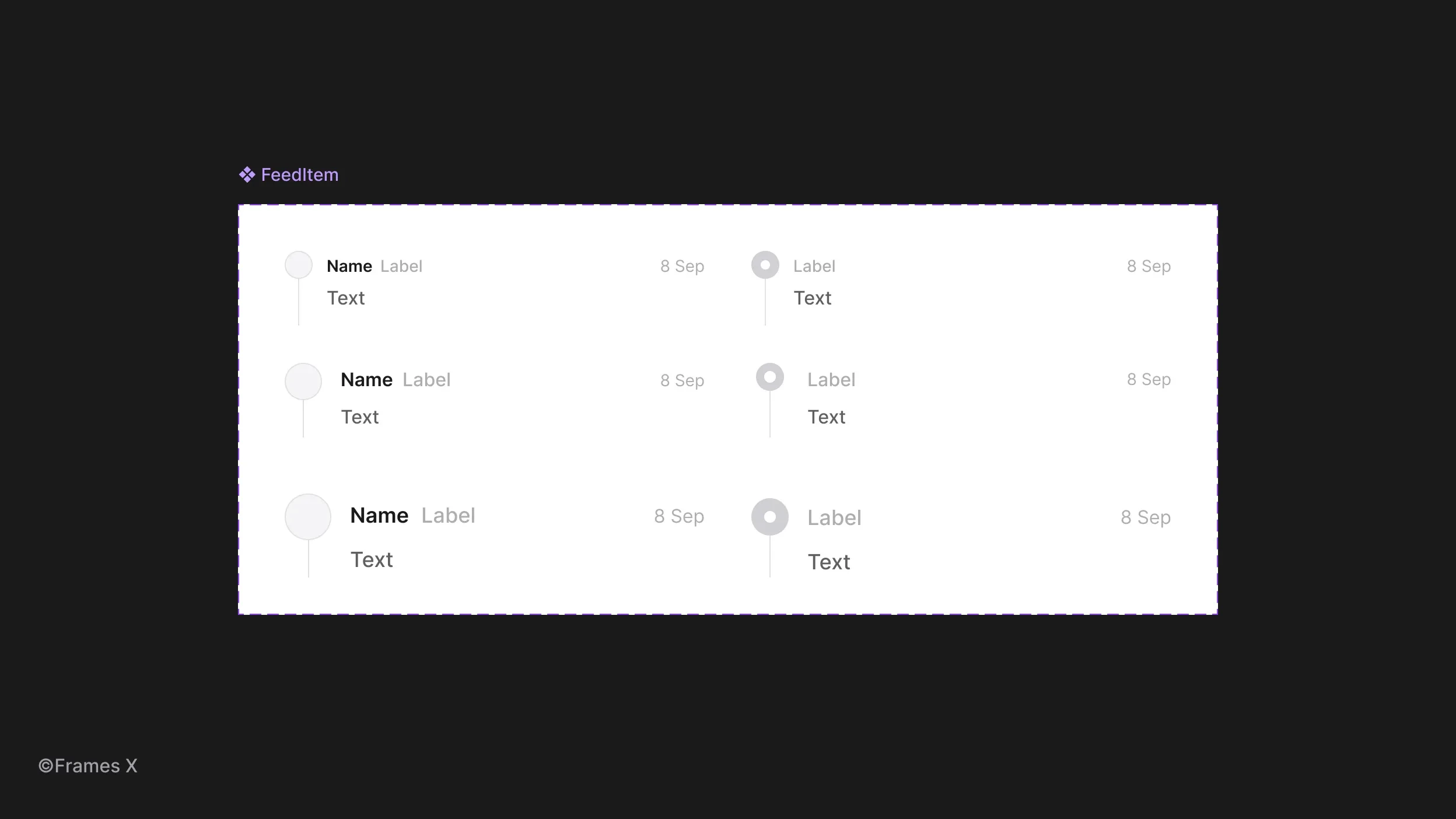
Updated Feeds UI component
We've enhanced the Feeds component with new smaller size variants and removed redundant properties, making it more user-friendly and useful for your designs.
With this update, Feeds UI is now easier to use for making dashboards, activity panels, and social media posts.
To better demonstrate its full power, we've also added a new Activity Feed template to our UI kit's Templates section.
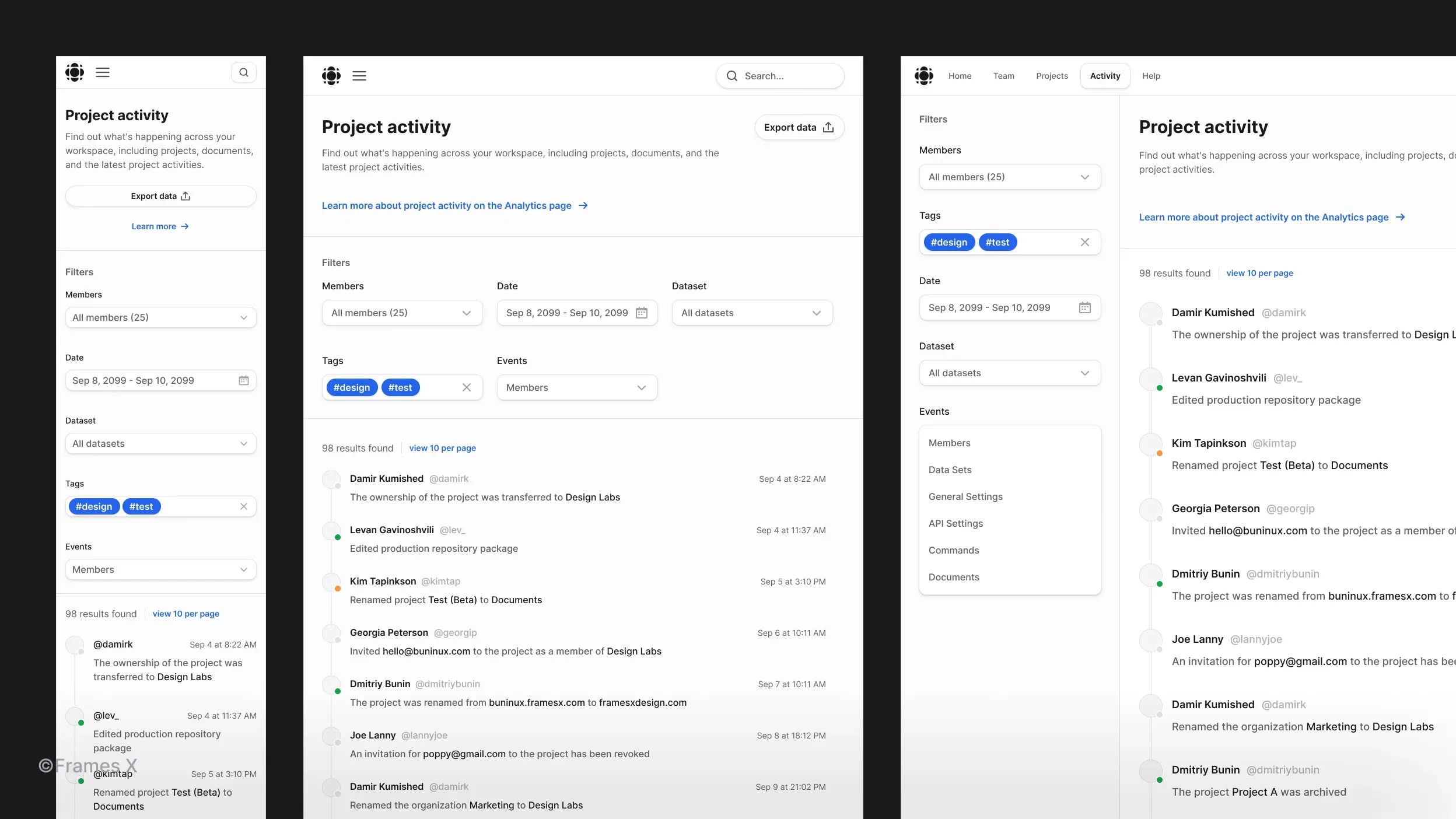
New Activity Feed template
We've created a responsive Activity Feed template utilizing recently added Feeds, Selects, and Date Picker components to battle-test them and show them in action.
This Figma template serves as both a practical demonstration and a rigorous test of these new UI elements.
The Activity Feed template helps you create social and media news feed interfaces. Its design features a UI with a real-time user activity stream, calendar events, and ongoing updates.
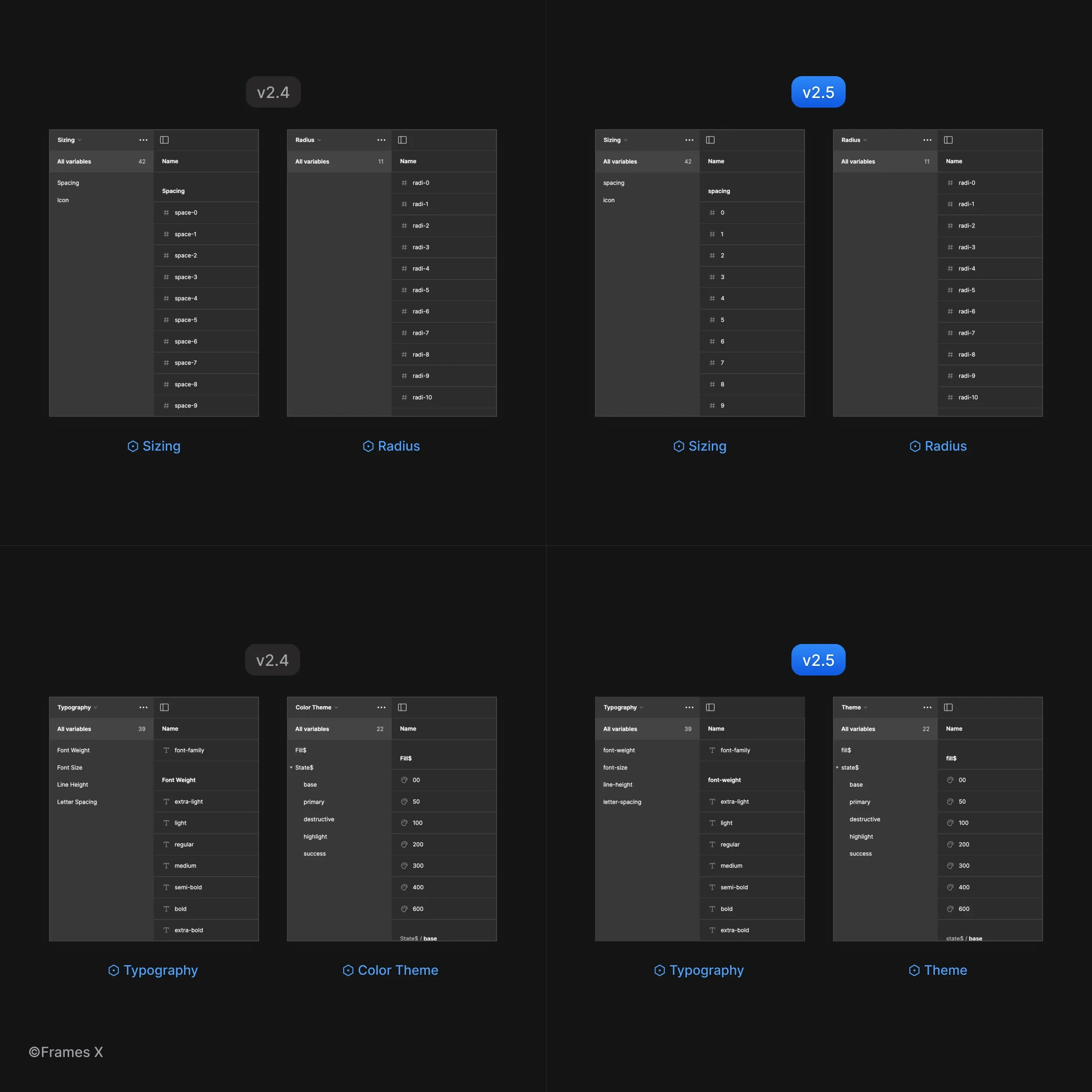
Updated Variables and Design Tokens names
We've streamlined the code export process for our UI kit, making it more developer-friendly. This update features refined variables and token names, along with optimized naming conventions for smoother export of CSS properties.
New Hover and Click UI Interactions
We've updated our set of interactive UI components with new interactions and improvements to animation easings.
Our team has dedicated significant effort to standardizing prototype easings throughout the design system, ensuring consistent interactions across all Frames X interactive components.
We've also introduced new interactions for Select and Date Picker UI components. You can explore all interactive components in our Interactive Components Playground.
→ See updated interactive components in action
Access to Frames X Community Chat
In this update, we are thrilled to introduce our new Design Chat. If you're a Frames X customer, you can now access the community chat on Telegram.
If you have already purchased Frames X license, you can get access by visiting the "Get Access" page from your purchase email.
Our new community chat is your hub for sharing feedback, getting help, and proposing ideas for future releases. You'll also enjoy connecting with professional engineers and designers from all over the world.
Hey there! We are excited to share the release of Frames X 2.5!
This update extends our toolset beyond any other UI framework! With new robust components added and upgrades to existing ones, our design system is now more universal than ever, solidifying FramesX's position as the best UI kit for Figma to date.
Frames X 2.5: New components, UI interactions, refined Figma variables and Community chat
Our newly updated library now boasts over 42 versatile UI component categories, providing an extensive collection of interface elements for your projects. Key additions in this release include:
Refined Variables and Token naming conventions to better align our UI kit with the code export and latest LLM AI models.
New community chat for collaborative design, feedback sharing, and problem-solving.
33% Reduction in file size and performance improvements in working with UI kit components.
Updated Slider UI component
We've expanded our Slider component to include range-based and single-value sliders. We've also restructured these complex UI components to optimize every nested slider element for optimal performance in your designs.
Updated Breadcrumbs UI component
We've reworked the Breadcrumbs component, introducing new pill-shaped variants and expanded sets with extra size variations. New Breadcrumbs are designed to better react to variables and modes, ensuring they adapt and help users navigate through your interfaces.
We've also added new variants to make the Breadcrumbs component more universal. This allows you to switch between breadcrumb separators and fit the navigation into any part of your user interface.
Updated Charts and Grid UI components
We've rolled out enhancements to our Charts and Grid components, introducing new Sharp Line charts with updated Grid and Legends components.
New improvements include restructuring charts, eliminating unused layers, and optimizing resizing. You can now expect better consistency between elements when resizing charts.
New Select UI component
We have introduced a new functional Select component. When interacted with, the Select displays a nested dropdown with a list of available actions.
The Select component is available in three sizes and two different styles, making it useful for your form designs duties.
New Date Picker UI component
We've added a new Date Picker component, which consists of an input field and a calendar pop-up element.
Just like most components, Date Picker input comes in three different sizes and two distinct visual styles to adapt to any interface. The Date Picker component enables users to enter, edit, and select dates using a text-based input.
Updated Badges and Chips UI components
We've enhanced Badges and Chips UI with new, compact-size variants to help you use them in any situation and under any screen resolution. Additionally, we've added a new type of badge: a Ghost badge.
Ghost badges feature a subtle, semi-transparent background with lower contrast. The foreground text is highlighted using one of the primary brand colors, creating a more understated appearance compared to standard badges.
Updated Pagination UI component
We've updated the Pagination component with new functional variants, increasing the number of available steps per element.
This enhancement aims to help you detach the pagination UI less and give more control over its properties. You can now more confidently use pagination UI to split the content into separate pages, sections, and interface steps.
Updated Feeds UI component
We've enhanced the Feeds component with new smaller size variants and removed redundant properties, making it more user-friendly and useful for your designs.
With this update, Feeds UI is now easier to use for making dashboards, activity panels, and social media posts.
To better demonstrate its full power, we've also added a new Activity Feed template to our UI kit's Templates section.
New Activity Feed template
We've created a responsive Activity Feed template utilizing recently added Feeds, Selects, and Date Picker components to battle-test them and show them in action.
This Figma template serves as both a practical demonstration and a rigorous test of these new UI elements.
The Activity Feed template helps you create social and media news feed interfaces. Its design features a UI with a real-time user activity stream, calendar events, and ongoing updates.
Updated Variables and Design Tokens names
We've streamlined the code export process for our UI kit, making it more developer-friendly. This update features refined variables and token names, along with optimized naming conventions for smoother export of CSS properties.
New Hover and Click UI Interactions
We've updated our set of interactive UI components with new interactions and improvements to animation easings.
Our team has dedicated significant effort to standardizing prototype easings throughout the design system, ensuring consistent interactions across all Frames X interactive components.
We've also introduced new interactions for Select and Date Picker UI components. You can explore all interactive components in our Interactive Components Playground.
→ See updated interactive components in action
Access to Frames X Community Chat
In this update, we are thrilled to introduce our new Design Chat. If you're a Frames X customer, you can now access the community chat on Telegram.
If you have already purchased Frames X license, you can get access by visiting the "Get Access" page from your purchase email.
Our new community chat is your hub for sharing feedback, getting help, and proposing ideas for future releases. You'll also enjoy connecting with professional engineers and designers from all over the world.
Frames X is the most robust and largest Figma UI library in the world. Download Frames X design system now to receive all future updates and enhance your design workflow—complete UI design projects faster and get paid more.
See you in the next update!
Posts
The Perfect Figma Tabs Component
Frames X v2.7: Figma design system at scale
Best Figma plugins for UI design and design systems
Best practices for UI color palettes in Figma
WYSIWYG UI: How to design a text editor in Figma
Frames X v2.6: Universal UI kit and component library
Best free icons pack for UI design and development
Figma tips and tricks to work efficiently
Frames X v2.4: Typography variables, new components and charts
Frames X v2.3: Enhanced tools for data-driven design